bauhaus-design-skill
Health Warn
- License — License: MIT
- Description — Repository has a description
- Active repo — Last push 0 days ago
- Low visibility — Only 7 GitHub stars
Code Warn
- Code scan incomplete — No supported source files were scanned during light audit
Permissions Pass
- Permissions — No dangerous permissions requested
No AI report is available for this listing yet.
A Claude Skill for generating UIs in the Bauhaus / Swiss International Typographic Style
bauhaus-design-skill
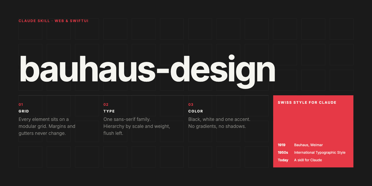
A Claude skill for generating frontends, posters, dashboards, and web UIs rooted in Bauhaus and Swiss International Typographic Style design principles.
Inspired by Josef Müller-Brockmann, Max Bill, Jan Tschichold, Herbert Bayer, and László Moholy-Nagy.
What it does
When triggered, this skill instructs Claude to produce web interfaces following five core principles:
- Mathematical grid systems — 12-column (or 3/4/6) grids as structural skeleton
- Typographic hierarchy through scale — Sans-serif only, one family, mathematical ratios
- Color as information — Max 3 colors, no gradients, no shadows
- Geometric abstraction — Circles, rectangles, diagonals as visual vocabulary
- Asymmetric balance — Off-center compositions, active whitespace
Installation
Claude Desktop / Claude Code
Copy the bauhaus-design-skill folder into your skills directory, or install the .skill file if packaged.
Manual
Place the folder where your Claude configuration can reference it, and ensure SKILL.md is accessible as a skill.
Trigger phrases
The skill activates on mentions of:
- Bauhaus, Swiss design, International Typographic Style
- Grid systems, Müller-Brockmann, Max Bill, Jan Tschichold
- Constructivism, De Stijl-influenced UI
- "Clean modernist", "grid-based design", "Swiss poster"
- Neue Grafik, Akzidenz-Grotesk, Helvetica-era aesthetics
Examples
All outputs below were generated by Claude using this skill.
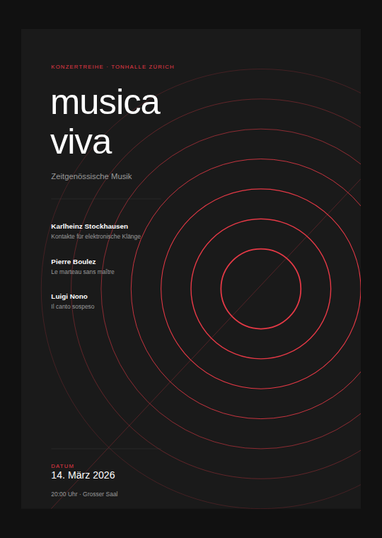
Concert poster (Müller-Brockmann style)
Concentric arcs, flush-left typography, single red accent, diagonal tension line.
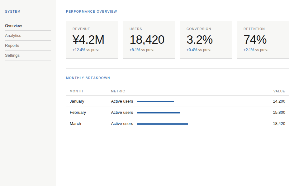
Dashboard (light)
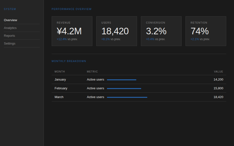
12-column grid, sharp corners, no shadows, blue accent, tabular data with inline bar charts.
Dashboard (dark)
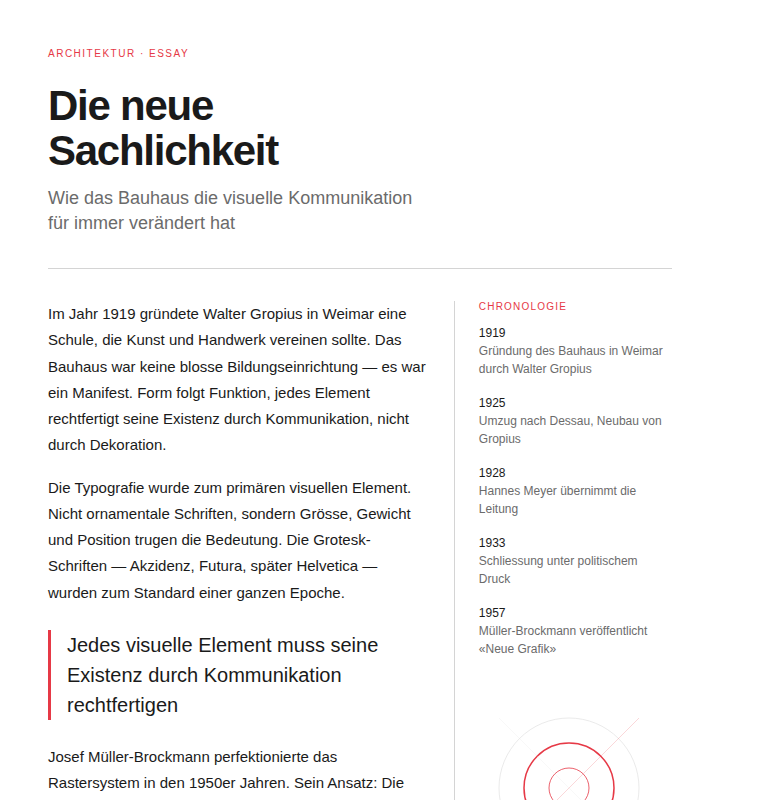
Editorial layout (light)
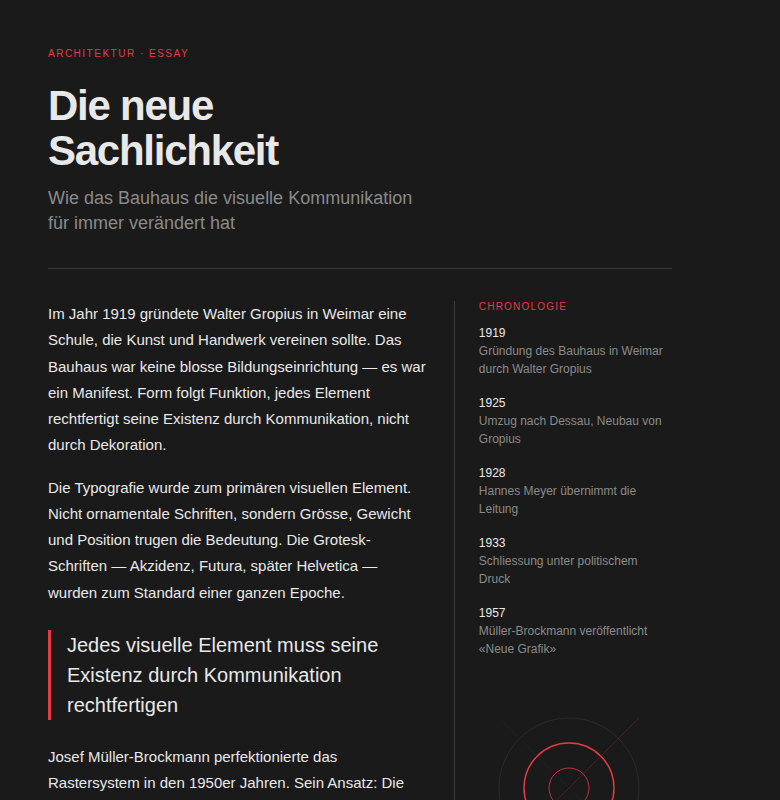
7:4 asymmetric column split, sidebar chronology, pull quote with accent border, geometric ornament.
Editorial layout (dark)
Platform Support
- Web (HTML/CSS/SVG): See
SKILL.md - iOS (SwiftUI): See
IOS_ADAPTATION.md
iOS Quick Start
The iOS adaptation translates the five Bauhaus pillars into SwiftUI:
- Grid →
LazyVGrid/GridwithBauhausTokens.gutter - Typography → SF Pro, mathematical type scale (1.333 ratio)
- Color → 3-color max, no gradients,
BauhausTokensenum - Geometry →
Canvas/Path/Shape(replaces SVG) - Asymmetry → Proportional
HStacksplits,.leadingalignment
iOS Examples
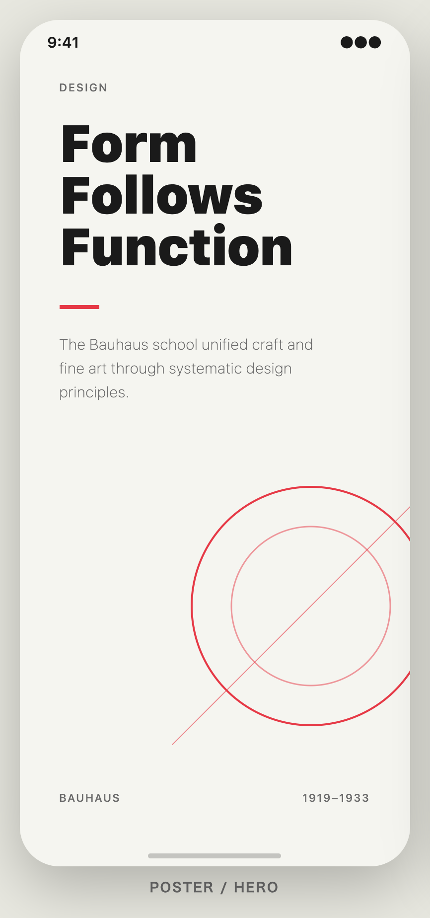
Poster / Hero
Large headline with geometric accent (concentric circles + diagonal), flush-left typography, single red accent bar.
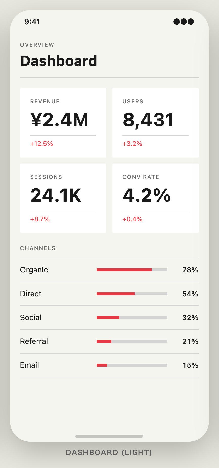
Dashboard (light)
2-column LazyVGrid metric cards, inline bar charts, BauhausTokens spacing throughout.
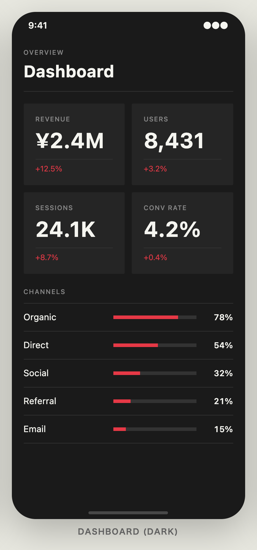
Dashboard (dark)
Same structure, dark palette. No gradients, no materials — solid color fields only.
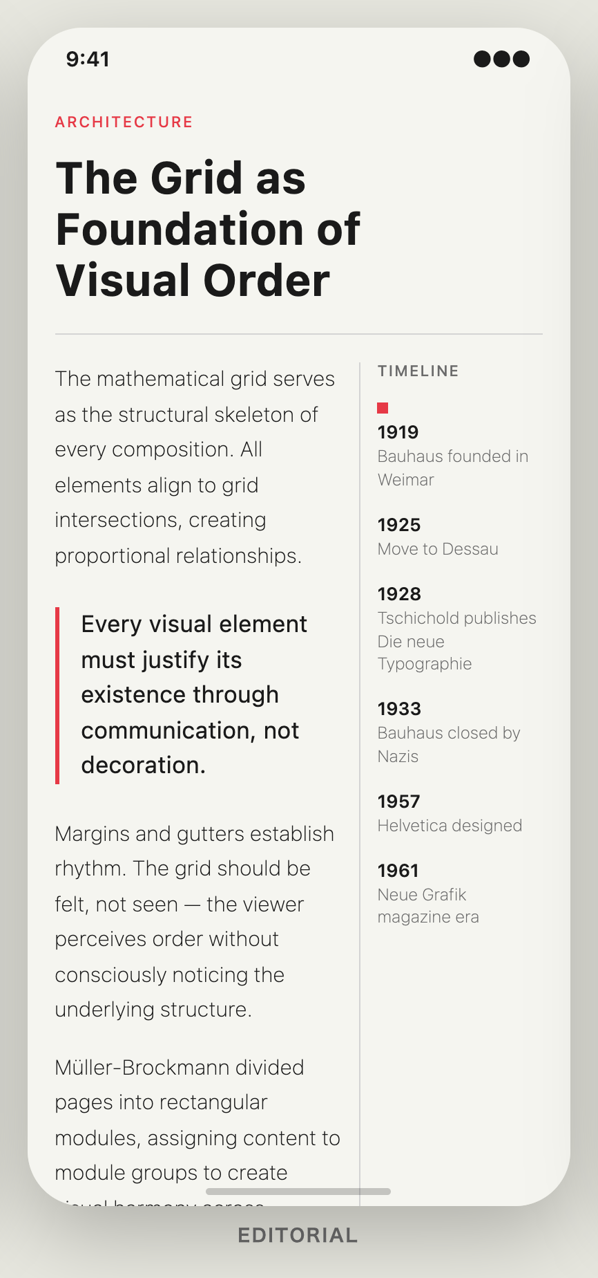
Editorial
7:5 asymmetric layout with pull quote (accent border) and sidebar timeline.
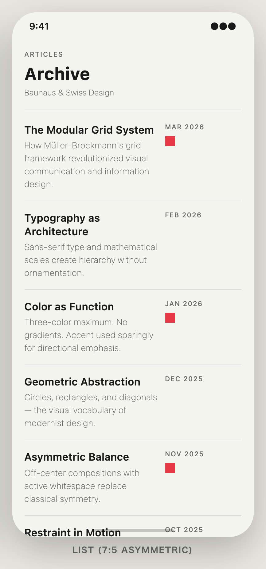
Article list
7:5 asymmetric list rows, red accent squares, uppercase date labels.
License
MIT
Reviews (0)
Sign in to leave a review.
Leave a reviewNo results found