storybook-vrhythm
Health Pass
- License — License: MIT
- Description — Repository has a description
- Active repo — Last push 0 days ago
- Community trust — 22 GitHub stars
Code Fail
- spawnSync — Synchronous process spawning in apps/react/scripts/run-story-tests.mjs
Permissions Pass
- Permissions — No dangerous permissions requested
No AI report is available for this listing yet.
Baseline grid for Storybook that coding agents can run: a measured audit with exact pixel deltas, plus a visual overlay
storybook-vrhythm



Baseline grid overlay for Storybook. See your vertical rhythm while you build.
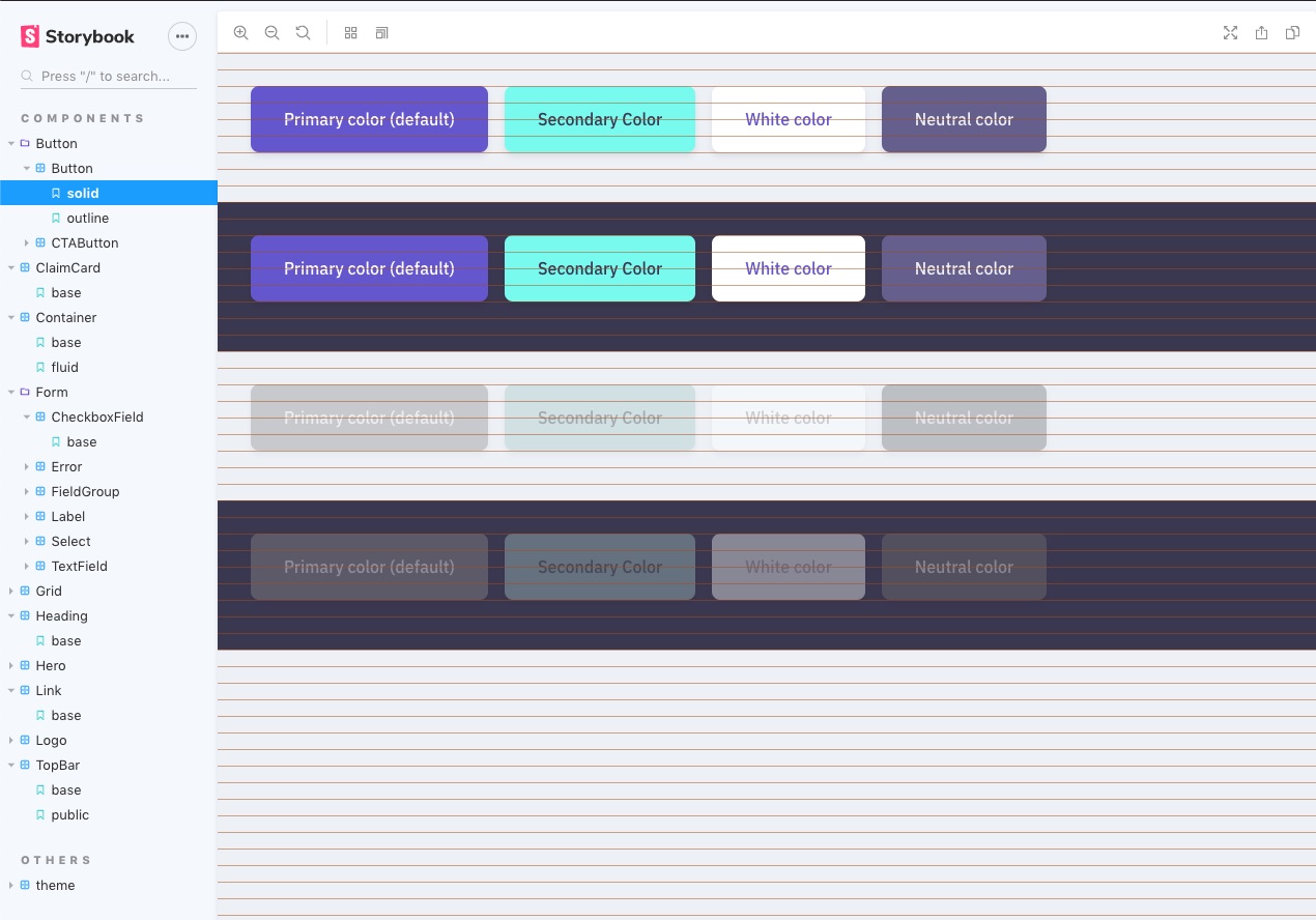
Stop guessing if your spacing is consistent. storybook-vrhythm draws a customizable baseline grid on top of your stories so you can see alignment issues as you develop — not after you ship.
Features
- Framework agnostic — React, Vue, Angular, Svelte, Web Components, HTML
- Toolbar toggle — Show/hide the grid from Storybook's toolbar, no reload needed
- Built-in presets — pixel-based grids plus Material, Tailwind, Bootstrap, and Carbon aliases ready to use
- Column grids — Optional vertical column overlay with configurable gutter width
- Fully customizable — Color, line height, line width, offset, opacity, z-index, max width
- Rhythm audit — Assert grid alignment in
playfunctions, with exact pixel offsets in the failure - Agent ready — Ships
llms.txtand a numeric audit, so coding agents can set it up and fix alignment without screenshots - Lightweight — Pure CSS overlay via
linear-gradient. Zero runtime dependencies - Non-intrusive —
pointer-events: nonekeeps your stories fully interactive - TypeScript first — Full type safety with Storybook parameter augmentation
Requirements
- Node.js 22.12+
- Storybook 10 or 11
Storybook 10 is supported but not continuously tested: CI runs against Storybook 11 only.
While Storybook 11 is in prerelease, install the next tag to use it: pnpm add -D storybook-vrhythm@next. The latest tag is 0.x, which supports Storybook 10 only.
Quick start
pnpm add -D storybook-vrhythm
# or: npm install --save-dev storybook-vrhythm
Add to .storybook/main.ts:
const config = {
  addons: ['storybook-vrhythm'],
};

export default config;
Done. A baseline grid overlay is now visible on every story, toggleable from the toolbar.
CSF Next
Using definePreview? Register the addon in .storybook/preview.ts instead:
import { definePreview } from '@storybook/your-framework';
import vrhythm from 'storybook-vrhythm';

export default definePreview({
  addons: [vrhythm()],
});
This gives parameters.vrhythm full type safety in your stories. It needs no entry in .storybook/main.ts, though keeping one is harmless: the decorator still runs once.
definePreview must come from your framework package. @storybook/html and @storybook/html-vite 11.0.0-beta.0 don't export it, so HTML projects should register the addon in .storybook/main.ts.
Configuration
Global defaults
Set defaults for all stories in .storybook/preview.ts:
export const parameters = {
  vrhythm: {
    color: 'rgba(99, 102, 241, 0.2)',
    lineHeight: '8px',
  },
};
Per-story overrides
export const Compact = {
  parameters: {
    vrhythm: { lineHeight: '4px', color: 'rgba(244, 67, 54, 0.15)' },
  },
};

export const NoGrid = {
  parameters: {
    vrhythm: { hide: true },
  },
};
Using presets
Skip manual configuration with built-in presets that match popular design systems:
export const MaterialGrid = {
  parameters: {
    vrhythm: { preset: 'material' },
  },
};
| Preset | Line height | Color | Best for |
|---|---|---|---|
4px |
4px | rgba(0, 150, 255, 0.15) |
Dense UIs, compact grids |
8px |
8px | rgba(0, 150, 255, 0.2) |
Standard 8pt grid systems |
12px |
12px | rgba(0, 150, 255, 0.2) |
12px grids, mid-density UIs |
16px |
16px | rgba(204, 204, 204, 0.5) |
Body text baseline |
24px |
24px | rgba(204, 204, 204, 0.5) |
Heading alignment |
32px |
32px | rgba(204, 204, 204, 0.5) |
Large-scale layout grids |
Aliases. These names add no style of their own. Each one is exactly the base preset shown, under a name you may recognize from a design system:
| Alias | Same as | Reason |
|---|---|---|
material |
4px |
Material Design uses a 4dp grid |
tailwind |
4px |
Tailwind's spacing unit is 0.25rem |
bootstrap |
24px |
Body text is 1rem × 1.5 line-height |
carbon |
8px |
IBM Carbon uses an 8px mini-unit |
Column grid
Add vertical column lines on top of the horizontal baseline:
export const ColumnGrid = {
  parameters: {
    vrhythm: {
      lineHeight: '8px',
      columnWidth: '80px',
      gutterWidth: '16px',
      columnColor: 'rgba(99, 102, 241, 0.1)',
    },
  },
};
Manual decorator
If you prefer to opt out of the addon preset:
import { withVRhythm } from 'storybook-vrhythm';

export const decorators = [withVRhythm];
Options
Style options
| Option | Type | Default | Description |
|---|---|---|---|
color |
string |
'rgb(204, 204, 204)' |
CSS color for horizontal guide lines |
lineHeight |
string | number |
'16px' |
Baseline grid height ('8px', '1rem', etc.) |
lineWidth |
string | number |
'1px' |
Thickness of each horizontal guide line |
offset |
string | number |
0 |
Vertical offset from the top of the container |
opacity |
number |
1 |
Overlay opacity (0–1) |
zIndex |
number |
9999 |
Stack order of the overlay |
maxWidth |
string | number |
— | Centers the overlay with this max width |
columnWidth |
string | number |
— | Repeating column width for a vertical column grid |
columnColor |
string |
— | CSS color for column lines (falls back to color) |
gutterWidth |
string | number |
— | Gutter between columns (requires columnWidth) |
Config options
| Option | Type | Default | Description |
|---|---|---|---|
hide |
boolean |
false |
Hide the overlay for this story (overrides toolbar toggle) |
preset |
string |
— | Built-in preset name (see table above) |
container |
string |
— | CSS selector for the overlay's parent element (defaults to body) |
Parameter resolution order
DEFAULT_PARAMS → preset styles → story-level parameters
Later sources override earlier ones. The story-level hide param takes precedence over the toolbar toggle.
Auditing rhythm in tests
The overlay shows the grid to people. storybook-vrhythm/audit measures it, so tests, CI and coding agents get numbers instead of a picture. See Using with coding agents for a ready-made prompt.
import { expectRhythm } from 'storybook-vrhythm/audit';

export const Card = {
  play: async ({ canvasElement }) => {
    await expectRhythm(canvasElement);
  },
};
expectRhythm throws when an element is off the grid:
Expected elements on the 8px grid starting at y=0px, found 1 off-grid:
  h2.title top: 21px, nearest 24px (delta -3px)
Use auditRhythm to get the result as data:
import { auditRhythm } from 'storybook-vrhythm/audit';

const report = await auditRhythm(canvasElement);
// {
//   ok: false,
//   grid: { lineHeight: 8, origin: 0 },
//   checked: 12,
//   violations: [
//     { selector: 'h2.title', edge: 'top', actual: 21, nearest: 24, delta: -3 },
//   ],
// }
grid.origin is the viewport Y of the first grid line. actual and nearest are relative to it. It comes from the overlay's top, or from the top of root plus offset when offset is set or the overlay is hidden.
Options for both functions:
| Option | Type | Default | Description |
|---|---|---|---|
lineHeight |
string | number |
From the overlay | Grid size in px, rem, or a number of pixels |
offset |
string | number |
Overlay position | Grid start below the top of root, unlike the story's offset |
tolerance |
number |
0.5 |
Allowed distance from a grid line, in pixels |
checks |
('box' | 'baseline')[] |
['box'] |
What to measure |
ignore |
string |
— | Selector to skip, on top of [data-vrhythm-ignore] |
boxchecks the top and bottom of each visible element, except therootitself, inline text elements and inlinesvg. It suits spacing grids such as 4px and 8px.baselinechecks each line of text. It suits type-driven grids. Don't use it on a spacing grid: 16px text in a 24px line sits about 17px below an on-grid box. Results can differ by up to 1px, and more withfont-stretchorfont-size-adjust, so raisetoleranceif needed.- Invalid setups throw:
RhythmConfigErrormeans the audit could not give a real answer. It covers alineHeightoroffsetthat is not a finitepxorremlength, alineHeightof 0 or less, atolerancethat is negative, not finite, or half oflineHeightor more (no layout could fail it), and an edge or baseline the environment cannot measure. - Fixing violations: work from the top down and rerun after each change. Moving an edge shifts everything below it, so
deltavalues further down go stale, and on-grid edges can move off. - Off-grid on purpose? Add
data-vrhythm-ignoreto skip an element and everything inside it. Use it when the component owns the decision. Use theignoreoption, which also skips subtrees, to exclude something for one story or without touching markup. - Real layout required: run it in a browser, such as
@storybook/addon-vitestwith Playwright. jsdom has no layout, soexpectRhythmfails there withNothing was measured. - Hidden overlay: with
hide: trueor the toolbar set to Hide, passlineHeightyourself. The origin is then the top ofroot, not the top of the page. - Default Storybook layout: the
paddedlayout adds 1rem of body padding, which is off a 24px grid. Uselayout: 'fullscreen'for those stories.
Using with coding agents
Coding agents such as Claude Code, Cursor and Copilot can set up the addon and fix alignment on their own. Two things make that work:
llms.txtships in the package atnode_modules/storybook-vrhythm/llms.txt. It holds the API, the options and the fix workflow in a form agents read well. It is also on GitHub.storybook-vrhythm/auditreturns numbers, not pixels. An agent can't judge a screenshot of a grid overlay, but it can move an edge by-deltapixels and rerun the test.
Copy this prompt into your agent and replace the parts in <...>:
Put <Component> on a <8px> baseline grid with storybook-vrhythm.

1. Read node_modules/storybook-vrhythm/llms.txt first. If the package is not installed, add it as a dev dependency and register it in .storybook/main.ts, or in .storybook/preview.ts with definePreview if this project uses CSF Next.
2. Set lineHeight to <8px> in parameters.vrhythm, globally in .storybook/preview.ts or in the story.
3. Add `await expectRhythm(canvasElement)` from 'storybook-vrhythm/audit' to the play function of <path/to/Component.stories.tsx>.
4. Run that story's tests with this project's Storybook test command. It must run in a real browser (Vitest + Playwright), not jsdom.
5. Fix violations from the top down: move each reported edge by -delta pixels, rerun after every change, and repeat until the audit passes.
6. Add data-vrhythm-ignore only to elements that are off-grid on purpose, and say why. Do not raise tolerance, lower lineHeight or delete the assertion to make the test pass.

Report what you changed and the final audit result.
Why vertical rhythm?
Vertical rhythm is the practice of aligning elements to a consistent baseline grid. When text, images, and components share the same vertical cadence, layouts feel cohesive and polished — even if users can't articulate why.
This addon makes the invisible grid visible during development, so spacing inconsistencies get caught in Storybook instead of production.
Contributing
Contributions are welcome. See CONTRIBUTING.md for the setup, or open an issue.
Inspiration
Baseliner — a Chrome extension by JP Ribeiro for overlaying baseline grids.
License
Reviews (0)
Sign in to leave a review.
Leave a reviewNo results found