Pipboy.Avalonia
Health Warn
- No license — Repository has no license file
- Description — Repository has a description
- Active repo — Last push 0 days ago
- Low visibility — Only 6 GitHub stars
Code Pass
- Code scan — Scanned 6 files during light audit, no dangerous patterns found
Permissions Pass
- Permissions — No dangerous permissions requested
A UI theme library for Avalonia UI that applies a Fallout 4 Pip-Boy aesthetic to desktop and web applications. It provides custom controls, a monochromatic color system, and CRT visual effects without requiring third-party dependencies.
Security Assessment
The automated code scan reviewed 6 files and found no dangerous patterns, hardcoded secrets, or suspicious network activity. No dangerous permissions are requested. The tool does not execute shell commands or access sensitive data. It relies solely on the standard Avalonia framework reference, keeping the attack surface minimal. Overall risk is rated as Low.
Quality Assessment
The project is currently active, with the last push occurring today. However, there are notable maturity concerns: the repository has no license file, which means default copyright laws apply and technically restrict legal usage or modification by others. Community trust indicators are very low, with only 6 GitHub stars, suggesting limited public vetting. A significant portion of the codebase was generated with Claude Code (an AI assistant), which is transparently documented, but developers should be aware that AI-generated UI code may occasionally lack the polish or edge-case handling of manually written themes.
Verdict
Safe to use, but be aware of the unlicensed status and low community adoption—consider reaching out to the author to clarify licensing terms before incorporating it into a commercial project.
A Fallout 4 Pip-Boy inspired theme library for Avalonia UI.
# Pipboy.Avalonia

A Fallout 4 Pip-Boy inspired theme library for Avalonia UI.
Sharp corners, monochromatic phosphor palette, retro terminal aesthetic — drop it in as your sole application theme and every standard control gets the Vault-Tec treatment.
▶ Try the live WASM demo — runs entirely in the browser, no install needed.
A significant portion of this codebase was written with Claude Code.
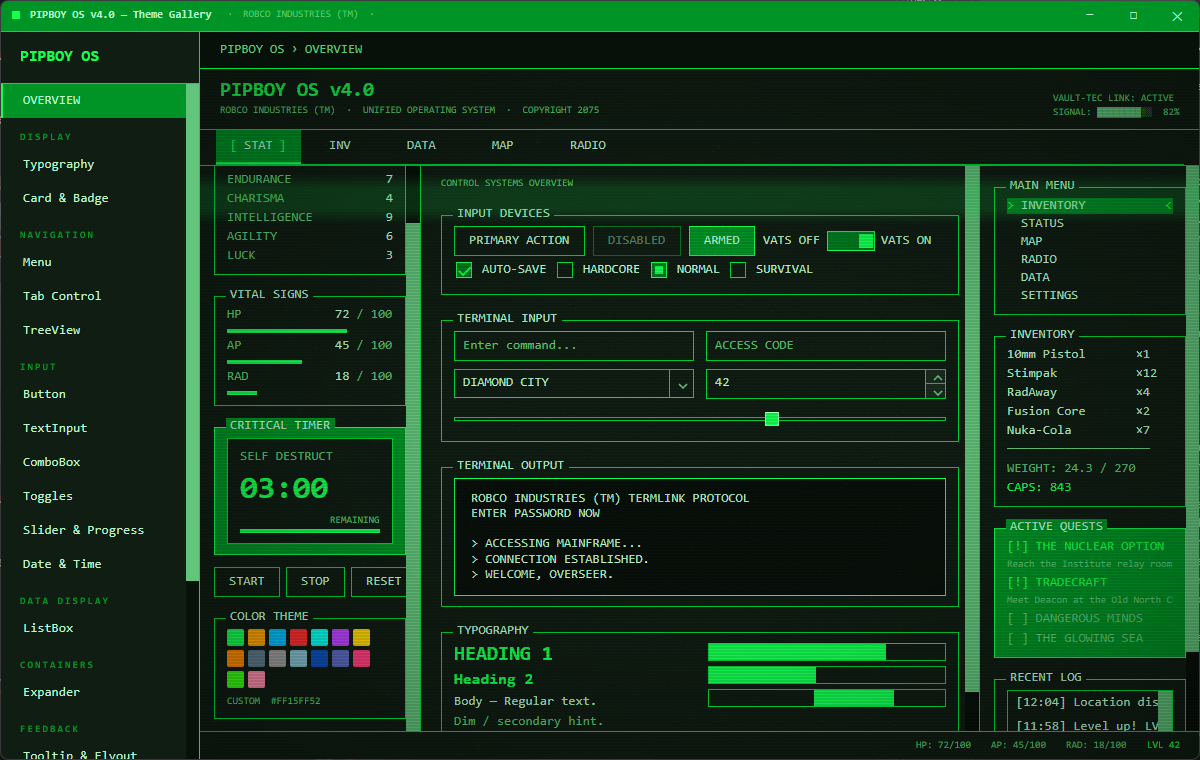
Screenshots
Features
- Full control coverage — Button, RepeatButton, HyperlinkButton, SplitButton, DropDownButton, TextBox, CheckBox, RadioButton, ToggleButton, ToggleSwitch, Slider, ProgressBar, ScrollBar, ListBox, ComboBox, TreeView, TabControl, Menu, ContextMenu, Expander, NumericUpDown, AutoCompleteBox, DatePicker, TimePicker, CalendarDatePicker, SplitView, GridSplitter, ToolTip, FlyoutPresenter, DataValidationErrors, Notification, and more.
- Runtime color switching — change the primary color at any time; all brush resources and CRT effects update instantly — no layout passes triggered.
- Monochromatic palette — the entire color system is derived from a single HSL primary color. Hover, pressed, selection, border, and background variants are computed automatically.
- Purpose-built controls —
CrtDisplay,PipboyWindow,PipboyTitleBar,PipboyCountdown,PipboyPanel,SegmentedBar,RatedAttribute,BracketHighlight,PipboyTabStrip,TerminalPanel,BlinkText,ScanlineOverlay. - MVVM-ready — all custom controls expose
ICommandproperties (CompletedCommand,ClosedCommand) alongside routed events for pure MVVM usage. - No rounded corners — all controls use
CornerRadius="0"by design. - Zero third-party dependencies — only
Avaloniais referenced. - AOT / trimming compatible — compiled XAML bindings,
IsTrimmable, andIsAotCompatibleall enabled. net10.0primary target.- Multi-platform — Desktop (Windows, macOS, Linux), Browser (WASM), Android, iOS.
- Typography utility classes —
h1,h2,dim,accent,error,warning,successforTextBlock;pipboy-panel,pipboy-surfaceforBorder.
Platform Support
| Platform | Project suffix | Notes |
|---|---|---|
| Windows / macOS / Linux | .Desktop |
IClassicDesktopStyleApplicationLifetime |
| Browser (WASM) | .Browser |
net8.0-browser, Avalonia.Browser |
| Android | .Android |
net8.0-android |
| iOS | .iOS |
net8.0-ios |
Installation
dotnet add package Pipboy.Avalonia
Quick Start
1. Apply the theme in App.axaml
<Application xmlns="https://github.com/avaloniaui"
             xmlns:x="http://schemas.microsoft.com/winfx/2006/xaml"
             xmlns:pipboy="clr-namespace:Pipboy.Avalonia;assembly=Pipboy.Avalonia"
             x:Class="MyApp.App">
  <Application.Styles>
    <pipboy:PipboyTheme />
  </Application.Styles>
</Application>
PipboyTheme is a self-contained Styles collection — no base Fluent/Simple theme required.
2. (Optional) Set the primary color at startup
// In App.axaml.cs or Program.cs — before the window is shown
PipboyThemeManager.Instance.SetPrimaryColor(Color.Parse("#FFA500")); // Amber
The default color is phosphor green (#4CAF50-ish).
3. (Optional) Change color at runtime
PipboyThemeManager.Instance.SetPrimaryColor(Color.Parse("#00BFFF")); // Blue
Subscribe to ThemeColorChanged if you need to react to changes:
PipboyThemeManager.Instance.ThemeColorChanged += (_, e) =>
{
    // e.Palette exposes all computed colors
};
Typography Classes
Apply directly on TextBlock:
| Class | Effect |
|---|---|
h1 |
20 px, bold, primary color |
h2 |
16 px, bold, primary color |
dim |
Dimmed foreground (PipboyTextDimBrush) |
accent |
Primary color foreground |
error |
Error red foreground |
warning |
Warning amber foreground |
success |
Success green foreground |
<TextBlock Classes="h2" Text="INVENTORY"/>
<TextBlock Classes="dim" Text="Weight: 12.4 lbs"/>
<TextBlock Classes="error" Text="ENCUMBERED"/>
Layout Classes
Apply on Border:
| Class | Effect |
|---|---|
pipboy-panel |
Elevated surface (PipboySurfaceHighBrush) with border + 8 px padding |
pipboy-surface |
Flat surface (PipboySurfaceBrush) with border |
<Border Classes="pipboy-panel">
  <TextBlock Text="SECTION CONTENT"/>
</Border>
Custom Controls
Pipboy.Avalonia ships purpose-built controls that go beyond Avalonia's built-in set.
SegmentedBar
Displays a value as discrete rectangular segments — the iconic Fallout HP/AP/RAD bar style.
<pipboy:SegmentedBar Label="HP" Value="78" Maximum="100" SegmentCount="20" />
RatedAttribute
Shows a named attribute with filled/empty dot indicators — S.P.E.C.I.A.L. style.
<pipboy:RatedAttribute Label="STRENGTH" Value="8" Maximum="10" />
BlinkText
Wraps any content with a configurable blink animation (pure XAML — WASM safe).
<pipboy:BlinkText IsBlinking="True">
    <TextBlock Classes="accent" Text="PRESS ENTER TO CONTINUE" />
</pipboy:BlinkText>
ScanlineOverlay
A Decorator that draws repeating CRT-style horizontal scanlines over its child using DrawingContext (no unsafe code, WASM safe).
<pipboy:ScanlineOverlay LineSpacing="4" LineOpacity="0.08">
    <Border Classes="pipboy-panel">
        <TextBlock Text="ROBCO INDUSTRIES" />
    </Border>
</pipboy:ScanlineOverlay>
BracketHighlight
Wraps content with animated > ... < bracket indicators on hover or when IsSelected=true.
<pipboy:BracketHighlight IsSelected="True">
    <TextBlock Text="INVENTORY" />
</pipboy:BracketHighlight>
PipboyTabStrip
Horizontal tab-strip navigation with bracket indicators and D-Pad Left/Right keyboard support for gamepad use.
<pipboy:PipboyTabStrip SelectedIndex="0">
    <pipboy:PipboyTabStripItem Content="STAT" />
    <pipboy:PipboyTabStripItem Content="INV" />
    <pipboy:PipboyTabStripItem Content="DATA" />
    <pipboy:PipboyTabStripItem Content="MAP" />
    <pipboy:PipboyTabStripItem Content="RADIO" />
</pipboy:PipboyTabStrip>
TerminalPanel
A container styled as a Fallout terminal screen. Supports TypewriterEffect for character-by-character text reveal using DispatcherTimer (WASM safe).
<pipboy:TerminalPanel TypewriterEffect="True" TypewriterDelayMs="40"
Content="ACCESSING VAULT-TEC MAINFRAME...
CONNECTION ESTABLISHED." />
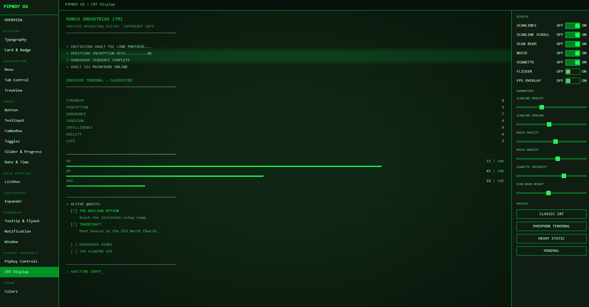
CrtDisplay
A Panel that layers animated CRT monitor effects over its content using only managed DrawingContext APIs — fully WASM-safe and AOT-compatible.
Effects are independently toggleable: scanlines, scan beam, static noise, vignette, and flicker.
The scan beam color automatically follows the active theme by default; explicitly setting ScanBeamColor opts out of auto-tracking.
<pipboy:CrtDisplay EnableScanBeam="True" EnableScanlines="True" EnableVignette="True"
                   EnableNoise="True" ScanBeamSpeed="55" VignetteIntensity="0.4">
    <Border Background="{DynamicResource PipboySurfaceBrush}">
        <!-- your content -->
    </Border>
</pipboy:CrtDisplay>
PipboyWindow / PipboyTitleBar
A custom Window with a fully themed chrome: draggable title bar with TitleBarContent injection slot, working Minimize/Maximize/Close buttons, and a right-click system menu (Minimize / Maximize·Restore / Close). PipboyTitleBar is the same chrome as a standalone control for embedding inside other layouts.
<pipboy:PipboyWindow Title="VAULT-TEC OS">
    <pipboy:PipboyWindow.TitleBarContent>
        <pipboy:BlinkText IsBlinking="True">
            <TextBlock Classes="accent" FontSize="10" Text="● ONLINE" />
        </pipboy:BlinkText>
    </pipboy:PipboyWindow.TitleBarContent>
    <!-- window content -->
</pipboy:PipboyWindow>
PipboyCountdown
A countdown timer control with configurable precision (Seconds / Minutes / Hours / Milliseconds), a label, and a Completed event plus CompletedCommand for MVVM.
<pipboy:PipboyCountdown Duration="0:3:00" Label="SELF DESTRUCT"
                         Precision="Seconds" CompletedCommand="{Binding AlarmCommand}" />
PipboyPanel
A titled, closable panel container. Raises a Closed routed event and ClosedCommand when the user dismisses it.
<pipboy:PipboyPanel Header="SYSTEM ALERT" Classes="warning">
    <TextBlock Text="Reactor core temperature critical." />
</pipboy:PipboyPanel>
Design Tokens
All tokens are available as {DynamicResource} in XAML.
Brushes
| Resource | Description |
|---|---|
PipboyPrimaryBrush |
Primary brand color |
PipboyPrimaryLightBrush |
Lighter variant (highlights) |
PipboyPrimaryDarkBrush |
Darker variant (selected background) |
PipboyBackgroundBrush |
Window / deepest background |
PipboySurfaceBrush |
Card / panel background |
PipboySurfaceHighBrush |
Elevated panel background |
PipboyTextBrush |
Primary text |
PipboyTextDimBrush |
Secondary / label text |
PipboyBorderBrush |
Default control border |
PipboyBorderFocusBrush |
Focused control border |
PipboyHoverBrush |
Hover state background |
PipboyPressedBrush |
Pressed state background |
PipboySelectionBrush |
Selected item background |
PipboyFocusBrush |
Focus ring color |
PipboyDisabledBrush |
Disabled foreground |
PipboyErrorBrush |
Error severity (hue-derived, near-white lightness) |
PipboyWarningBrush |
Warning severity (hue-derived, bright lightness) |
PipboySuccessBrush |
Success severity (hue-derived, mid lightness) |
Font Sizes
| Resource | Value |
|---|---|
PipboyFontSizeSmall |
11 |
PipboyFontSize |
13 |
PipboyFontSizeLarge |
16 |
Other
| Resource | Description |
|---|---|
PipboyFontFamily |
Consolas, Courier New, monospace |
PipboyPrimaryColor |
Raw Color value of the primary |
PipboyBackgroundColor |
Raw Color of the background |
PipboyTextColor |
Raw Color of the text |
Runtime Color Switching — How It Works
PipboyTheme registers SolidColorBrush instances as DynamicResource entries. When PipboyThemeManager.SetPrimaryColor() is called, PipboyColorPalette computes the full HSL-derived palette and OnThemeColorChanged mutates each brush's .Color in place. Avalonia's reactive binding system propagates the change to every bound control automatically — no re-layout, no template re-application.
SetPrimaryColor(color)
  └─ PipboyColorPalette(color)      — HSL-derive all palette colors
       └─ ThemeColorChanged event
            └─ PipboyTheme.OnThemeColorChanged()
                 └─ brush.Color = newColor  (× 18 brushes)
                      └─ DynamicResource invalidation → UI updates
PipboyTheme implements IDisposable. If you remove the theme from Application.Styles at runtime, call Dispose() to unsubscribe from ThemeColorChanged and avoid a memory leak.
Supported Avalonia Version
11.3.12 (tested). Compatible with Avalonia 11.x.
License
MIT
Reviews (0)
Sign in to leave a review.
Leave a reviewNo results found