ui
Health Pass
- License — License: NOASSERTION
- Description — Repository has a description
- Active repo — Last push 0 days ago
- Community trust — 18 GitHub stars
Code Fail
- execSync — Synchronous shell command execution in .github/scripts/version-snapshot.ts
Permissions Pass
- Permissions — No dangerous permissions requested
No AI report is available for this listing yet.
A simple, copy-paste component system for SolidJS built natively for Tailwind CSS v4. Honoring the iconic Georgian painter Niko Pirosmani (Nikala).
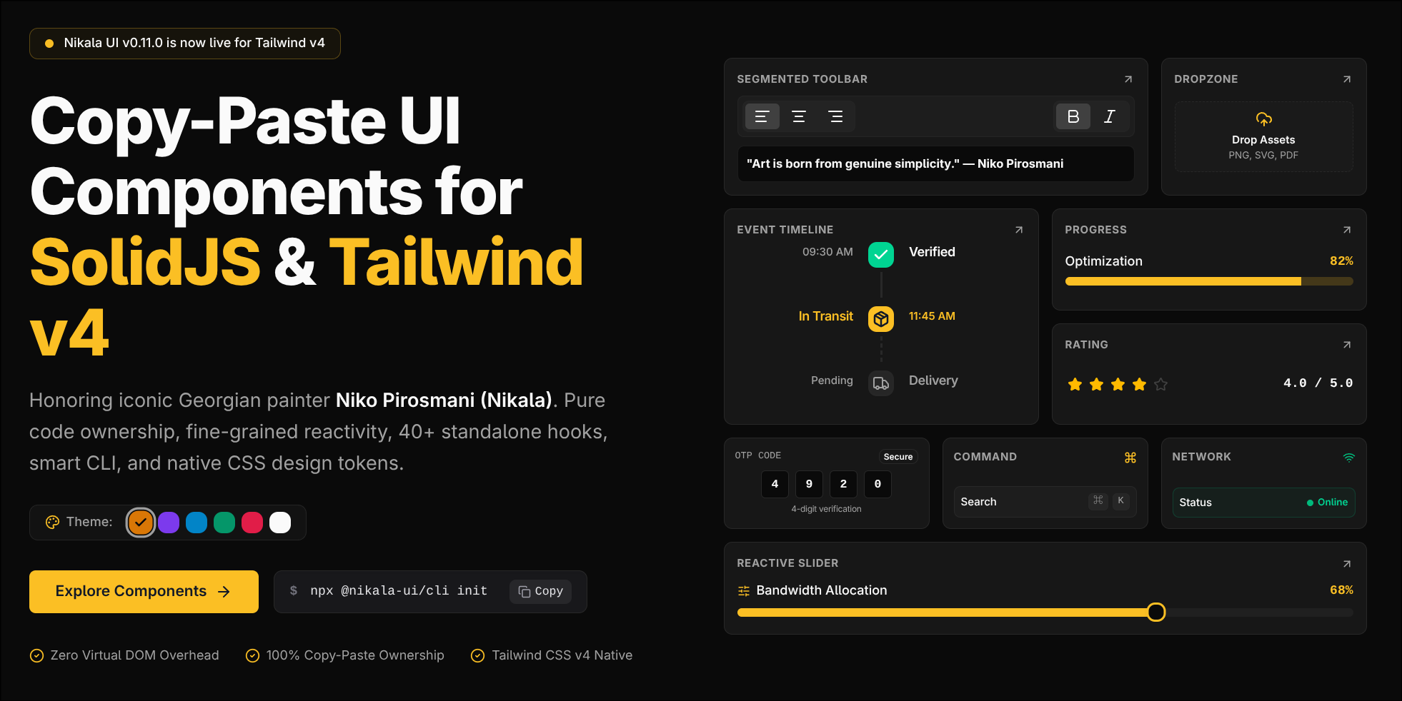
Nikala UI
A simple, copy-paste component system and reactive primitives suite for SolidJS built natively for Tailwind CSS v4 and Tauri v2.
Honoring the iconic Georgian painter Niko Pirosmani (Nikala).








Official Documentation & Live Playground: nikala.dev
Why Nikala UI?
Tailwind CSS v4 introduced a CSS-first configuration (@theme), which broke compatibility with many existing SolidJS UI wrappers.
Nikala UI gives you full ownership of your code. Instead of adding a heavy third-party UI package to your node_modules, Nikala's CLI writes lightweight, fully reactive SolidJS components directly into your src/components/ui directory and primitives into src/hooks.
- Native SolidJS Reactivity — Built with
splitPropsand fine-grained reactivity without virtual DOM overhead. - Tailwind CSS v4 First — Designed around modern
@import "tailwindcss";setups with semantic design tokens. - SolidJS & SolidStart Ready — Smart auto-detection for standard Vite SPA, Tauri, Electron, and SolidStart (SSR / Fullstack) projects.
- Tauri v2 Desktop Native — First-class support for cross-platform desktop applications (frameless titlebars, multi-document tabs, auto-updaters, and OS shortcuts).
- 47+ Reactive Primitives — Fine-grained SolidJS hooks (keyboard bindings, mouse position, audio/video, storage, media queries).
- Full Code Ownership — The component files live in your project. Tweak them as you see fit.
- Smart CLI — Automatically detects your package manager (
bun,pnpm,npm,yarn) and installs required dependencies. - Model Context Protocol (MCP) — Native AI pair programming integration for Cursor, Claude, and Antigravity.
- Dynamic Theme Engine — Customize base gray palettes, primary brand accent colors, and border radii at build-time or runtime.
- Custom Registries — Supports adding components directly from remote HTTP(S) URLs.
- Monorepo Architecture — Decoupled CLI (@nikala-ui/cli) and core design system (@nikala-ui/core) for instant background registry updates.
Quick Start
1. Initialize Nikala UI in your project
Run the initialization command in your SolidJS workspace:
# Execute via npm package scope or bunx/npx/pnpm dlx
bunx @nikala-ui/cli init
# or
npx @nikala-ui/cli init
This will:
- Prompt for directory preferences, base gray palette, and primary brand accent color
- Generate
nikala.config.json - Configure
@path aliases invite.config.tsorapp.config.ts - Create the
src/lib/cn.tshelper utility - Set up standard Tailwind CSS v4 variables in
src/index.cssorsrc/app.css - Automatically inject CSS imports into your main entry file (
index.tsx,app.tsx, etc.)
2. Customize Theme Colors via CLI
Switch brand accent colors or base palettes anytime without re-running initialization:
# Interactive theme selection menu
bunx @nikala-ui/cli theme

# Direct command execution
bunx @nikala-ui/cli theme set sky slate
3. Add components to your project
Add specific components or install all at once:
# Add specific components
bunx @nikala-ui/cli add button input card theme-manager

# Or add all available components
bunx @nikala-ui/cli add --all

# Add reactive primitive hooks to src/hooks/
bunx @nikala-ui/cli add -h create-clipboard create-fetch create-document-tabs
You can also install components from custom remote URLs:
bunx @nikala-ui/cli add https://example.com/registry/my-custom-card.json
4. Import and use
import { Button } from "@/components/ui/button";
import {
  Card,
  CardHeader,
  CardTitle,
  CardDescription,
  CardContent,
  CardFooter,
} from "@/components/ui/card";
import { Badge } from "@/components/ui/badge";

export function App() {
  return (
    <Card class="w-[350px]">
      <CardHeader>
        <div class="flex items-center justify-between">
          <CardTitle>Nikala UI</CardTitle>
          <Badge>v0.11.0</Badge>
        </div>
        <CardDescription>SolidJS + Tailwind v4 component system.</CardDescription>
      </CardHeader>
      <CardContent>
        <p>Simple, copy-paste components built for SolidJS.</p>
      </CardContent>
      <CardFooter>
        <Button onClick={() => alert("Gamarjoba!")}>Get Started</Button>
      </CardFooter>
    </Card>
  );
}
🖥️ Desktop & Tauri v2 Suite
Nikala UI provides a complete desktop-ready component and primitive suite tailored for Tauri v2 and SolidJS:
<Titlebar>: Custom frameless window header supporting macOS Traffic Lights, Windows 11 fluent controls, window drag regions, and double-click maximize.<TitlebarTabs>: Draggable, multi-document tab bar with mouse wheel horizontal scrolling, pinned tabs, unsaved dirty state indicators, and auto-adjacent activation.<UpdaterModal>: Production-ready Tauri v2 application update dialog with download progress bars, release notes preview, and relaunch actions.- Desktop Primitives:
createTauriWindow,createDocumentTabs,createAppUpdater,createGlobalShortcut.
# Add desktop components to your Tauri app
bunx @nikala-ui/cli add titlebar updater-modal
import {
  Titlebar,
  TitlebarControls,
  TitlebarTabs,
} from "@/components/ui/titlebar";
import { createDocumentTabs } from "@/hooks/create-document-tabs";

export function AppHeader() {
  const tabs = createDocumentTabs({
    initialTabs: [
      { id: "main.rs", title: "main.rs", isPinned: true },
      { id: "app.tsx", title: "App.tsx", isDirty: true },
    ],
    enableKeybindings: true, // Enables Ctrl+W to close active tab
  });

  return (
    <Titlebar platform="macos" class="h-10 bg-card border-b">
      <TitlebarControls platform="macos" />
      <TitlebarTabs
        manager={tabs}
        variant="editor"
        onAddTab={() => tabs.addTab({ id: `doc-${tabs.count() + 1}`, title: "Untitled" })}
      />
    </Titlebar>
  );
}
Components
Nikala UI provides a growing library of accessible, beautifully designed SolidJS components built natively for Tailwind CSS v4.
Explore all components, interactive live previews, and API references at nikala.dev/docs/components.
You can also list all available components directly from your terminal:
bunx @nikala-ui/cli add
Documentation & Guides
- Desktop Suite & Tauri Setup — Frameless titlebars, multi-document tabs, auto-updaters, and window signals.
- CLI Commands Guide — Comprehensive guide covering initialization, component installation, interactive multiselect menu, workspace health diagnostics (
validate), code diffing (diff), and CLI theme commands (theme). - Theming & Color System Guide — Comprehensive guide covering CLI theme customization, CSS design tokens,
ThemeProvider,ThemeTogglemodes, and Web View Transition animations. - MCP AI Integration — Model Context Protocol tools, resources, and prompts for AI coding agents.
- Component Authoring & Contribution Guide — Detailed rules and conventions for creating, registering, and contributing new components.
Sponsor & Support
Nikala UI is a 100% free and open-source project. If it has saved you development time or helped your team build better apps, please consider sponsoring its ongoing development:

License
Reviews (0)
Sign in to leave a review.
Leave a reviewNo results found