animateicons
Health Gecti
- License — License: MIT
- Description — Repository has a description
- Active repo — Last push 3 days ago
- Community trust — 1524 GitHub stars
Code Gecti
- Code scan — Scanned 12 files during light audit, no dangerous patterns found
Permissions Gecti
- Permissions — No dangerous permissions requested
Bu listing icin henuz AI raporu yok.
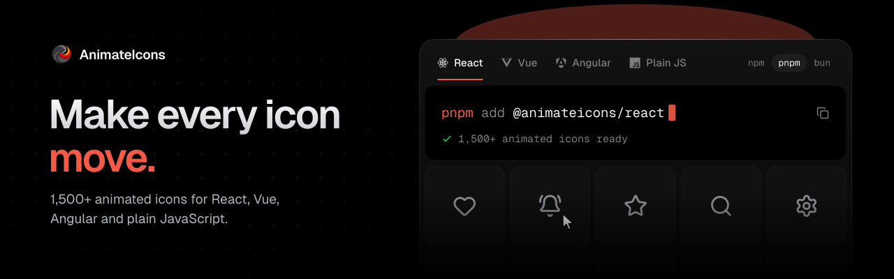
1,500 free, open source animated icons for React, Vue, Angular and plain JavaScript. Every animation is hand-crafted and tuned to feel smooth, and plays the same in every framework.
Browse icons · Docs · MCP · Sponsor


1,500 animated SVG icons with hover and imperative triggers, and configurable size, color and duration. Built on motion.
Quick start
pnpm add @animateicons/react
import { BellRingIcon } from "@animateicons/react/lucide";

export function Notifications() {
	return <BellRingIcon size={24} color="#f45b48" />;
}
Icons animate on hover by default, and motion is bundled. Import from @animateicons/react/lucide or @animateicons/react/huge.
Prefer to own the code? Copy one icon into your project with npx animateicons add bell-ring.
Other frameworks
The same icons and the same motion ship for more than React:
| Framework | Package | Docs |
|---|---|---|
| Plain JS, web components, Svelte, Solid, Astro | @animateicons/vanilla |
Plain JS |
| Vue 3 and Nuxt | @animateicons/vue |
Vue |
| Angular 20, 21 and 22 | @animateicons/angular |
Angular |
Props
| Prop | Type | Default |
|---|---|---|
size |
number |
24 |
color |
string |
currentColor |
duration |
number |
1 |
isAnimated |
boolean |
true |
className |
string |
- |
Hover, click or both
[!TIP]
UseuseIconHoverto play an icon when a user hovers or clicks the button, link or card around it.
"use client";
import { useIconHover } from "@animateicons/react";
import { BellRingIcon } from "@animateicons/react/lucide";

export default function Bell() {
	const { ref, triggerProps } = useIconHover(); // hover (default)

	return (
		<button {...triggerProps}>
			<BellRingIcon ref={ref} size={28} />
		</button>
	);
}
See the full docs for click, both and multiple icons.
Documentation
| Topic | What it covers | Docs |
|---|---|---|
| React | Props, Next.js, Server Components and types | React |
| Examples | Hover helper, buttons, inputs, cards and menus | Examples |
| shadcn | Add icons with the shadcn CLI | shadcn |
| CLI | Copy icons into your project with npx animateicons |
CLI |
| MCP | Let AI agents search and add icons | MCP |
Start with the introduction for everything else.
Contributing
PRs adding icons are welcome. See CONTRIBUTING.md.
License
MIT. Icon shapes are based on Lucide and Hugeicons, see the third-party notices.
Yorumlar (0)
Yorum birakmak icin giris yap.
Yorum birakSonuc bulunamadi