practicaltypography
Health Gecti
- License — License: MIT
- Description — Repository has a description
- Active repo — Last push 0 days ago
- Community trust — 19 GitHub stars
Code Gecti
- Code scan — Scanned 2 files during light audit, no dangerous patterns found
Permissions Gecti
- Permissions — No dangerous permissions requested
Bu listing icin henuz AI raporu yok.
Typography skill for AI agents - audit and produce publication-grade text. Butterick's Practical Typography for your coding agent.
practicaltypography
Your agent already knows typography rules. It doesn't know which ones matter, in what order, or when you're allowed to break them.


One skill that audits and produces publication-grade typography for blogs, websites, docs, slides, résumés, and data tables — distilled from Matthew Butterick's Practical Typography. It carries an ordered audit procedure with severity tiers, per-role ranges (body text rules are not display rules are not slide rules), graded font verdicts, and named presets for when your taste and the benchmark disagree.
The demo
Same agent. Same prompt. One of them read the skill first.
Prompt: "My blog looks unprofessional and I can't figure out why. Can you audit the typography?" — with CSS: 14px Open Sans/Arial,
line-height: 1.8, full-width column, indent + margin on paragraphs, justified, uppercase underlined headings, bold-italic blockquotes.
| Any agent, vanilla | Same agent, typography |
|---|---|
|
A solid 8-point list: 14px too small ("use 16–18px"), unconstrained line length ("readable 45–75 characters"), uppercase + underlined headings, justify rivers, redundant paragraph separation, bold+italic blockquotes, "line-height 1.5–1.65 at 16px+ reads better", straight quotes. (All real issues. No order, no severity, no verdict on the fonts — Arial sat in that stack unremarked. The numbers are vibes: 45–75, 1.5–1.65, "ideally 1.125rem+".) |
…then paragraphs, headings, emphasis, characters — each |
The vanilla answer isn't bad. It's good — and it missed the font entirely, ranked nothing, and its numbers drift with whatever the model last read. The skill's answer is a procedure: six checks in impact order, severity by definition rather than vibes, sourced ranges, and a required closing the user can act on.
Before / after
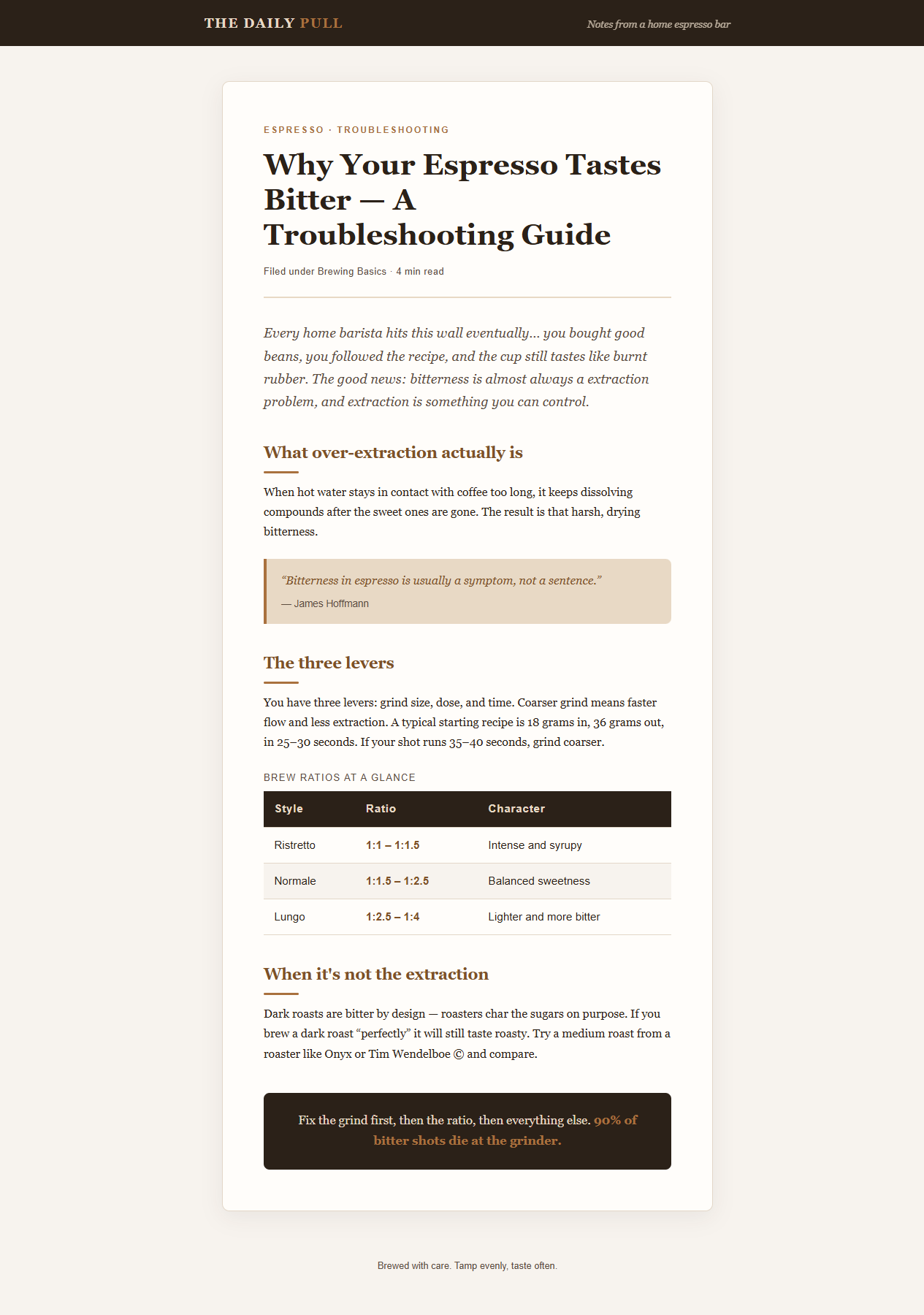
A vanilla agent got one prompt — "build me a blog post page, style it nicely" — and produced demo/before.html, saved unretouched. The skill then audited it (demo/AUDIT.md, findings in its own reporting format) and produced demo/after.html with the content untouched.
| Before — vanilla agent | After — typography skill |
|---|---|
 |
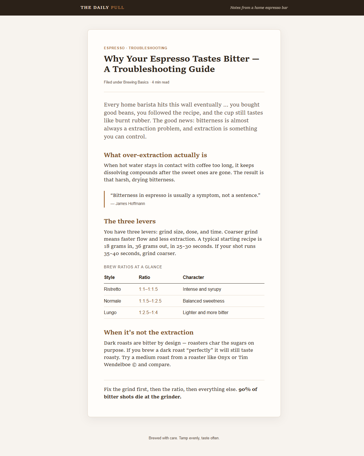 |
The headline changes: 16px/1.7 Georgia became 18px/1.4 Charter, the dark striped table header became thin rules with tabular figures, the italic intro and tinted blockquote calmed down to structural distinction, and the centered inverse closing box became left-aligned text. Same content — and the page got shorter (1584px vs 1804px of scroll), because tighter leading recovers what the web-default 1.7 wastes. Good typography costs nothing in word count.
Install
Any agent (recommended):
npx skills add danium/practicaltypography
Claude Code (plugin):
/plugin marketplace add danium/practicaltypography
/plugin install practicaltypography@practicaltypography
Codex: ask $skill-installer to install from https://github.com/danium/practicaltypography
Manual: clone and copy skills/typography into your agent's skills directory.
What's inside
| File | Covers |
|---|---|
SKILL.md |
The body-text contract, per-role scope table (body / display / small-UI / slides), the six-step audit procedure, the user-preference protocol with three presets, supporting-element specs, character rules |
fonts.md |
Butterick's letter-graded system font lists (A/B/C/F), endorsed free fonts, professional alternatives, criteria for judging fonts not on any list |
media.md |
Print margins and columns, presentations (black backgrounds, gray type, the 12–15-line calibration), web, email, résumés, tables of numbers, the nine maxims of page layout |
Pick your entry point
| Situation | Where the skill takes it |
|---|---|
| "This page/deck looks unprofessional" | Six-step audit, findings ranked [MAJOR|MINOR], corrected values, top-3 fixes |
| "Set up typography for my blog / docs site" | Body contract + supporting-elements table (code, tables, captions, nav, callouts) |
| "Make it airy like Medium, not like a book" | Preference protocol: intent governs, reference beats quoted number, named presets (Bookish · Airy modern web · Compact docs) |
| "Style my conference slides" | Slide role: size calibration, pure-black/gray contrast rules, consistent sizes, cut words not points |
| "Which font should I use?" | Graded lists + a pass/fail test for anything unlisted |
| "My data tables look off" | Tabular lining figures, alignment by number kind, thin rules |
How it was built
Test-driven, the way you'd build code: four pressure scenarios (audit, slide deck, user-preference conflict, full docs system) were run against a baseline first, and every agent improvised the same four things — an audit procedure, range scoping, element coverage, and a protocol for user taste. The skill was written against those documented failures, then all four scenarios were re-run until each agent's numbers traced to the skill instead of to improvisation. The demo above is from those real sessions, not composed.
What this is (and isn't)
Provenance: Matthew Butterick, Practical Typography (2010–present). All core rules — the body-text "big four," the character rules, the font verdicts, the layout maxims, the per-document guidance — are his. This repo is an independent distillation for AI agents: paraphrased working rules, not the book, and not affiliated with or endorsed by Butterick.
Practical Typography is reader-supported. If this skill earns its keep, pay for the book or buy his fonts — they're the professional upgrade the skill keeps recommending.
Where the skill knowingly deviates, it says so inline. Example: the "Airy modern web" preset sanctions line-height 1.5–1.6 at 19px+, above Butterick's 1.45 ceiling, flagged as a deliberate deviation for pure-screen reading — because the skill's job is to serve the user's stated intent with the benchmark as the floor, not to win an argument.
Contributing
Every rule must trace to Practical Typography — or be explicitly marked as a deviation with its reasoning. Edits are baseline-tested with subagents before they ship. See CONTRIBUTING.md.
License
MIT — covers this distillation and its structure. The underlying book and its content remain © Matthew Butterick.
Yorumlar (0)
Yorum birakmak icin giris yap.
Yorum birakSonuc bulunamadi