spotkit
Health Gecti
- License — License: MIT
- Description — Repository has a description
- Active repo — Last push 0 days ago
- Community trust — 32 GitHub stars
Code Gecti
- Code scan — Scanned 3 files during light audit, no dangerous patterns found
Permissions Gecti
- Permissions — No dangerous permissions requested
Bu listing icin henuz AI raporu yok.
Spotkit — a Claude Code skill that turns a feature description into minimal, abstract SVG product illustrations that all belong to one design system.
Spotkit
A Claude Code skill that turns a feature description into a clean, abstract product illustration — as real SVG, not a picture of one.
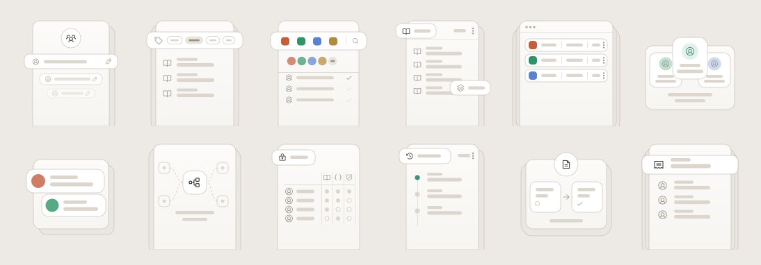
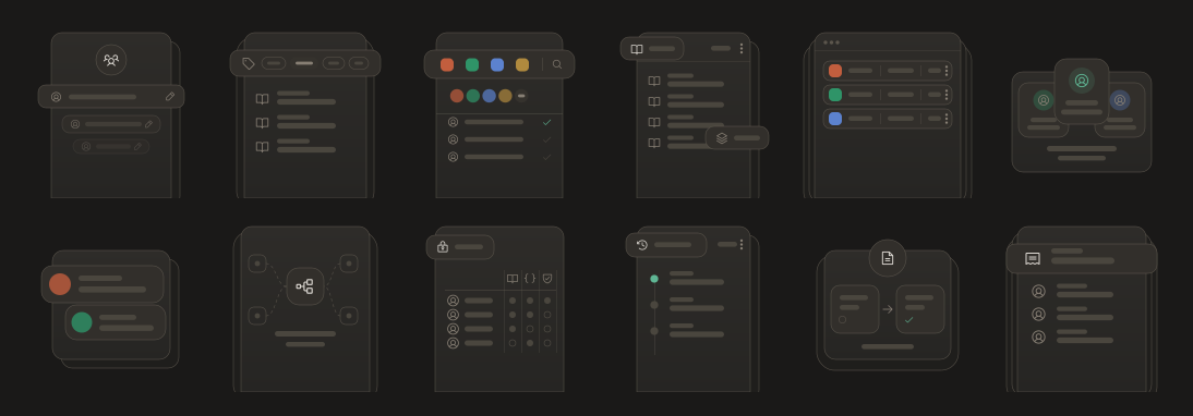
Twelve features, twelve layouts, one set of rules —
and the same twelve files in both themes, from twelve CSS variables.
What it does
You say:
Create an illustration for API version management.
You get a concept, a metaphor, and a production-ready SVG that looks like it
belongs to everything else you've made.
These aren't marketing illustrations. They're abstractions of an interface —
what a feature looks like if you keep its most recognisable parts and throw away
the other 90%.
Abstract the interface, not the idea.
A good one makes someone think "I understand what this feature does." Never
"that's a screenshot of the product."
Install
git clone https://github.com/Devesh-Shirsath/spotkit.git \
  ~/.claude/skills/spotkit
Restart Claude Code and just ask. The skill picks itself up whenever you mention
feature illustrations, spot illustrations, empty states, or an illustration set
for a product.
No dependencies. Python 3 only, and only if you want to regenerate.
Try it without installing
Open examples/gallery.html in a browser — twelve
illustrations, light and dark, from the same twelve files.
Why SVG and not an image model
This style is pure geometry: hairline strokes, exact radii, repeated placeholder
bars, one icon family. Diffusion models are weak at all of it, and weakest at the
thing that matters most — twenty illustrations that look like one family.
Claude writes the SVG directly instead. The output is exact, themeable, editable,
diffable, and identical in treatment across a whole set. A prompt-based fallback
is included if you want it anyway.
How it works
your feature description
      ↓
what does it actually do?
      ↓
what relationship is it about?      grouping · connecting · gating
      ↓                             packaging · reviewing · sequencing
2–5 UI primitives that carry it
      ↓
a layout — chosen from the prompt, not from habit
      ↓
SVG, themed by CSS custom properties
      ↓
a quality checklist
Twelve layouts
Picked by meaning and by how many elements the idea needs — never by rotation.
| Layout | Reads as |
|---|---|
| Header + rows | many of one thing |
| Cascade | a group, receding |
| Tab bar | one option chosen from several |
| Toolbar | tools and the people using them |
| Corner chips | a thing with parts attached |
| Window | a real surface, more off-screen |
| Fanned | a set with one chosen |
| Notifications | events arriving |
| Constellation | systems converging |
| Matrix | who can do what |
| Timeline | sequence, newest first |
| Split | moving through stages |
They come from independent choices — where the floating element sits, what it is,
how content is arranged, how the panel is framed — so the real space is much
larger than twelve.
Monotony is the failure mode of this style. A set where every piece is
"header card, then rows" reads as one image twelve times, however clean each one
is. The skill budgets layout reuse, caps full-width headers at two per twelve,
and checks each illustration against its neighbours.
Theming
Twelve CSS custom properties. One file serves light and dark — never ship two.
:root {
  --il-canvas:  #EDEAE6;   --il-ghost:   #EAE7E2;   --il-panel: #F7F5F2;
  --il-surface: #FFFFFF;   --il-line:    #B9B1A4;   /* every stroke, width 0.5 */
  --il-stroke:  #35322D;   --il-fill:    #DCD6CE;   --il-accent: #3E9077;
}
Change three values, rerun build.py, the whole set rethemes.
Inline the SVG to theme it. CSS custom properties don't cross into
<img src="…">or<object>— those show the fallback palette forever and
never follow dark mode. If you must use<img>, use the pre-flattened files inexamples/flat/.
If several illustrations share a page, suffix every id in each
(fade-teams → fade-teams-1) or their masks and filters cross-apply.
Using these in Figma
Copy the contents of any file in examples/flat/light/
and paste onto a Figma canvas — you get editable vector layers. Use the flat
files, not the themed ones; Figma doesn't run CSS either, so a themed file pastes
as black shapes.
Figma discards SVG filters on import, so the drop shadow won't come across —
re-apply it as a Figma effect on the one floating layer.
Regenerate
python3 build.py       # rewrites examples/ and the gallery
python3 flatten.py     # rewrites the flat exports and contact sheets
Every constant lives in the GEO dict at the top of build.py. Change one and
all twelve move together — which is the operation you'll want most, and the one
that's most error-prone by hand.
What's in the box
SKILL.md                  entry point and workflow
references/
  metaphor.md             feature → concept, ~24 worked SaaS examples
  archetypes.md           the twelve layouts and the choices behind them
  primitives.md           verified geometry + copy-paste SVG library
  theme.md                tokens, light/dark, accent rules
  scaling.md              96px icon through 720px hero
  screenshots.md          abstracting a real product screenshot
  sets.md                 producing and extending a family
  checklist.md            pre-delivery quality gate
  image-prompt.md         fallback path for image models
assets/illustration.css   drop-in token definitions
examples/                 twelve illustrations, flat exports, contact sheet
build.py · flatten.py     generators — every constant in one place
icons.py                  embedded Phosphor geometry
Known limitations
Worth stating rather than having you discover:
- The metaphor test isn't enforced. The checklist says cover the icon — can
a stranger still describe the relationship? Nothing forces a run to apply it.
In testing, two prompts in ten produced illustrations that lean on their icon
to be legible. - One style preset. The dial system — elevation, edge treatment, overhang,
corner language, stroke weight, icon style, palette, density — is documented,
but only one combination ships. A second is additive; nothing in the method
changes. - The 0.5 stroke has a floor. Below roughly 96px display width it drops under
half a device pixel and antialiases away. At those sizes, drop the hairlines
and let fills carry the composition. - Figma import loses shadows. See above.
Who it's for
Product and UX designers, frontend developers, SaaS founders, design system and
docs teams — anyone who needs feature illustrations, empty-state graphics or a
coherent illustration family for a whole product, and doesn't want to draw twenty
of them by hand.
Author
Spotkit was built by Devesh Shirsath, a product
designer working on developer tools and API documentation.
Portfolio ·
LinkedIn ·
GitHub ·
Instagram
Credits
Icons are Phosphor (MIT), regular weight — filled
paths on a 256 grid, so fill them rather than stroking.
The shipped style was derived by measuring a real production illustration family,
rebuilding it from first principles, and verifying by rendering and comparison.
Aesthetic direction was informed by contemporary bento-grid layouts. Your own
direction can differ on every visual dial — the method is what transfers.
MIT licensed. Contributions welcome, especially new layouts and new style presets.
Yorumlar (0)
Yorum birakmak icin giris yap.
Yorum birakSonuc bulunamadi