fossui
Health Gecti
- License — License: MIT
- Description — Repository has a description
- Active repo — Last push 0 days ago
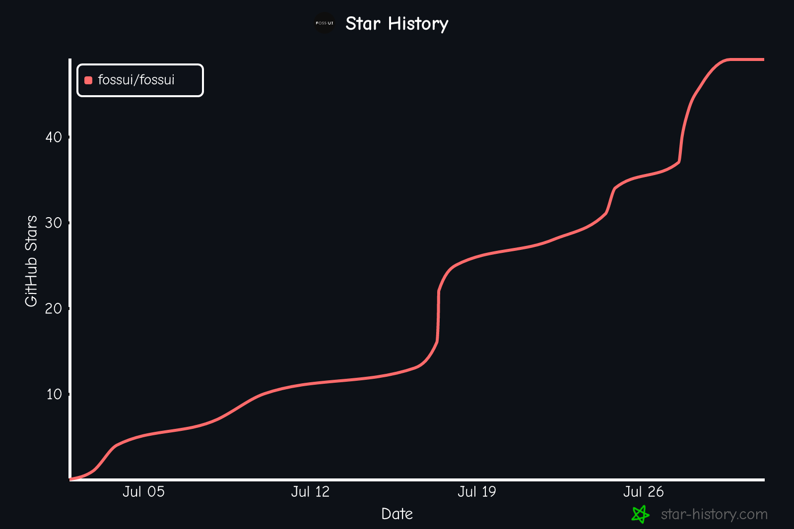
- Community trust — 49 GitHub stars
Code Gecti
- Code scan — Scanned 12 files during light audit, no dangerous patterns found
Permissions Gecti
- Permissions — No dangerous permissions requested
Bu listing icin henuz AI raporu yok.
The Fresh, Minimal Flutter UI kit. Inspired by coss.com/ui, Cal.com's design system.
The Fresh, Minimal Flutter UI kit.
Themed from one source. Inspired by coss.com/ui, Cal.com's design system.



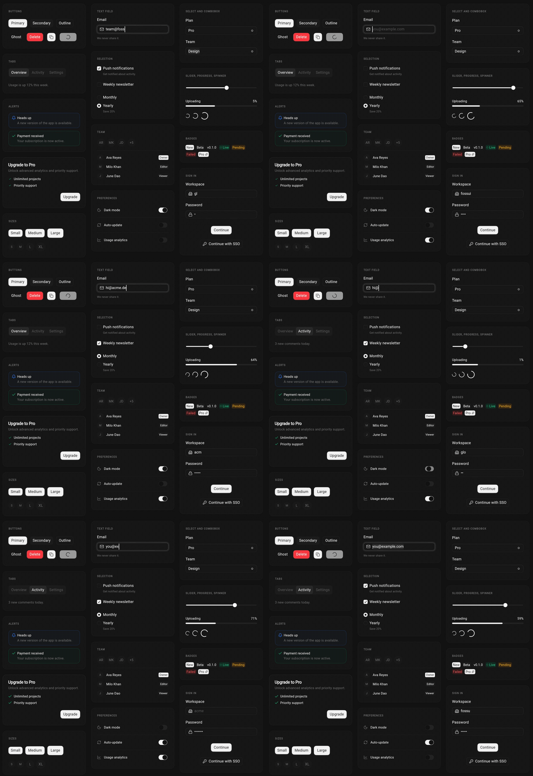
fossui is a set of 30+ components for developers tired of every Flutter app
looking like Material. It drops into any app (MaterialApp, CupertinoApp, or a
bare WidgetsApp) and reads its own theme first, not replacing yours. The look
comes from coss.com/ui, Cal.com's design system: clean,
neutral, superellipse corners. One import, one theme, light and dark out of the
box.
[!IMPORTANT]
Unofficial and independent. Not affiliated with or endorsed by Cal.com, Inc.
or coss.com. See NOTICE for attribution.
Why fossui
- A look that isn't Material. A neutral, understated aesthetic with
superellipse corners, drawn from the coss/Cal.com design language. - Framework-agnostic. Built on
package:flutter/widgets.dart, with no
platform channels and noFossAppwrapper. The widgets work under any app
shell. - Reads your theme, not the other way around. Components resolve
context.fossThemebefore falling back to Material, so they keep their look
inside an existing app. - Themed from one source. A single
FossThemeDataholds every semantic
token: color, type, radius, spacing, shadow, motion. Reskin the whole app,
light and dark, in one call. - Light on dependencies. One runtime dependency and no bundled icon package.
A worst-case app that imports nearly every component adds about 384 KB: roughly
310 KB of Dart code, which tree-shakes down to what you actually use, plus the
Geist font (74 KB installed, ~35 KB over the wire). Pass your own icons through
plainWidgetslots. - Preview-rich docs. Every component's API doc renders a live light and dark
preview, not just text, and the same preview shows on hover in your IDE. Each
one states plainly what it does and does not do. - Accessible by default. Semantics, focus, and touch targets are built into
each component.
Install
dependencies:
  fossui: ^0.1.1
Or from the command line:
flutter pub add fossui
Browse the package on pub.dev/packages/fossui.
Quick start
Register the theme once, then use the widgets anywhere.
import 'package:flutter/material.dart';
import 'package:fossui/fossui.dart';

void main() => runApp(
      MaterialApp(
        theme: FossThemeData.light.toThemeData(),
        darkTheme: FossThemeData.dark.toThemeData(),
        home: Scaffold(
          body: Center(
            child: FossButton(
              onPressed: () {},
              child: const Text('Get started'),
            ),
          ),
        ),
      ),
    );
No wrapper lock-in. FossTheme drops into any app, and context.fossTheme
resolves identically under MaterialApp, CupertinoApp, or a bareWidgetsApp.
See example/ for a runnable app.
Theming
The defaults give fossui its look, but nothing is locked. Read tokens through
one accessor:
final theme = context.fossTheme;
final color = theme.colors.primary;
final radius = theme.radii.md;
To reskin the app, layer a FossThemeSpec over a base theme. Every field is
optional, and anything you leave unset keeps the default.
MaterialApp(
  theme: FossThemeData.light.retheme(
    const FossThemeSpec(primary: Color(0xFF16A34A), radius: 22),
  ).toThemeData(),
  darkTheme: FossThemeData.dark.retheme(
    const FossThemeSpec(primary: Color(0xFF51F0A8), radius: 22),
  ).toThemeData(),
);
Components
The library covers input, feedback, overlays, and layout:
| Group | Components |
|---|---|
| Actions and input | Button, TextField, NumberField, OtpField, Select, Combobox, Checkbox, Radio, Switch, Toggle, ToggleGroup, Slider, DatePicker |
| Feedback | Alert, Badge, Meter, Progress, Skeleton, Spinner, Toast, Tooltip |
| Overlays | Dialog, Drawer (sheet and bottom sheet), Popover |
| Layout and media | Accordion, Card, Tabs, Separator, Text, Calendar, Avatar |
See the components roadmap
for what is shipped and what is planned, and the
component checklist
for the bar each one clears.
Icons
Icon slots accept a plain Widget, so any icon set works: Lucide, Material
Icons, Cupertino, SVGs, or your own. The package pulls in no icon dependency of
its own. Examples and docs use Lucide
as the documented companion.
Platforms
With no platform channels, fossui runs anywhere Flutter does: Android, iOS, web,
macOS, Windows, and Linux are all supported.
AI-native
fossui runs an MCP server so your AI coding assistant writes fossui code against
the real component API instead of guessing prop names and enum values. It works
with any MCP client (Claude Code, Cursor, VS Code, and more) over one endpoint:
https://mcp.fossui.org
Per-client setup and the full tool list are in the
AI-native docs.
Blog
- Introducing fossui: a minimal Flutter UI kit
- Migrating from Material to fossui
- Minimal Flutter UI kits compared: fossui vs Material (2026)
More at fossui.org/blogs.
Ecosystem
- Documentation: fossui.org
- Blog: fossui.org/blogs
- Live gallery: play.fossui.org
- AI-native (MCP): fossui.org/docs/ai-native
- Package: pub.dev/packages/fossui
Development
This package pins its Flutter SDK with fvm:
fvm install          # uses .fvmrc (Flutter 3.41.9)
fvm flutter pub get
fvm flutter test
The test suite runs on every change and holds full line coverage; browse the
live report at coverage.fossui.org.
Contributions are welcome. Start with CONTRIBUTING.md and the
Code of Conduct.
Acknowledgements
The look and component API are drawn from coss.com/ui, the
Cal.com design system, with ideas from Base UI
and shadcn/ui. Full attribution is in
NOTICE.
Support
If fossui is useful to you, two clicks go a long way:
- ⭐ Star fossui on GitHub
- 👍 Like fossui on pub.dev
- ✉️ Questions or feedback: [email protected]
Star History
Yorumlar (0)
Yorum birakmak icin giris yap.
Yorum birakSonuc bulunamadi