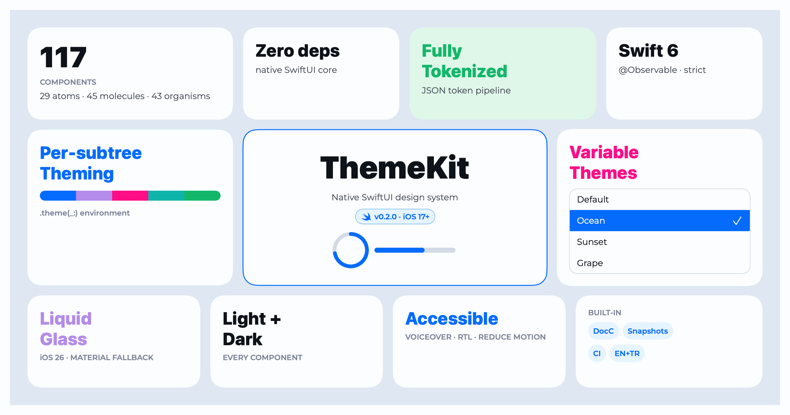
ThemeKit
Health Warn
- License — License: MIT
- Description — Repository has a description
- Active repo — Last push 0 days ago
- Low visibility — Only 5 GitHub stars
Code Pass
- Code scan — Scanned 12 files during light audit, no dangerous patterns found
Permissions Pass
- Permissions — No dangerous permissions requested
No AI report is available for this listing yet.
Theme-driven, brand-neutral SwiftUI design system — re-skin your whole app from one accent color. 130+ token-bound components, zero-dependency core.
ThemeKit
Native, brand-neutral SwiftUI design system — 117 token-bound components that
re-skin from a single accent color: light/dark, per-subtree, zero core dependencies.

Docs · API (DocC) · Wiki · npm (MCP) · Releases · Issues · Changelog
The banner above is rendered by ThemeKit itself (its own tokens + components) — the same render pipeline that paints every tile in the gallery.
A theme-driven, brand-neutral SwiftUI component library. Every color,
typography, spacing, radius and shadow is a design token resolved at runtime
from the active Theme, so the whole UI re-skins from a single accent color —
without touching component code. Components never hardcode a color — swap the
theme and everything follows.
import ThemeKit
Features
- 🎨 Figma → SwiftUI — the MCP's
design_to_code(aliasfigma_to_swiftui) turns a Figma node into
token-matched, verified-API ThemeKit code with a mapping report (see the
Advanced — Figma → SwiftUI & MCP section). - 🪄 Design Mode — point ThemeKit at a free-form
design.md(or a bundled style
— Linear, Notion, iOS, Brutalist, Pastel) and it re-skins every component to
match, via an offline heuristic parser (+ an optional LLM path). - 🤖 AI-native — a 24-tool MCP server, a Claude Code Agent skill, and an
llms.txt, so agents generate correct, token-bound UI — all from one source. - 🧩 Design tokens everywhere — colors / radius / spacing from JSON, typography /
shadows in code; one semantic name (fg-hero,rd-sm), different values per theme. - 🌈 33 theme presets — ThemeKit's Default plus 32 ready-made color sets
(cupcake, dracula, cyberpunk, nord…) inspired by daisyUI, each recoloring the
whole Ant-style palette on device. - 📸 Snapshot + render testing — every component renders to a theme-aware PNG via
ImageRenderer; the suite guards tokens, themes, validation and renders. - 117 components — Atoms / Molecules / Organisms, all token-bound.
- Runtime theming — a Swift token generator + a live configurator turn any
accent (orbase-100) color into a full Ant-style palette on device (no Python,
no baked files). - Validation — pure, testable predicates + a SwiftUI presentation layer.
- Accessibility — Dynamic Type and Reduce Motion honored throughout.
- Localization — English-default strings via a bundled String Catalog (with
Turkish), every default still overridable. - Zero-dependency core — Lottie is an opt-in, separate product.
- DocC catalog, a demo app, and a test suite.
Requirements
| Platforms | iOS 17+ · macOS 14+ |
| Swift tools | 6.2 |
| Dependencies | none (core) · lottie-ios 4.4.0+ (only the Lottie add-on) |
Installation
Swift Package Manager. In Xcode: File ▸ Add Package Dependencies… and enter
the repository URL, or add it to your Package.swift:
dependencies: [
    .package(url: "https://github.com/isamercan/ThemeKit.git", from: "0.3.0"),
],
targets: [
    .target(
        name: "MyApp",
        dependencies: [
            .product(name: "ThemeKit", package: "ThemeKit"),
            // Optional — only if you need Lottie-backed animations:
            // .product(name: "ThemeKitLottie", package: "ThemeKit"),
        ]
    ),
]
Products
| Product | Dependencies | Use |
|---|---|---|
ThemeKit |
none | the full design system (core) |
ThemeKitLottie |
lottie-ios |
adds Lottie (After Effects / JSON) animation views; pulls Lottie only if imported |
Quick start
Install the theme once at the root, then build with token-bound views:
@main
struct MyApp: App {
init() { Theme.shared.applyPersistedConfig() } // restore last-used theme (optional)
var body: some Scene {
WindowGroup {
ContentView().themeKit() // inject + repaint on theme change
}
}
}
struct ContentView: View {
@ThemeContext private var theme
var body: some View {
VStack(spacing: theme.spacing(.md)) {
Text("Welcome").textStyle(.headingBase)
PrimaryButton("Get started") { await signIn() }
}
.padding(theme.spacing(.base))
.background(theme.background(.bgElevatorPrimary))
.cornerRadius(.base)
.themeShadow(.elevated)
}
}
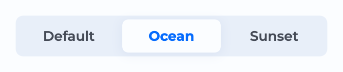
Theme.shared.loadTheme(named: "oceanTheme") // runtime switch
Per-subtree theming
Theming isn't just a global switch — any Theme can be injected into a single
subtree with .theme(_:), and every component inside re-skins to it. NoTheme.shared mutation, no global state; the rest of the app keeps its theme.
let ocean = Theme(); ocean.loadTheme(named: "oceanTheme")
let grape = Theme(); grape.applyGenerated(primaryHex: "#7C3AED")   // generated on-device

HStack {
    BookingCard(...)                 // app theme
    BookingCard(...).theme(ocean)    // ocean — this subtree only
    BookingCard(...).theme(grape)    // grape — this subtree only
}
The same components, four injected themes, one screen — brand colors follow the
injected theme while semantic colors (info, success…) stay consistent:
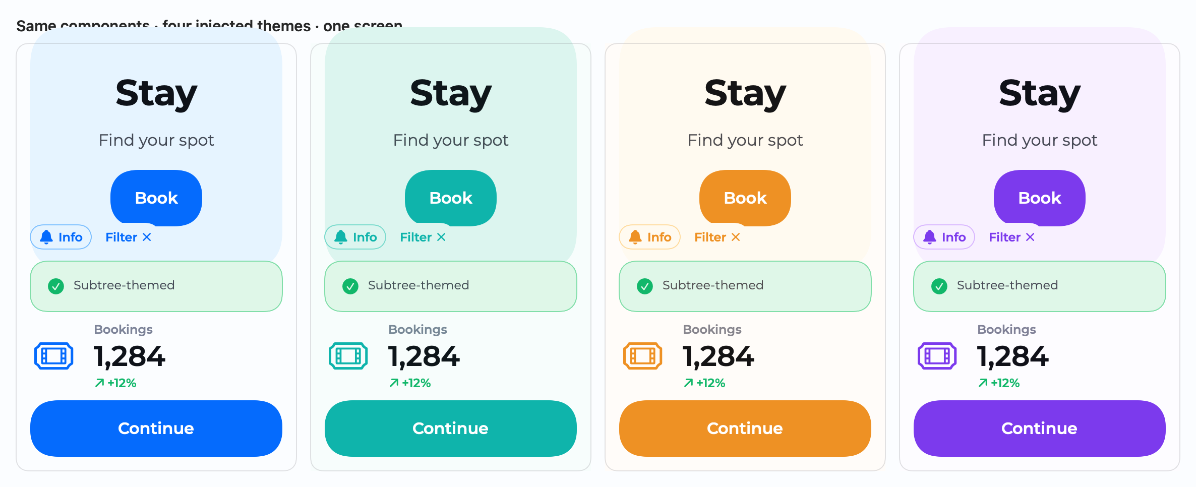
Every component reads @Environment(\.theme) (default Theme.shared), so this is
additive and backward-compatible. Try it live in the gallery's Theme Injection page.
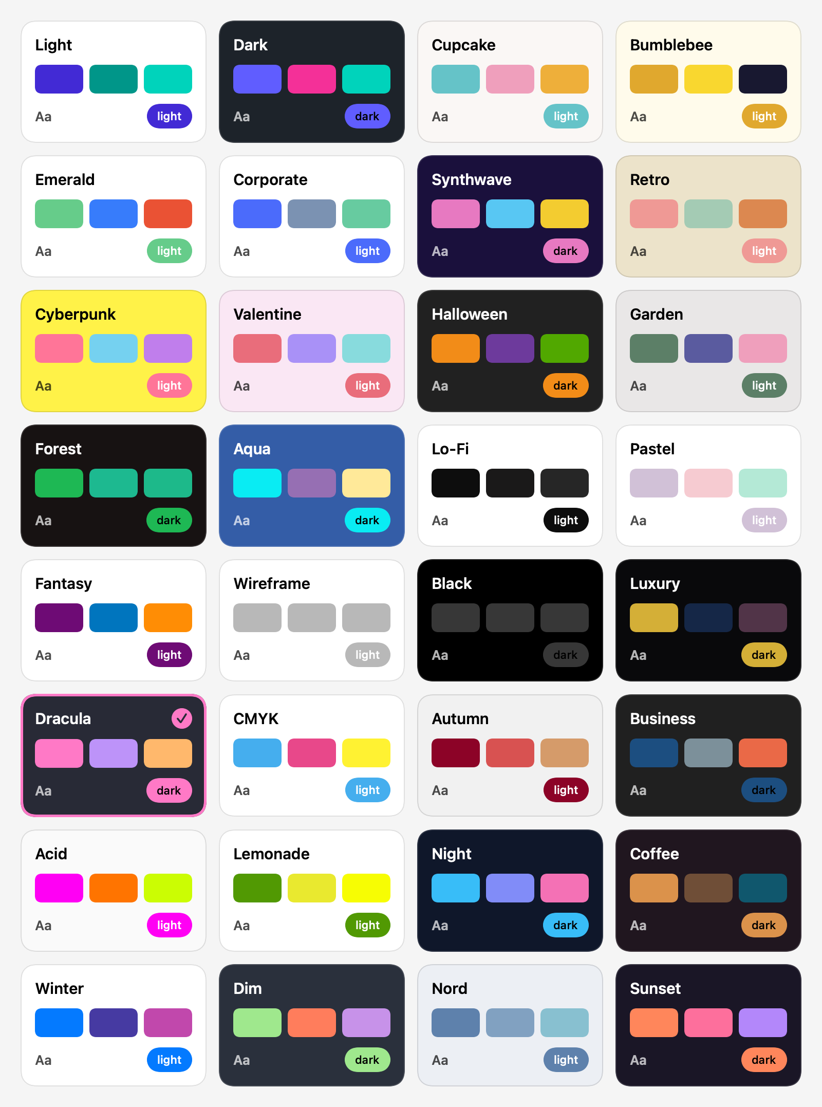
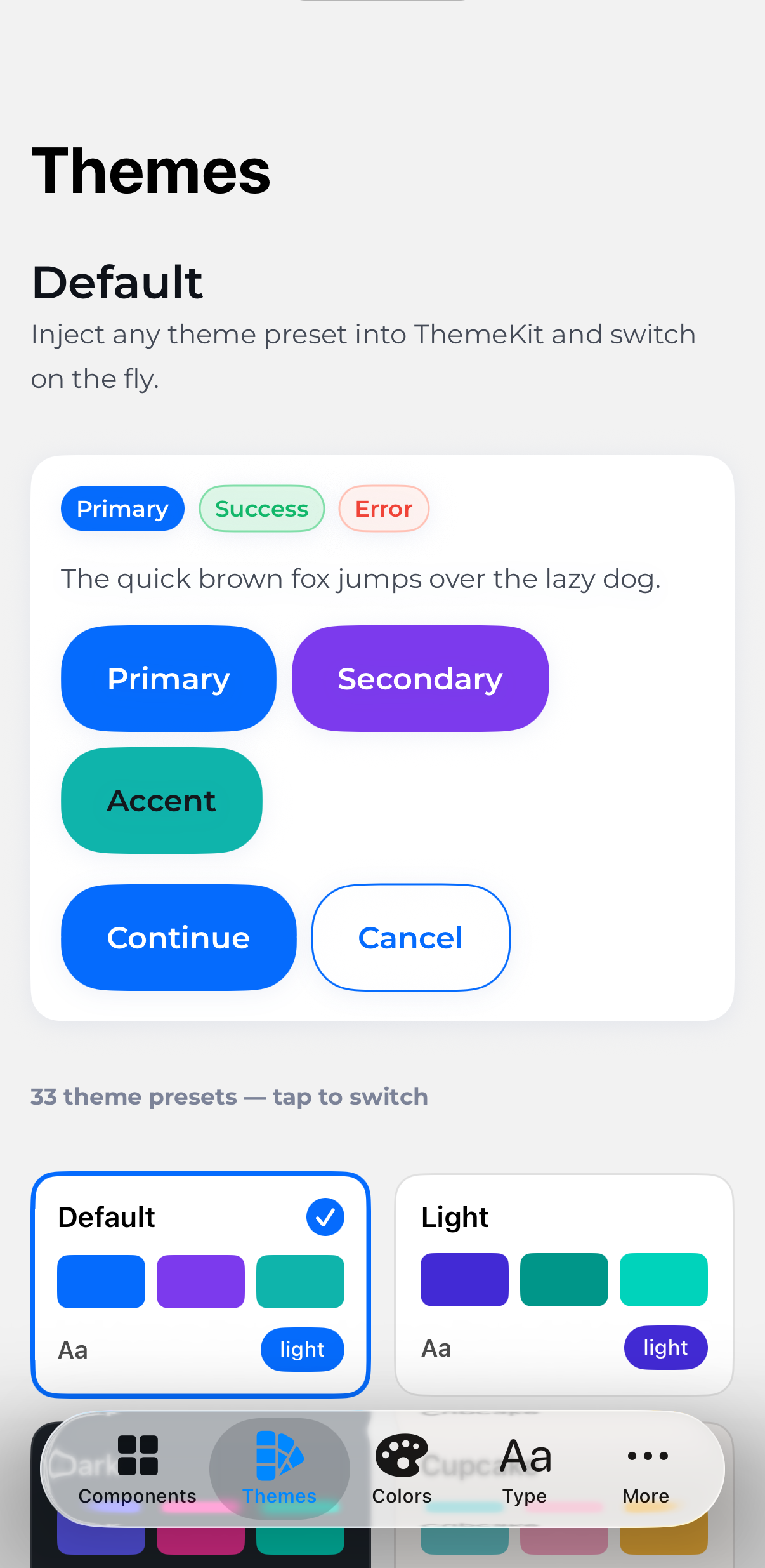
Theme presets
ThemeKit ships 33 ready-made theme presets — its Default plus 32 color sets
inspired by daisyUI (cupcake, dracula, cyberpunk, synthwave, nord, coffee…). Each is aThemePreset recipe: its accent recolors the whole Ant-style palette and itsbase-100 becomes the surface tone, so every theme keeps its signature look —
cupcake stays cream, cyberpunk yellow, dracula slate. The same components,
four injected themes:
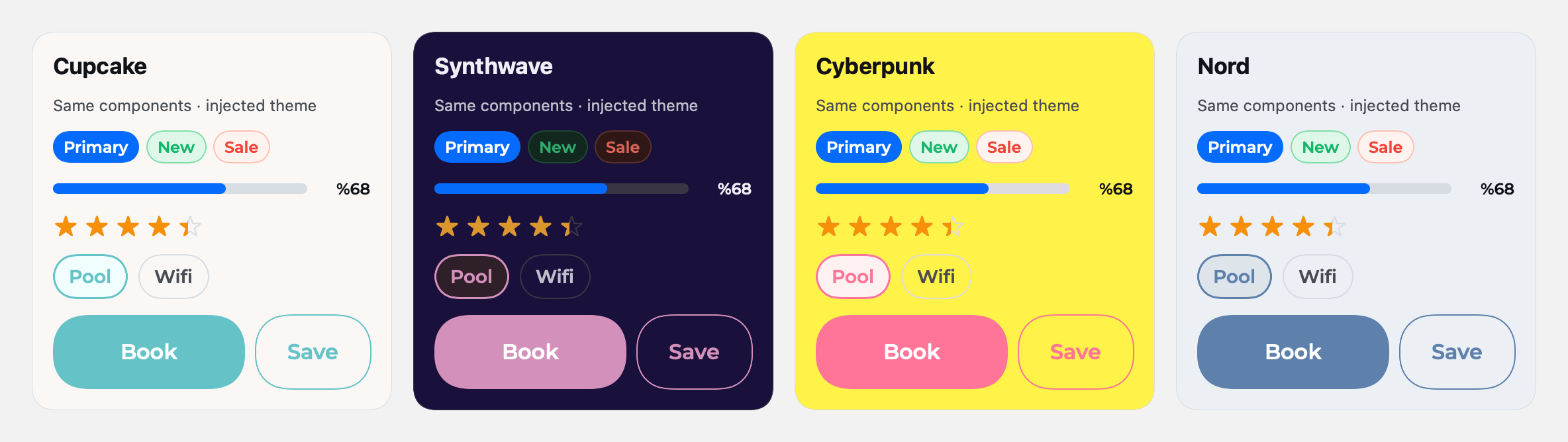
Apply one live, or drop the bundled ThemePicker into any screen for a
theme switcher (it's the demo app's Themes tab):
ThemePreset.named("dracula")?.apply()        // recolors Theme.shared on the fly

@State private var active: String? = "cupcake"
ThemePicker(selection: $active)             // a tappable grid of all 33 themes
Screenshots
The demo app on device — the component catalog, live theming, the design-token
gallery, and a full booking flow built entirely from ThemeKit components.
 Component catalog |
 Live theming · 33 presets |
 Design-token gallery |
 Theme Generator |
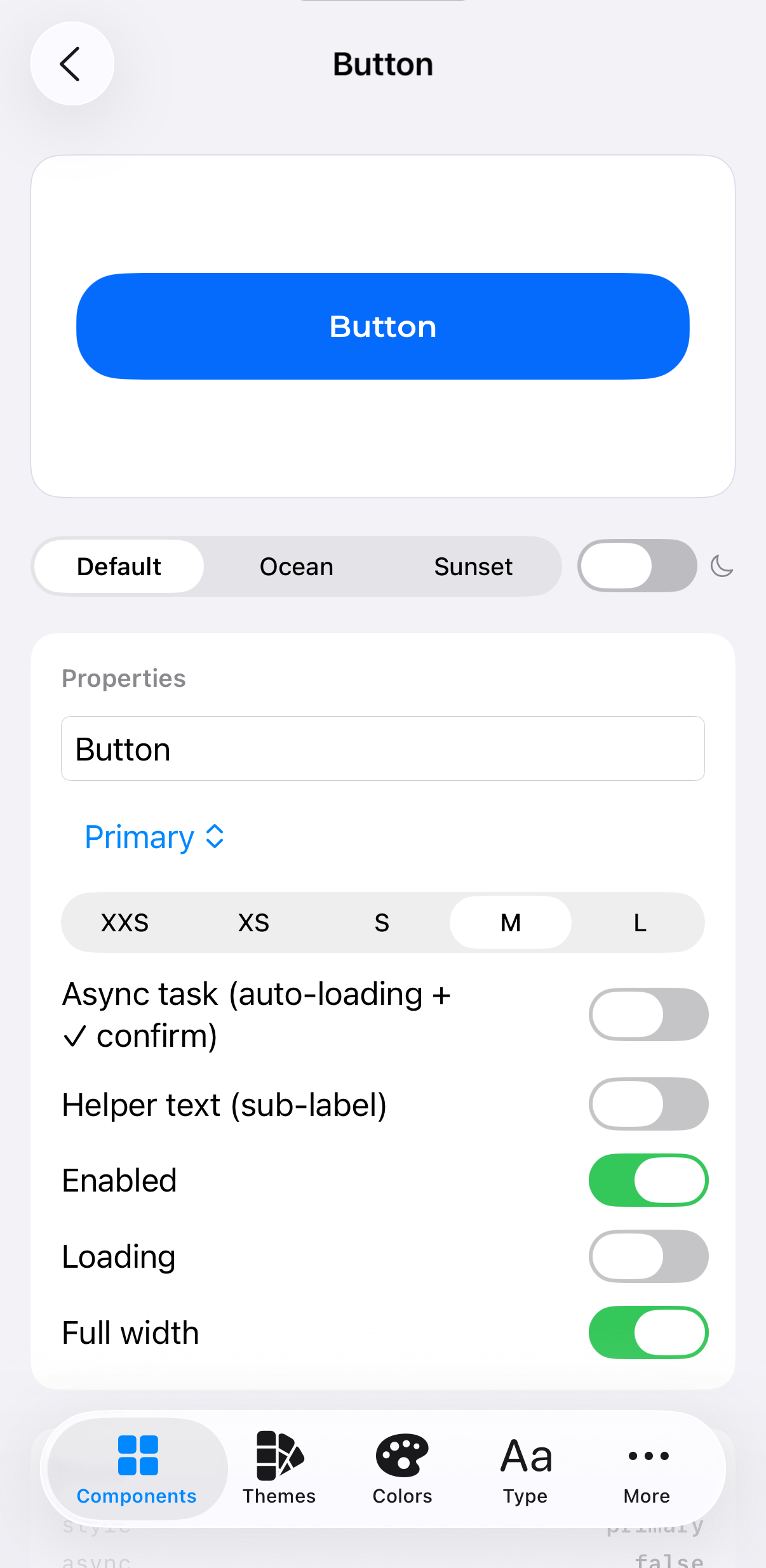 Button · variants |
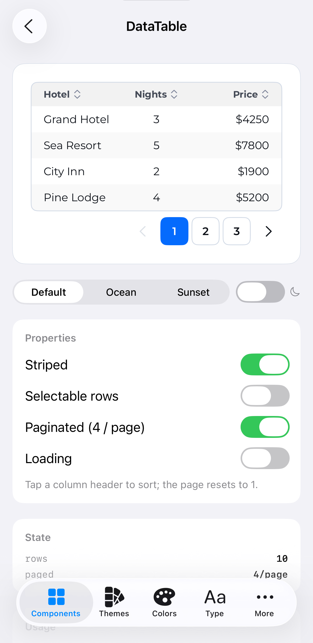 DataTable · sort/paginate |
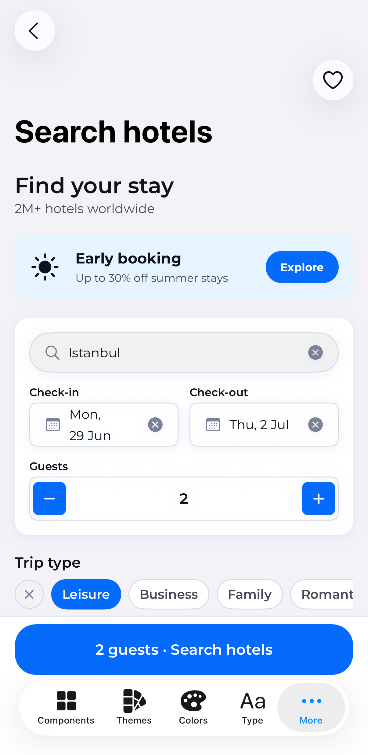 Example · search |
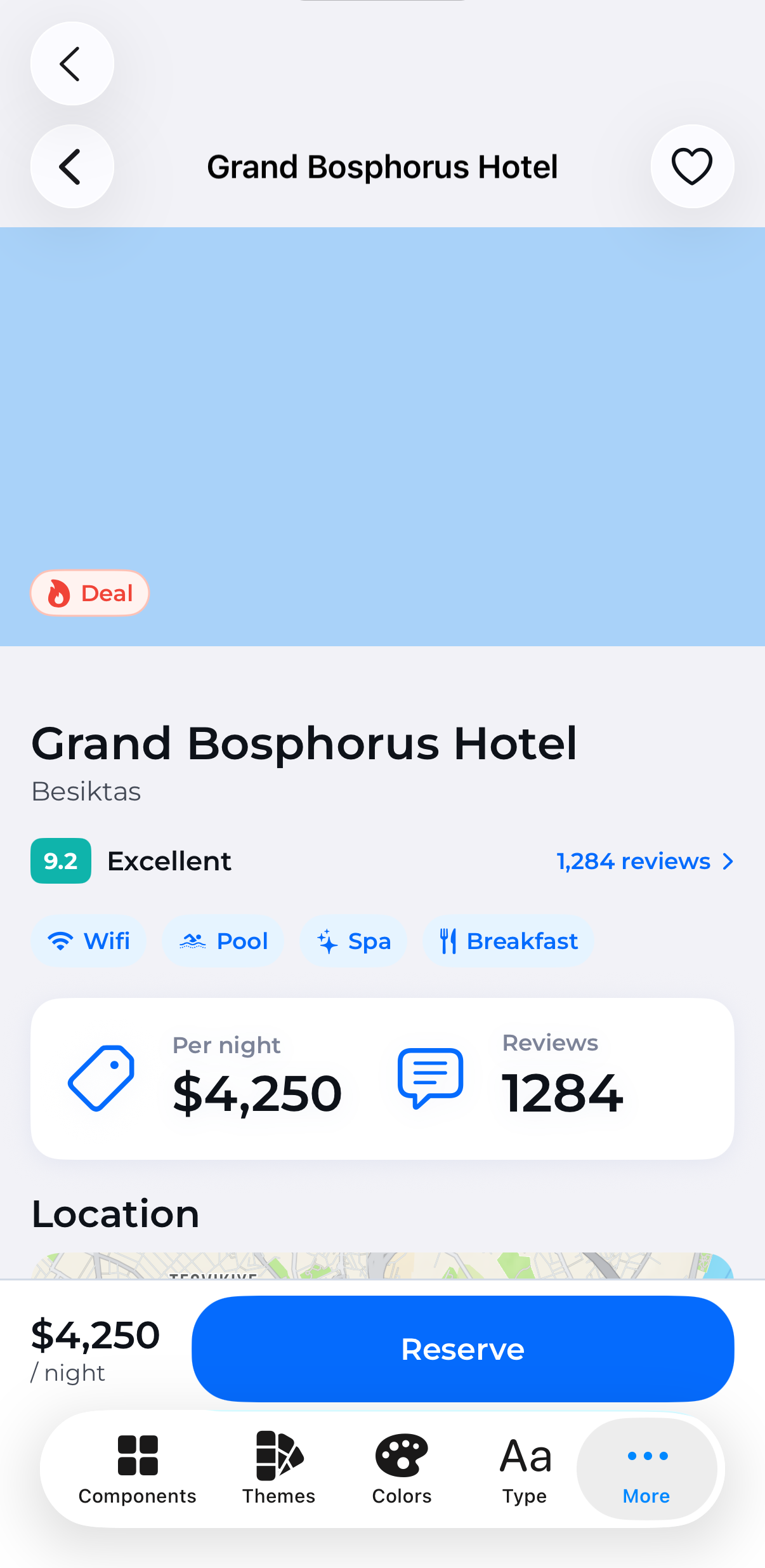 Example · detail |
Real screens from the bundled Demo app, not mockups — every pixel is
a ThemeKit component reading live design tokens.
Components
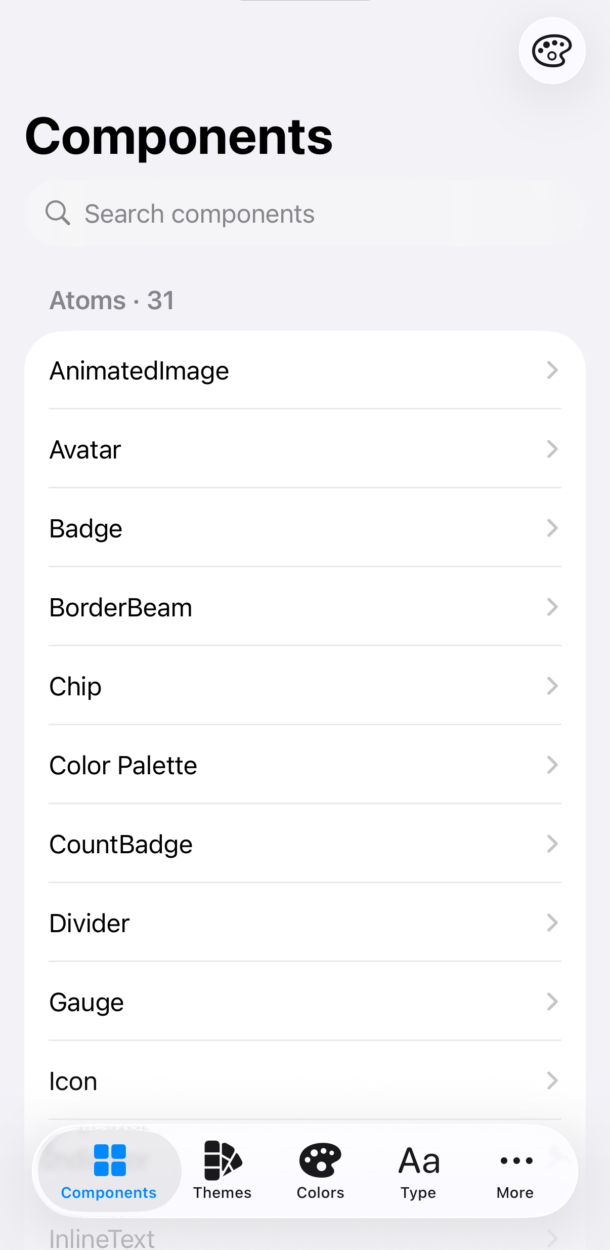
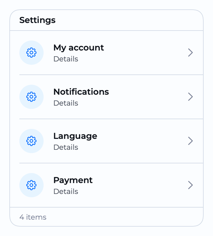
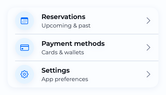
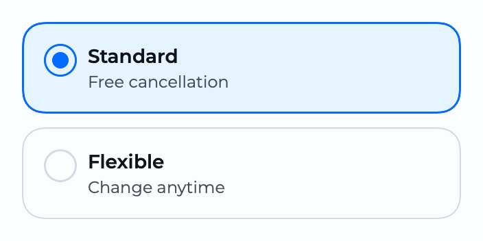
117 token-bound components, grouped by complexity:
- Atoms (29) —
Badge,Chip,Avatar,Icon,Rating,Spinner,StatusDot,Skeleton,ProgressBar,BorderBeam,RollingNumber… - Molecules (45) —
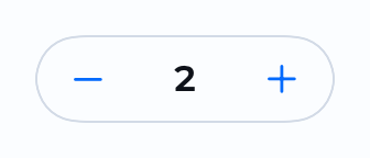
TextInput,OTPInput,Select,Checkbox,RadioGroup,Slider,RangeSlider,SearchBar,Tooltip, buttons… - Organisms (43) —
Card,Carousel,DataTable,Accordion,Steps,Timeline,ResultView,Upload,Tour,NavigationBar,ThemePicker…
Every component is curated by category in the DocC catalog.
Component gallery
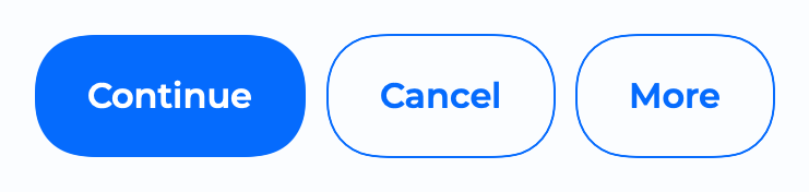
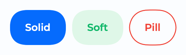
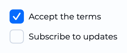
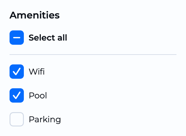
Rendered straight from the library via ImageRenderer (plain <img> so they render everywhere, including the GitHub mobile app) —
regenerate with make screenshots. Interactive overlays (Dialog, Drawer, Tour,
BottomSheet…) and media components are best seen live in the Demo app.
Atoms
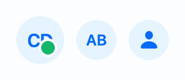 Avatar |
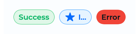 Badge |
 Chip |
 CountBadge |
 Divider |
 Icon |
 Indicator |
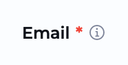 InputLabel |
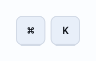 Kbd |
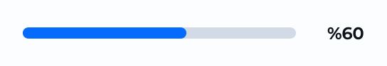 ProgressBar |
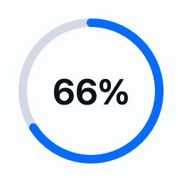 RadialProgress |
 Rating |
 RollingNumber |
 ScoreBadge |
 Skeleton |
 Spinner |
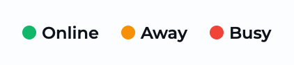 StatusDot |
 Swap |
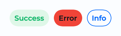 Tag |
 TextLink |
 Title |
 InlineText |
 BorderBeam |
 Join |
 Mask |
 TextRotate |
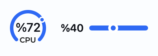 Gauge |
 ShareButton |
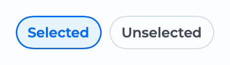
Molecules
 Button |
 ThemeButton |
 Checkbox |
 CheckboxGroup |
 RadioButton |
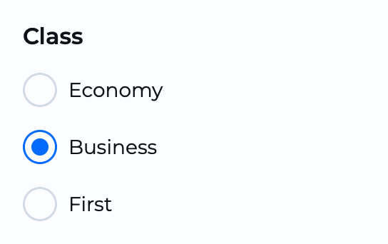 RadioGroup |
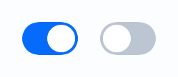
 ToggleGroup |
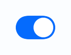
 ThemeToggle |
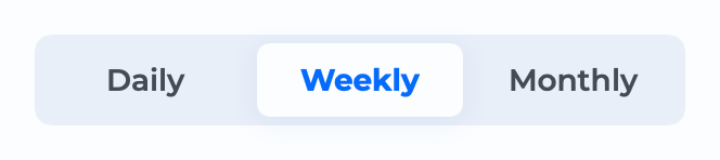 SegmentedControl |
 QuantityStepper |
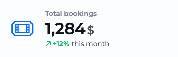 Stat |
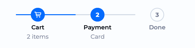 Steps |
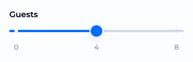 Slider |
 Breadcrumbs |
 TextInput |
 FileInput |
 Pagination |
 Fieldset |
 DateField |
 Select |
 MultiSelect |
 TreeSelect |
 Autocomplete |
 SearchBar |
 OTPInput |
 InputNumber |
 RangeSlider |
 MultiLineTextInput |
 Tooltip |
 Chips |
 FilterGroup |
 ProgressIndicator |
 ThemeController |
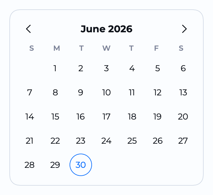 Calendar |
 ColorField |
Organisms
 Accordion |
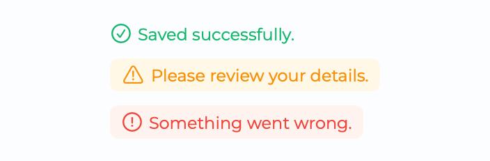
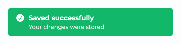 AlertToast |
 Callout |
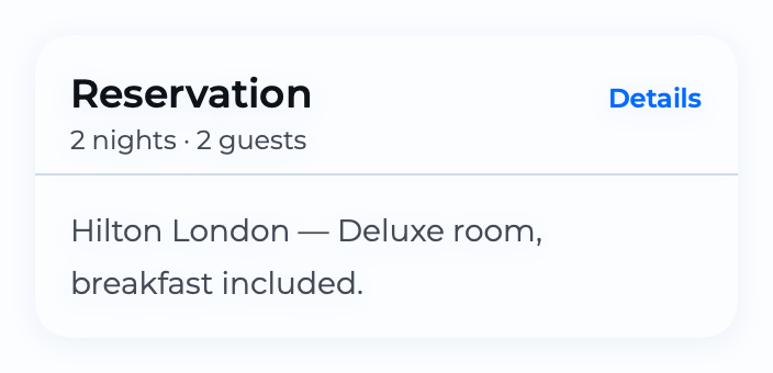 Card |
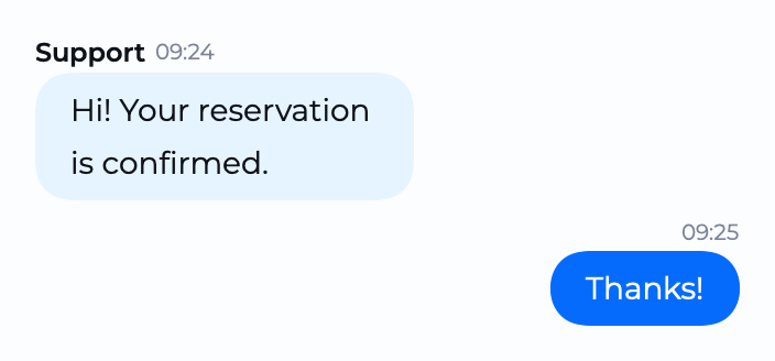 ChatBubble |
 Counter |
 Coupon |
 EmptyState |
 InfoBanner |
 KeyValueTable |
 ListRow |
 NotificationCard |
 PageHeader |
 RatingSummary |
 ResultView |
 SegmentedTabBar |
 Timeline |
 Upload |
 PromoBanner |
 ListView |
 MenuCard |
 NavigationBar |
 FAB |
 Hero |
 SelectionCards |
 CardStack |
 Gallery |
 Footer |
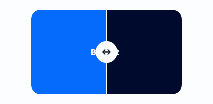 Diff |
Overlays (animated)
Entrance previews rendered from the live components. SelectBox, BottomSheet, Tour and Feedback use OS-owned presentations (native Menu / .sheet) that no offscreen renderer can capture — record them from the running app with make record-gif NAME=SelectBox (boots the simulator, you tap to open the dropdown; see docs/SCREENSHOTS.md).
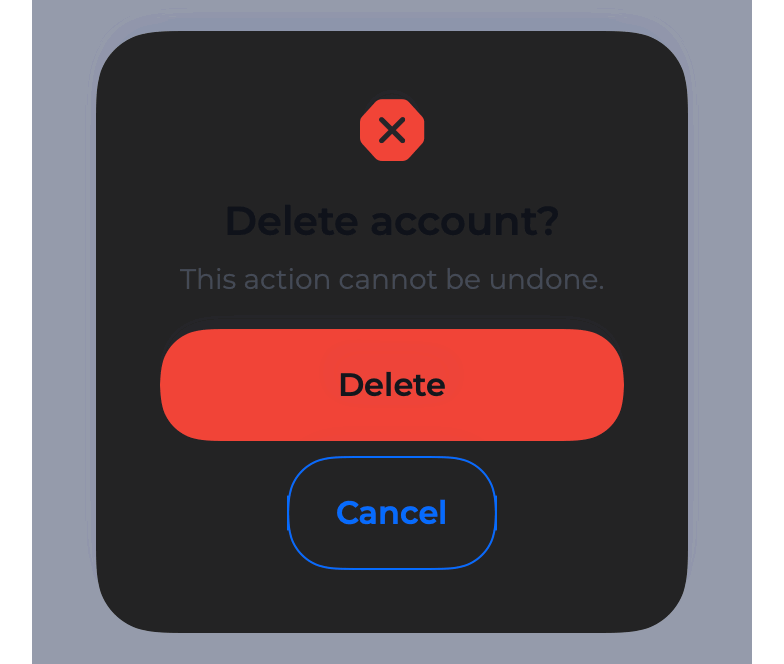 Dialog |
 Drawer |
 Popconfirm |
 AlertToast |
 Tooltip |
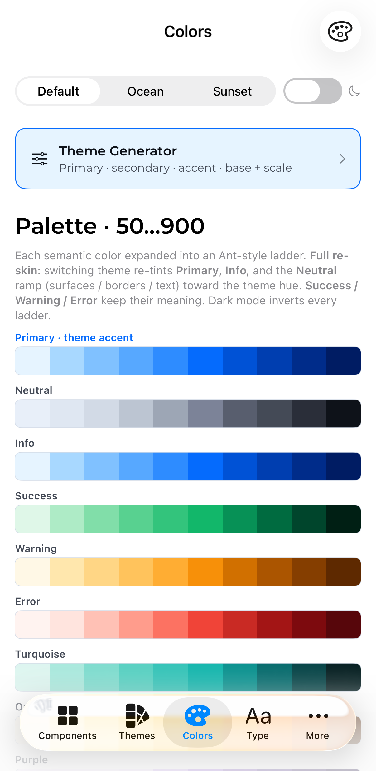
Token system
Sources/ThemeKit/
├─ Theme/              # Theme.shared, tokens, generator, configurator API
│  ├─ Theme.swift                 # ObservableObject singleton (Theme.shared)
│  ├─ ColorTokens.generated.swift # Foreground/Background/Border/Text color keys
│  ├─ ThemeModel.swift            # RadiusKey / SpacingKey
│  ├─ Typography.swift            # TextStyle ramp (Montserrat, Dynamic Type)
│  ├─ Shadows.swift               # ShadowStyle + .themeShadow()
│  ├─ SemanticColor.swift         # named palette colors
│  ├─ ThemeGenerator.swift        # runtime palette generator (Swift port)
│  ├─ ThemeConfig.swift           # Codable theme recipe
│  ├─ ThemeKit.swift         # .themeKit() root modifier
│  ├─ ThemeContext.swift          # @ThemeContext property wrapper
│  └─ ThemedHostingController.swift
├─ Components/         # Atoms / Molecules / Organisms (all token-bound)
├─ Validation/         # Validators / ValidationRule / Validator / InfoMessage
├─ Accessibility/      # Reduce Motion + Dynamic Type helpers
├─ Extensions/         # Color(hex:), AspectRatio, Motion, Grid
├─ Utils/              # Haptics, Impression, Localization bridge
├─ Documentation.docc/ # DocC catalog
└─ Resources/
   ├─ *.json                  # defaultTheme / oceanTheme / sunsetTheme (+ Dark)
   ├─ Localizable.xcstrings    # String Catalog (en source + tr)
   └─ Fonts/Montserrat.ttf     # bundled, registered at runtime
Token groups
| Group | Source of truth | Keys |
|---|---|---|
| Colors | Resources/*.json |
Theme.ForegroundColorKey · BackgroundColorKey · BorderColorKey · TextColorKey |
| Radius | Resources/*.json |
Theme.RadiusKey (rd-xs…rd-4xl) |
| Spacing | Resources/*.json |
Theme.SpacingKey (sp-xs…sp-4xl) |
| Typography | code (Typography.swift) |
TextStyle — Display / Heading / Label / Body / Overline / Link |
| Shadows | code (Shadows.swift) |
ShadowStyle — elevated / tabBar / soft |
Colors / radius / spacing vary per theme (JSON). Typography & shadows are
structural and constant across themes.
Themes
default (blue) · ocean (turquoise) · sunset (orange) — each with a Dark
variant. Token names are semantic; only the values differ per theme. Add a
theme by dropping a <name>Theme.json into Resources/.
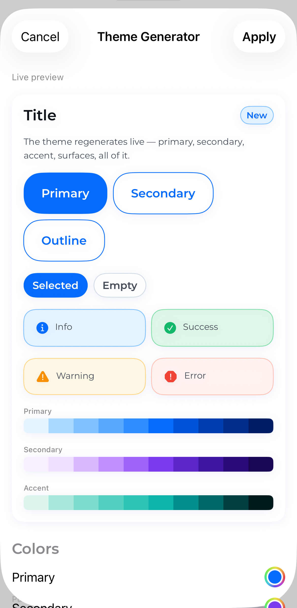
Theming your app (Configurator export)
The library ships a runtime token generator (ThemeGenerator, a Swift port oftools/gen_tokens.py): from a handful of inputs it regenerates the whole palette,
neutral ramp, surfaces, borders, text, and radius / spacing / font / shadow ramps
— on device, no Python and no baked palette files.
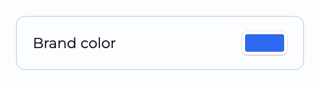
The Demo's Theme Configurator (Colors tab) lets you dial in an accent color +
tint + scale knobs + font + dark and exports a ThemeConfig recipe. To apply one:
// a) one-liner (paste the configurator's "Apply (Swift)" export)
Theme.shared.applyGenerated(primaryHex: "ff0d87", tint: 0.13, radiusScale: 1.0, font: "Montserrat")

// b) ship the Codable recipe as a resource (the configurator's `theme.json`)
let cfg = try ThemeConfig(jsonData: Data(contentsOf: themeJSONURL))
Theme.shared.apply(cfg)
Theme.shared.persistConfig()                            // remember across launches

// c) generator-free: bundle the pre-baked token JSON ("Copy full token JSON")
Theme.shared.setTheme(jsonData: Data(contentsOf: tokensURL))
ThemeConfig is Codable / Sendable / Equatable — persist it, sync it, A/B it.
How live theming works
Components resolve tokens from the Theme.shared singleton (no per-call
environment lookups), so SwiftUI can't infer that an arbitrary view depends on the
theme. .themeKit() closes that gap: it injects Theme into the environment
and (by default) rebuilds the subtree keyed on Theme.revision when the theme
changes, so every view re-reads the regenerated tokens.
- Switching theme from a settings screen → keep the default
(reactToRuntimeChanges: true); the whole UI repaints. - Editing the theme in-session (a live editor/inspector) → use
.themeKit(reactToRuntimeChanges: false)so the editor isn't torn down,
and scope.id(Theme.shared.revision)onto just the live-preview subtree.
Per-subtree theming (\.theme)
Components also read the theme from the \.theme environment value, which
defaults to Theme.shared (so unthemed components never crash). Inject a
different Theme instance to re-theme a branch — a second brand in one screen, or
a pinned theme in a preview/snapshot — without mutating global state:
SomeComponent()
    .theme(brandBTheme)        // this subtree only
This is migrating in: pilot components (Card, Tag) read \.theme today; the
rest still read Theme.shared directly and are moving over incrementally.
Fonts
Montserrat is bundled. System / SystemRounded / SystemSerif / SystemMono
need nothing. Any other family must be registered by the host app (add the .ttf +UIAppFonts), then pass its PostScript family name as font:.
Accessibility
- Dynamic Type — the type ramp scales with the user's preferred text size:
eachTextStyleanchors to a semanticFont.TextStyleviarelativeTo:. At the
default size nothing changes; it only grows/shrinks when the user opts in. Clamp
per-screen if needed:MyScreen().dynamicTypeSize(...DynamicTypeSize.accessibility2). - Reduce Motion — decorative/continuous animation is suppressed while
functional motion is kept:BorderBeam,Skeleton,RollingNumber,StatusDot,Carouselautoplay, the OTP caret all calm down;Spinnerkeeps spinning.
No caller configuration is required — components read the environment directly.
Validation
A pure logic layer (no SwiftUI, no theme) plus a separate presentation layer:
let messages = Validator.validate(email, [.required(), .email()])   // [InfoMessage]
InfoMessageList(messages)                                            // SwiftUI rendering
Feed your own logic — a custom predicate, a regex, a typed Regex, or an async
(server-side) check:
.regex("^[a-z]+$", caseInsensitive: true, "letters only")
ValidationRule("only AAA") { $0 == "AAA" }
let unique = AsyncValidationRule("Username taken") { await api.isAvailable($0) }
FormValidator ties fields, rules, focus and messages together for a whole form.
Localization
User-facing default strings (validation messages, placeholders, accessibility
labels…) come from a bundled String Catalog (Resources/Localizable.xcstrings).
The source language is English; a Turkish translation ships too, and
consumers can add their own.
Every such string is also overridable via API parameters — e.g.ValidationRule.required("Custom message") — so the catalog only supplies the
default.
Note: a plain
swift buildcopies.xcstringsverbatim (the SwiftPM CLI
doesn't run the catalog compiler), so only English resolves there. Xcode /xcodebuildcompile it, so all bundled localizations resolve in real apps.
⭐ Advanced — Figma → SwiftUI & MCP
ThemeKit is built for the AI-assisted workflow — so generated UI uses the right
component + modifier and resolves colors from tokens, never hardcoded values. One
source (make skill) feeds three surfaces, so they can't drift from the code:
| Surface | What it does | How to use it |
|---|---|---|
MCP server (mcp/) |
24 on-demand tools — get_component_api, get_design_tokens, search_components, validate_code, a11y_audit, compose_screen, diff_theme, render_preview, theme_preview, scaffold_screen, design_to_code (alias figma_to_swiftui)… — the agent pulls focused, verified context while it codes. |
claude mcp add themekit -- npx -y @isamercan/themekit-mcp (or from the repo: cd mcp && npm i && npm run build). Works in any MCP editor — Cursor, Windsurf, Claude Code. |
Agent skill (skills/themekit/) |
A Claude Code skill: idioms + patterns, every component's init & modifiers, the theme presets — generates correct ThemeKit code. | /plugin marketplace add isamercan/ThemeKit → /plugin install themekit@themekit, or copy skills/themekit/ into .claude/skills/ (zero-install). |
llms.txt |
Structured LLM context about every component, modifier and theme — the llms.txt standard, at the repo root. | Point any llms.txt-aware editor (Cursor, Windsurf, Copilot…) at llms.txt. |
Then just ask: "Build a sign-up screen. Use the ThemeKit skill." Works with
Claude Code, Cursor, Windsurf, GitHub Copilot, and any tool that supports MCP
or llms.txt.
Figma → SwiftUI
The star tool, design_to_code (alias figma_to_swiftui), turns a Figma node into ThemeKit SwiftUI with
verified APIs instead of guesses: it snaps fills / spacing / radius to design
tokens, maps nodes to components (config-driven via figma-mapping.json, then
heuristics), and returns the code plus a mapping report. Unmapped nodes are
flagged — never silently dropped.
Card {
    VStack(spacing: Theme.SpacingKey.md.value) {
        Badge("Sale").badgeStyle(.error)
        PrimaryButton("Continue") { }
        // ⚠️ unmapped: Mystery Widget (INSTANCE)
    }
}
// 3/4 nodes mapped · fill #f04438 → fg-error (ΔE 0.0) · itemSpacing 16 → sp-md
Set FIGMA_TOKEN in the MCP server's env — it's optional, only this tool needs
it; every other tool works without it. See mcp/README.md for the
full tool list and the figma-mapping.json schema.
Triggering it — paste a Figma link and ask the agent; it pulls fileKey +nodeId straight from the URL (the URL's node-id=25795-9030 becomes 25795:9030):
Use the themekit MCP. Convert this Figma node to ThemeKit SwiftUI:
https://www.figma.com/design/<FILE_KEY>/App?node-id=<NODE-ID>
Or name the tool explicitly so the agent picks it directly (handy when several MCP
servers are configured):
Connect the themekit MCP and call design_to_code with this url:
https://www.figma.com/design/<FILE_KEY>/App?node-id=<NODE-ID>
Point it at a single screen/frame — it treats a Figma component INSTANCE as an
opaque leaf and won't expand a board of nested instances (see mcp/README.md).
Documentation
📖 Live docs: isamercan.github.io/ThemeKit — the documentation site (guides, component gallery, theming, MCP & DESIGN.md), published from main on every push. The full DocC API reference lives at /api/documentation/themekit.
📚 Wiki — installation, FAQ, troubleshooting, versioning, and contributing guides.
A DocC catalog ships with the package
(Sources/ThemeKit/Documentation.docc). Build it locally in Xcode via
Product ▸ Build Documentation (⌃⌘D), or from the command line:
xcodebuild docbuild -scheme ThemeKit -destination 'generic/platform=iOS'
It curates every component by category and includes guide articles for
Theming, Accessibility, and Validation. No extra dependency required.
Demo
Demo/ — a SwiftUI app (local package reference) with Components (gallery),
Themes (the ThemePicker + a live preview), Colors (token gallery
- live Theme Configurator), Type, Layout (spacing / radius / shadow
tokens), and Example (a full flow built from the real components), plus a
light/dark switcher.
Adding / updating tokens
Colors are generated to keep JSON ↔ Swift in sync:
- Update the token maps in
tools/gen_tokens.py. - Re-run:
python3 tools/gen_tokens.py .(regeneratesResources/*.json+ColorTokens.generated.swift).
Radius / spacing live in Resources/*.json (+ the RadiusKey / SpacingKey
enums); typography / shadows in Typography.swift / Shadows.swift.
Testing
swift test
The suite covers the token generator, theme integrity across every bundled theme,
validation, localization, accessibility mapping, and component render smoke tests.
Roadmap
- Per-subtree
\.thememigration — pilot components (Card,Tag) read\.themetoday; the rest are moving over incrementally so any subtree can be
re-themed without touchingTheme.shared. - API stabilization toward
1.0— the public API is still in0.x; a minor
release may include breaking changes until then (see the Versions & Releases wiki).
Shipped: the package is public (MIT), the MCP server is on npm
(@isamercan/themekit-mcp), the Claude Code plugin is installable
(/plugin marketplace add isamercan/ThemeKit), and the DocC docs are live.
Contributing
make ci            # format-lint + lint + build + test (the full gate)
swift test         # the test suite
make screenshots   # re-render component PNGs + rebuild the README gallery
make skill         # regenerate the MCP data, the Agent skill, and llms.txt
Colors are generated — edit tools/gen_tokens.py, then python3 tools/gen_tokens.py .
(see Adding / updating tokens). Keep the build and tests
green; the pre-push hook runs the same gates.
License
MIT © 2026 İsa Mercan. Free for commercial and private use — keep the
copyright notice; the software is provided without warranty.
Acknowledgements
- Theme presets — the 32 built-in color sets are inspired by daisyUI.
- Palette ramps — follow an Ant Design-style tonal scale.
- Montserrat — the bundled type family (SIL Open Font License).
- Lottie (
lottie-ios) — powers the optionalThemeKitLottieadd-on.
Reviews (0)
Sign in to leave a review.
Leave a reviewNo results found