liquefy-ui
Health Uyari
- License — License: MIT
- Description — Repository has a description
- Active repo — Last push 0 days ago
- Low visibility — Only 6 GitHub stars
Code Uyari
- fs module — File system access in .github/workflows/release.yml
Permissions Gecti
- Permissions — No dangerous permissions requested
Bu listing icin henuz AI raporu yok.
Liquid Glass UI components for React — real WebGL edge refraction, jelly springs, and accessible Base UI primitives. TypeScript, RSC-ready, shadcn registry, MCP server.

A TypeScript UI library that delivers highly transparent Liquid Glass through WebGL optics, physical springs, and accessible React primitives.
This is an independent open-source project and is not affiliated with Apple Inc. It references public design principles while providing an original implementation for the web.
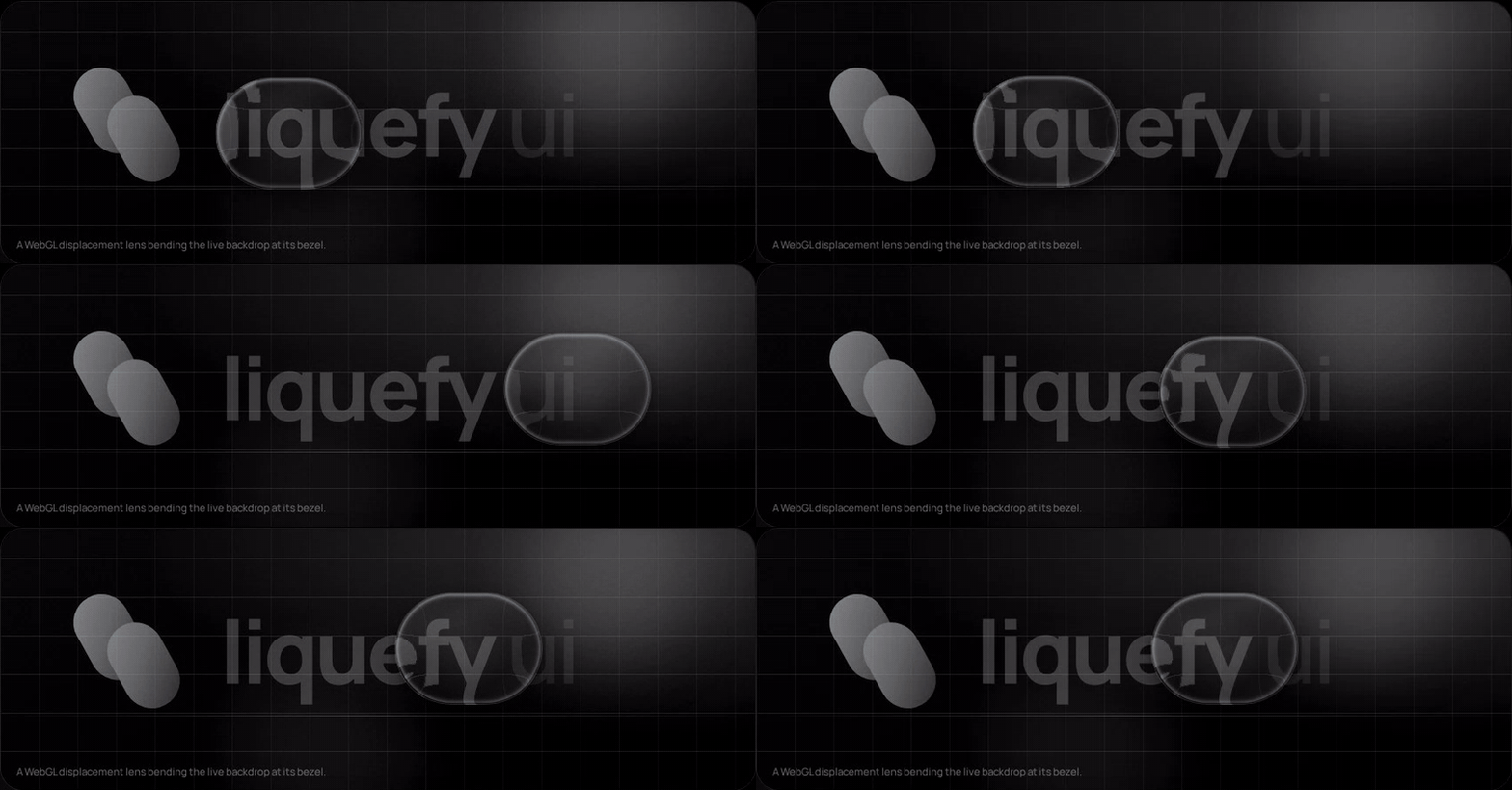
The capture above comes from the live playground: that is a displacement map
applied to the real backdrop through backdrop-filter, while the shape stretches
and overshoots from springs reading pointer velocity. Both are on by default.
Scroll it yourself at liquefy-ui.com, which also hosts the
component reference and the shadcn registry.
Packages
| Package | Purpose |
|---|---|
@liquefy-ui/react |
React components, themes, and provider |
@liquefy-ui/core |
Dependency-free WebGL, springs, and motion |
@liquefy-ui/icons |
Tree-shakeable React SVG icons |
@liquefy-ui/mcp |
MCP server that answers component questions from the real API |
Quick start
pnpm add @liquefy-ui/react @liquefy-ui/core @liquefy-ui/icons
import { LiquefyProvider, LiquidButton } from '@liquefy-ui/react'
import { SparklesIcon } from '@liquefy-ui/icons'
import '@liquefy-ui/react/styles.css'

export function App() {
  return (
    <LiquefyProvider>
      <LiquidButton iconBefore={<SparklesIcon />}>
        Create magic
      </LiquidButton>
    </LiquefyProvider>
  )
}
Next.js and React Server Components
Every component needs state, refs or the WebGL lens, so the whole package sits on
the client side of an RSC boundary. The published bundles carry a 'use client'
directive, so importing them straight into a server component works — no wrapper
file needed. Only event handlers have to move: a function cannot cross from a
server component into a client one, so anything with onClick or local state
belongs in its own 'use client' component.
apps/next-example is a working Next.js 16 App Router app whose page is a server
component, and its build runs in CI. If the client boundary ever regresses, that
build fails rather than yours.
Tailwind CSS v4
Import tailwind.css instead of styles.css, before Tailwind itself:
@import '@liquefy-ui/react/tailwind.css';
@import 'tailwindcss';
That declares the cascade layer order — so className="rounded-full" on aLiquidButton actually wins — and bridges the --lq-* tokens into Tailwind's
theme as bg-liquid-accent, text-liquid-muted, rounded-liquid,shadow-liquid, ease-liquid and friends. The bridge uses @theme inline, which
is what keeps those utilities resolving per-theme at use time.
For coding agents
| What | Where |
|---|---|
| MCP server | claude mcp add liquefy-ui -- npx -y @liquefy-ui/mcp — eight tools answering from the real exports, no network, no dependencies |
llms.txt |
/llms.txt and /llms-full.txt, generated from source |
| One page per component | /llms/liquid-button.md, plus icons.md, core.md and mcp.md — plain Markdown, because the docs site is a hash-routed SPA that a fetcher without JavaScript cannot read |
| shadcn registry | npx shadcn@latest add @liquefy-ui/liquid-button — the namespace is in shadcn's registry directory, so it needs no components.json entry |
The MCP tools are get_conventions, list_components, get_component,search_components, get_component_source, get_tokens, list_icons andget_core_api. The catalog behind them is generated from source at build time, and
lists only names the package entry point re-exports — so an agent is never told to
import something that does not resolve.
The registry copies real component source into your project rather than a
re-export, with imports rewritten to @/components/ui, @/lib and @/hooks. The
copied tree keeps @liquefy-ui/core and @base-ui/react from npm but not@liquefy-ui/react, so a copied LiquefyProvider never ends up competing with the
packaged one. Every copied file is written with its own 'use client' directive, so an
RSC app needs no follow-up edit.
Documentation
Everything is on liquefy-ui.com:
| Route | Contents |
|---|---|
#/ |
The playground first, then framework and agent-tooling compatibility, then component samples |
#/playground |
Every LiquefyProvider prop as a live control, applied to the whole site |
#/components |
Index of every component, each with live demos and a full prop table |
#/docs |
Introduction, installation, provider, theming, the styles prop, motion |
#/docs/frameworks · #/docs/tailwind · #/docs/ai-tooling |
Integration |
#/docs/accessibility · #/docs/performance · #/docs/troubleshooting |
Practices |
Old #/guides/* links redirect to their #/docs/* equivalents.
Style overrides: the styles prop
Every component takes a styles prop for one-off overrides, so reaching for a
stylesheet is optional. It is a superset of style:
<LiquidButton
  styles={{
    color: 'accent',            // colour words resolve to var(--lq-accent)
    p: 3,                       // spacing keys count --lq-space units
    w: { base: '100%', md: 240 }, // responsive, per breakpoint
    boxShadow: '$shadow',       // $token → var(--lq-token), anywhere in a string
    _hover: { bg: '$glass-soft' },
    _dark: { opacity: 0.92 },
    '&:has(svg)': { gap: 2 },   // raw selectors start with &, at-rules with @
  }}
>
  Create magic
</LiquidButton>
| Feature | Notes |
|---|---|
| CSS properties | Every camelCase property, plus --custom-properties. Numbers become px, matching style. |
| Spacing shorthands | p, px, py, pt/pr/pb/pl, and the m equivalents. Numbers count --lq-space units (4px by default, set spacing on the provider). gap and friends use the same scale. |
| Other shorthands | w, h, size, minW/maxW/minH/maxH, bg, radius. radius drives --lq-radius, so the press-squish keeps animating the corners. |
| Tokens | $name anywhere in a string resolves to var(--lq-name). Colour properties also accept the bare words accent, tint, foreground, muted, placeholder, text, line. |
| Responsive | { base, sm, md, lg, xl }, ordered ascending no matter how you write it. Override the widths with breakpoints on LiquefyProvider. |
| States | _hover, _focus, _focusVisible, _active, _disabled, _checked, _selected, _expanded, _open, _invalid, _readOnly, _placeholder, _first, _last, _odd, _even, and _dark / _light (which cover both the explicit theme and theme="system"). |
Static values ride the style attribute, so the common case adds no stylesheet
and no hydration concerns. As soon as a state or breakpoint appears, the whole
object moves into a generated class instead — otherwise the inline declarations
would outrank the very rules meant to override them. That class is inserted
unlayered, and the component stylesheet lives in @layer liquefy-ui, so
overrides win on cascade order rather than on !important or specificity.
Precedence is styles over the component's own custom properties, and style
over everything — style stays the last-resort escape hatch.
transform and backdrop-filter are written inline by the jelly springs every
frame and cannot be overridden through styles; development builds warn if you
try. Wrap the component and style the wrapper instead.
Building your own component on the same system:
import { useLiquidStyles, type LiquidStyleProps } from '@liquefy-ui/react'

export const Panel = ({ className, style, styles, ...props }: LiquidStyleProps & JSX.IntrinsicElements['div']) => {
  const root = useLiquidStyles('my-panel', { className, style, styles })
  return <div className={root.className} style={root.style} {...props} />
}
Server rendering: useInsertionEffect does not run on the server, so flush the
collected rules into the document head yourself with getLiquefyStyleSheet().
Static-only styles need nothing — they are already inline.
LiquefyProvider takes className and style but not styles — it owns the
config that styles reads. LiquidToastProvider takes none of the three: it
renders no root element of its own, only the toast viewport. slotStyles is reserved for per-part styling
({ header, body, footer }) and is not implemented yet.
The full version of this — every shorthand, token reference, breakpoint and state
key, plus custom components and server rendering — is at #/docs/styles-prop,
with the token system itself at #/docs/theming.
Components
35 components and 50 icons, each with live demos and a full prop table at
liquefy-ui.com/#/components.
| Category | Components |
|---|---|
| Inputs | LiquidButton, LiquidIconButton, LiquidCheckbox, LiquidRadioGroup / LiquidRadio, LiquidSwitch, LiquidSlider, LiquidTextField, LiquidTextArea, LiquidSelect, LiquidDatePicker, LiquidSegmented, LiquidRating |
| Data display | LiquidAvatar / LiquidAvatarGroup, LiquidBadge, LiquidChip, LiquidTooltip, LiquidTable family, LiquidList family, LiquidDivider |
| Feedback | LiquidAlert, LiquidProgress, LiquidSpinner, LiquidSkeleton, LiquidToastProvider / useLiquidToast, LiquidDialog |
| Surfaces | LiquidSurface, LiquidGlass, GlassCard, LiquidAccordion / LiquidAccordionItem |
| Navigation | LiquidTabs family, LiquidBreadcrumbs, LiquidPagination, LiquidMenu, LiquidDrawer, GlassDock / DockItem |
| Foundation | LiquefyProvider, useLiquefyConfig, useLiquidGlass, useLiquidStyles, getLiquefyStyleSheet, defaultBreakpoints |
When WebGL is unavailable, components automatically fall back to the transparent
CSS material. Lens, WebGL, motion, transparency and glow are on by default;
ripple, shimmer and sparkle are off, so the rim stays a neutral line unless you
turn shimmer on for colour. Use the provider props to tune them across
a subtree.
Use theme="dark", theme="light", or theme="system" on LiquefyProvider to control appearance.
Design notes
- Real edge refraction: a rounded-rect lens displacement map bends the live backdrop through an SVG
feDisplacementMapinsidebackdrop-filter. Its fold-safe curve keeps the sampled backdrop one-to-one even at control sizes. Chromium renders it fully; WebKit and Gecko gracefully fall back to the blurred CSS material. - One shared WebGL context: browsers cap live WebGL contexts (~16 per page), so every component draws through a single hidden GL canvas and blits into its own 2D canvas. Any number of glass components can coexist.
- Jelly physics: scale, skew, and tilt run on deliberately underdamped springs. Pointer velocity is injected into the springs, so fast sweeps make surfaces sway, and press/release produces several visible overshoots. The shader receives the same energy as
u_wobbleand wiggles the rim in sync. - The overlay shader renders RGB-edged rim light, iridescence, pointer glow, press ripples, and a moving sheen — only during interaction and decay, never continuously.
- Glass is intended for interaction and navigation layers rather than primary content.
- Accessibility comes from Base UI: Dialog, Drawer, Menu, Select, Tooltip, Tabs and Accordion are built on
@base-ui/react, which supplies focus trapping and restoration, scroll locking, Escape handling, roving tabindex, typeahead, and collision-aware positioning. liquefy-ui keeps the optics and the springs and stops re-implementing the parts that are easy to get subtly wrong. The keyboard behaviour is asserted inpackages/react/test/keyboard.test.tsxrather than assumed. - React and React DOM are peer dependencies, preventing duplicate React bundles.
- Motion and transparency are always on by default, independent of OS accessibility settings (macOS "Reduce Motion" / "Reduce Transparency" silently flip both media queries in every desktop browser). Toggle them per subtree with
motion={false}/transparency={false}onLiquefyProvider; apps that want to honor the OS can pass e.g.motion={!matchMedia('(prefers-reduced-motion: reduce)').matches}or use the core-levelrespectReducedMotion/respectReducedTransparencyoptions.
Contributing
Issues and pull requests are welcome. rc is the development branch — branch from
it and open the pull request back into it. CONTRIBUTING.md has
the local setup, the test suites, the CI jobs and the commit convention.
Sponsor
GitHub Sponsors funds the maintenance of this
library — the shader work, the browser matrix, and the release plumbing that keepspnpm add @liquefy-ui/react boring. Sponsorship goes to the maintainer rather than
to an organisation; there is one of us.
GitHub takes no cut, so the whole amount arrives. One-off is as welcome as monthly.
License
MIT
Yorumlar (0)
Yorum birakmak icin giris yap.
Yorum birakSonuc bulunamadi