landing-skill
Health Pass
- License — License: MIT
- Description — Repository has a description
- Active repo — Last push 0 days ago
- Community trust — 51 GitHub stars
Code Warn
- network request — Outbound network request in scripts/check-links.mjs
Permissions Pass
- Permissions — No dangerous permissions requested
No AI report is available for this listing yet.
Скилл для Claude Code: лендинги, которые не выглядят как вайб-код
landing
English | Русский | Українська | 简体中文
A Claude Code skill that keeps landing pages from looking like vibe code.
I made it after watching two videos with checklists on "why your site looks generated" and trying to simply feed those lists to the model. It did not work: ban the purple gradient and Inter, and you get a cream background with green and another fashionable grotesque. The template stays, only its generation changes.
So the skill is not built as a list of bans but as a working order: first understand what is being sold and to whom, then write the texts, then make design decisions drawn from the world of the service itself, and only then lay it out.
Before and after
The same short brief: a landing page for a cleaning company in Kyiv, with no logo, colors, photos or reviews.
Without the skill:
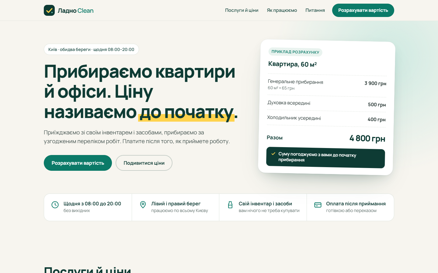
With the skill:

The first version is tidy, but if you swap the name it could be a coffee shop or a dental clinic. In the second you can see what the company does before you read the headline.
What the skill does
The work goes in seven steps:
- Brief. What is sold, who arrives, the one target action, which facts the brief provides and which it does not.
- Content before design. Texts are written before layout. Reviews, counters and client logos come only from the brief. No data, no section.
- Design decisions. Three genuinely different directions to choose from, a palette and typeface drawn from the world of the service, one memorable element.
- Structure. Sections follow the visitor's questions, not the stock "benefits, reviews, pricing" set.
- Layout. Static HTML and CSS without a build step by default, states for buttons and forms, mobile width from 360 px.
- Completeness. Favicon, link preview image, 404, privacy policy, no dead links.
- Audit. Screenshots in a browser, a separate pass over the mobile version, a check against the checklist of tells.
There is also a second mode: auditing an existing landing page, with findings ordered by priority.
Key ideas
- The swap test. Mentally replace the name with a coffee shop. If the design would fit unchanged, it is rejected. The first screen must show the service itself, and a brand motif repeats across the page.
- Three directions, and not the first. The first direction that comes to mind is almost always a template. The skill writes down three and explains why it picked one.
- Sell, do not surprise. The pick is not the most original direction but the one the buyer will believe faster.
- No invented facts. Instead of fake reviews the skill either removes the section or puts in a
[ЗАПОЛНИТЬ: …]("fill in") placeholder and lists it in the report. - A first screen that works. A "what is this and for whom" headline, the main action and something visual are all visible without scrolling.
- One action, one name. A button is named the same everywhere and says what will happen after the click.
- The ✦ sparkle is banned. It sits on every AI button and gives a page away more than any gradient.
- The checklist of tells comes last. The file
references/tells.mdis used at audit time, not as the starting brief.
How the skill came about
The skill was built after I compared landing pages made from the same brief several times, with and without it. The main conclusion: a landing page looks generated not because of a particular font or color, but because nobody made any decisions. The rules then appeared from specific misses, and SKILL.md keeps only the rules themselves. The history is here:
- A list of bans did not work. Ban the purple gradient and Inter and the next most frequent template takes their place. That is why the skill has no list of bans at the start, and the checklist
references/tells.mdis read at the end. - Detailed and short briefs. With a detailed brief I saw almost no difference between the variants; with a short one it is visible from the first screen.
- Time. By my measurements a full pass takes about twice as long as building without the skill. Hence the draft mode: steps 1 to 5 and a short look, with step 6 skipped.
- Invented facts. In my tests the model did not make up reviews even without the rule, but I kept the rule: the mistake costs more here than anything else.
- Button names. Without the "one action, one name" rule, one page ended up with three different names for the same button.
- The skill's own template. In the first versions the skill twice in a row produced the same "paper document" look (an estimate, a receipt, a printout). Hence the requirement to write down three different directions and treat the first as suspect.
- Witty versus selling. After a test on a cleaning company: a witty variant with a dark field of "tiles" came out drier and sold worse than an ordinary warm landing page made without any skill. Hence the criterion "pick what the buyer will believe".
- Recognizability. The requirement appeared when I looked at two tidy landing pages for a cleaning company and realized a coffee shop site could look exactly the same.
- The ✦ sparkle. I caught it on a "Leave a request" button in an almost finished landing page: the model took it as "the shine of cleanliness", and by meaning it even fit. But the symbol sits on every AI button and gives the page away, so the ban is unconditional.
- The first screen. The rule of three required things appeared after a variant whose first screen was only text with no button: it looked empty and lost people who were already ready to leave a request.
- Stock photos. In the first version I banned all stock photos and advised sticking to typography, and the pages came out faceless. Now there is one ban: do not pass off someone else's or generated pictures as the company's work, team, office or clients.
- The test-mode note. At first it was a red frame under every form, and in a demo it read as a breakage. Now it is one calm line next to the form.
Installation
Through the Claude Code marketplace, in two commands:
/plugin marketplace add Magerko/landing-skill
/plugin install landing@landing-skill
The plugin is invoked as /landing:landing and also triggers on its own from the task description.
Or as a plain skill, by cloning the repository:
git clone https://github.com/Magerko/landing-skill ~/.claude/skills/landing
On Windows the path is C:\Users\<name>\.claude\skills\landing. After that the skill is available in all projects and is invoked as /landing.
How to use
Just ask Claude Code to build a landing page and give it a brief; the skill kicks in by itself. You can also call it explicitly: /landing.
Example requests:
- "Build a landing page from this brief" plus the text or a file with the task.
- "Check my landing page, it looks like everyone else's."
- "I need a quick draft of a landing page": in this case the legal pages and 404 step is skipped.
If you are around, the skill first shows a concept in five to seven lines and waits for your answer. This is the cheapest moment to change something.
How I tested it
I ran two agents on the same brief: one built a landing page as usual, the second with the skill. After each comparison I corrected the skill and ran again. There were five runs on two products in total.
What came out of it:
- With a detailed brief that already fixes colors, typeface and texts there is almost no difference. The skill is needed where the executor decides.
- With a short brief the difference is visible from the first screen.
- The first version of the skill produced original but dry pages that sold worse than ordinary ones. Hence the rule "pick what the buyer will believe".
- Two tidy variants in a row did not say that this was cleaning. Hence the swap test and the mandatory illustration of the service.
- The model did not make up reviews even without the skill. I kept the facts rule as insurance.
Limitations
- Building with the skill takes about twice as long and uses one and a half to two times more tokens.
- There are few tests, one run per variant, so this is a working tool, not a proven method.
- The skill is tuned for landing pages. App interfaces need a different working order.
- The privacy policy comes out as a draft with placeholders. A lawyer should review it.
SKILL.mdandreferences/are written in Russian: they are instructions for the model, and the typography and Cyrillic rules target Russian and Ukrainian texts. The README translations do not change them.
Feedback
Found a page where the skill did badly, or a rule that gets in the way? Write in Issues. Please attach:
- the brief the landing page was built from (or its gist, if it is long);
- the result: the page code or a link to it;
- a screenshot showing the problem (ideally desktop and mobile).
The report template is filled in when you create an issue.
What is inside
SKILL.md                        working order, seven steps
references/tells.md             checklist of template-landing tells
references/recognizability.md   three layers of service recognizability (step 3)
references/finishing.md         completeness checklist (step 6)
references/verification.md      screenshots at two widths and dead-link search (step 7)
references/stack-notes.md       React, Next, Astro, page weight, SEO, forms, dark theme, languages
scripts/check-links.mjs         link checker in dependency-free Node
examples/                       comparison screenshots
.claude-plugin/                 plugin and marketplace manifests
.github/ISSUE_TEMPLATE/         problem report template
LICENSE                         MIT license
License
MIT. Use, change and distribute freely.
Reviews (0)
Sign in to leave a review.
Leave a reviewNo results found