makino-data-slides
Health Uyari
- License — License: Apache-2.0
- Description — Repository has a description
- Active repo — Last push 0 days ago
- Low visibility — Only 7 GitHub stars
Code Uyari
- Code scan incomplete — No supported source files were scanned during light audit
Permissions Gecti
- Permissions — No dangerous permissions requested
Bu listing icin henuz AI raporu yok.
Data Slides — Turn structured data into investor-grade HTML slide cards. ECharts + static cards, Playwright screenshot.
makino-data-slides — Data tells the story
数据分析结论直接生成文章级配图,省掉手动做图做排版,带观点带叙事带图表。



Install
cd ~/.claude/skills/
git clone https://github.com/makinotes/makino-data-slides.git
Then type /makino-data-slides in Claude Code.
Usage
/makino-data-slides
Interactive mode: provide your data file + narrative direction, get slide cards.
/makino-data-slides path/to/data.xlsx
Generate slides from a data file (Excel/CSV/JSON/markdown).
Best with Strong Reasoning Models
This skill is not just "draw a chart" — it's analyze data → form opinions → generate visual cards with narrative. The quality of the takeaway line, the choice of comparison angle, the storytelling order — all depend on the model's ability to reason about the data.
Recommended: Use with Claude Code's default model (Opus-class) for best results. Weaker models tend to produce generic takeaways and miss non-obvious patterns in the data.
Features
- Each card 1080x720, fixed 5-layer structure (header → takeaway → chart → footer)
- Playwright auto-screenshot, ready to embed in articles
- Investor-report visual language: hero numbers, stat boxes, ECharts charts, insight callouts
- Not a chart tool — this is data analysis → opinionated visual cards
What Problem Does This Solve
You finished a data analysis, conclusions scattered across notebooks, and you want article-grade illustrations. Screenshots are ugly, redoing in Figma is slow. This skill turns Excel data directly into publishable visual cards with narrative and opinions — no design tool needed.
When to Use This
| Need | Use this? | Use instead |
|---|---|---|
| Single chart (line/bar/pie) | No | Any charting library |
| Article → navigable slide deck | No | /content-to-html |
| Cover image for article | No | An image generator |
| Data analysis → multi-slide cards with narrative | Yes | — |
Input
Primary: Excel/CSV with structured data (scores, rankings, time series, category breakdowns).
Also works with JSON, markdown tables, or verbal description of data + conclusions.
Output
Single self-contained HTML file. All CSS and JS inline. Only external dependency: ECharts CDN.
No PowerPoint, no Keynote, no dependencies. Open in any browser, share as a file, or screenshot individual slides.
Each slide is screenshot-ready at 1080x720 via Playwright.
Demo
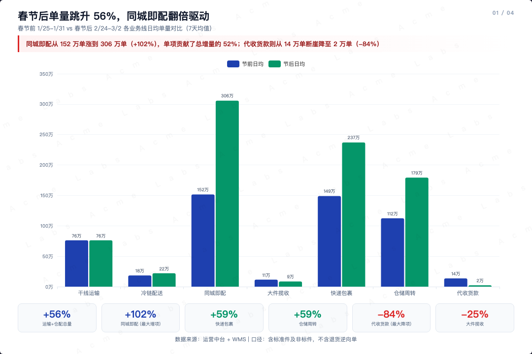
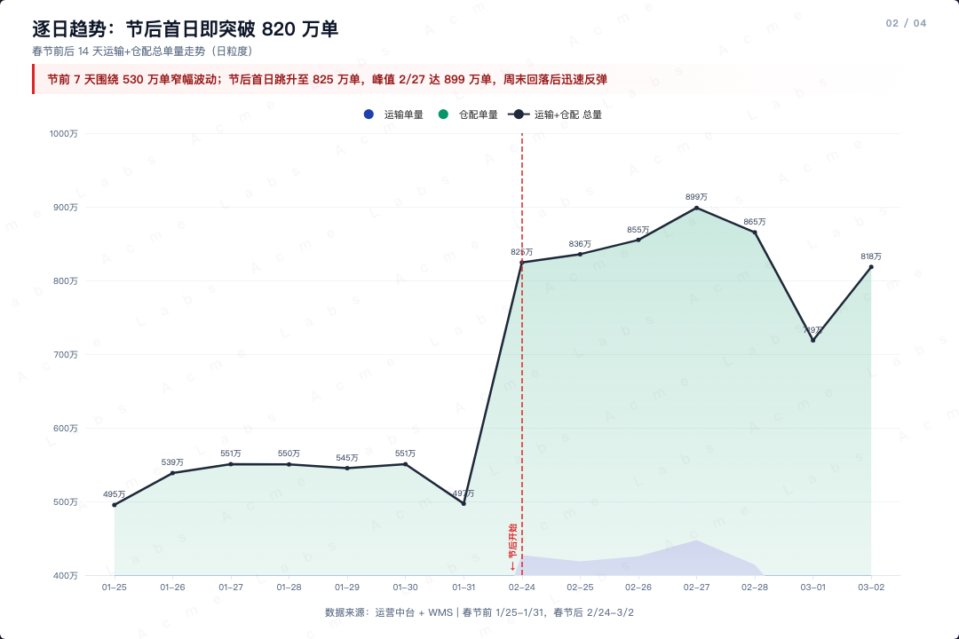
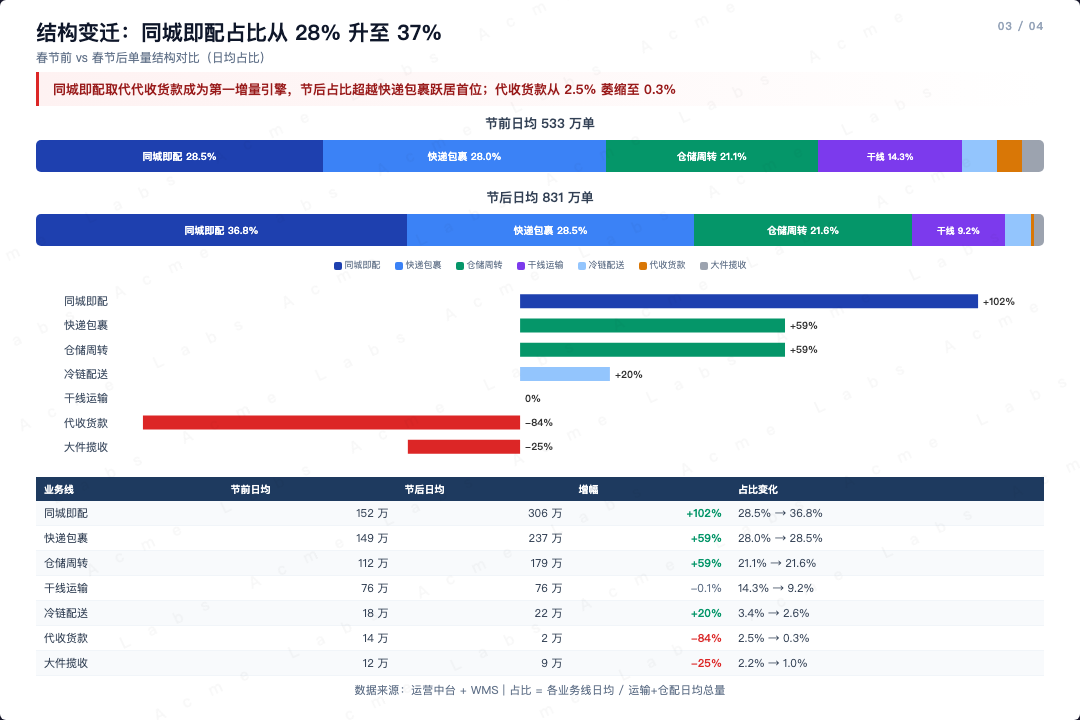
Demo 1: Logistics — Holiday Order Analysis (4 slides)
Pre/post holiday order volume analysis — grouped bar, area chart, composition breakdown, monthly summary.
 |
 |
 |
 |
Interactive HTML:
demo/logistics/demo_slides.html
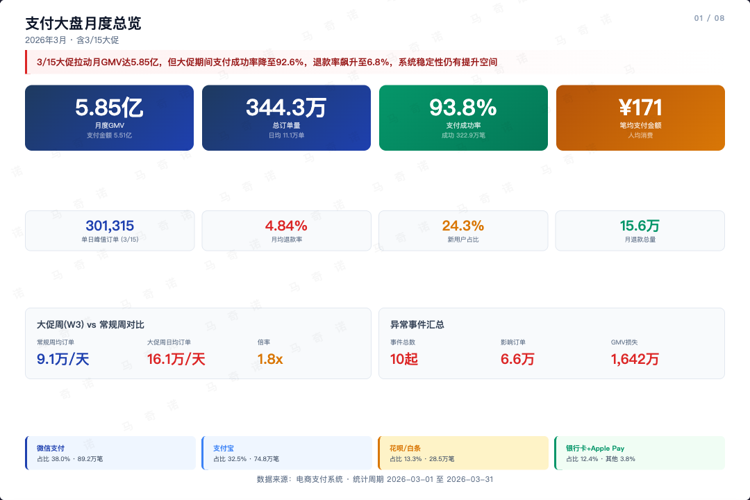
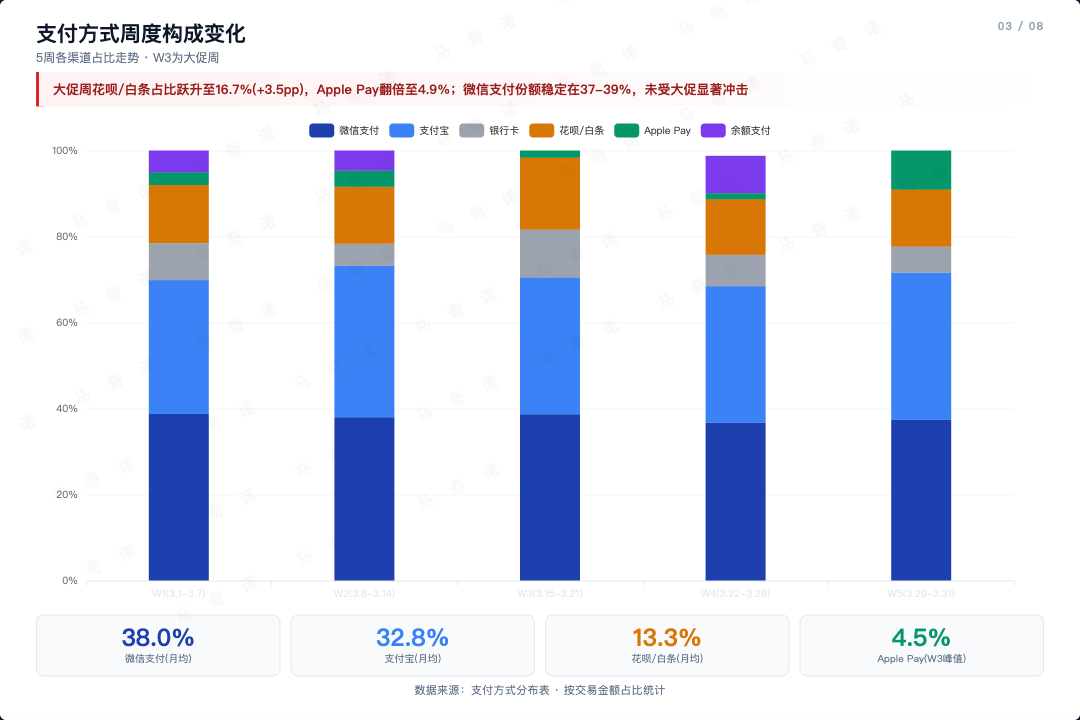
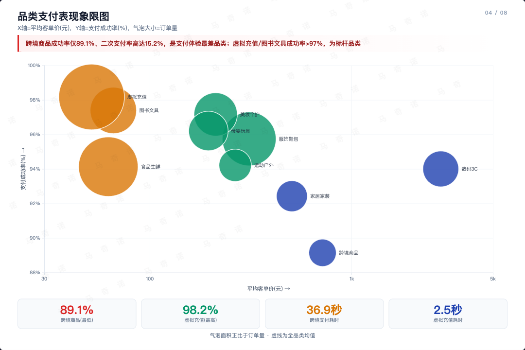
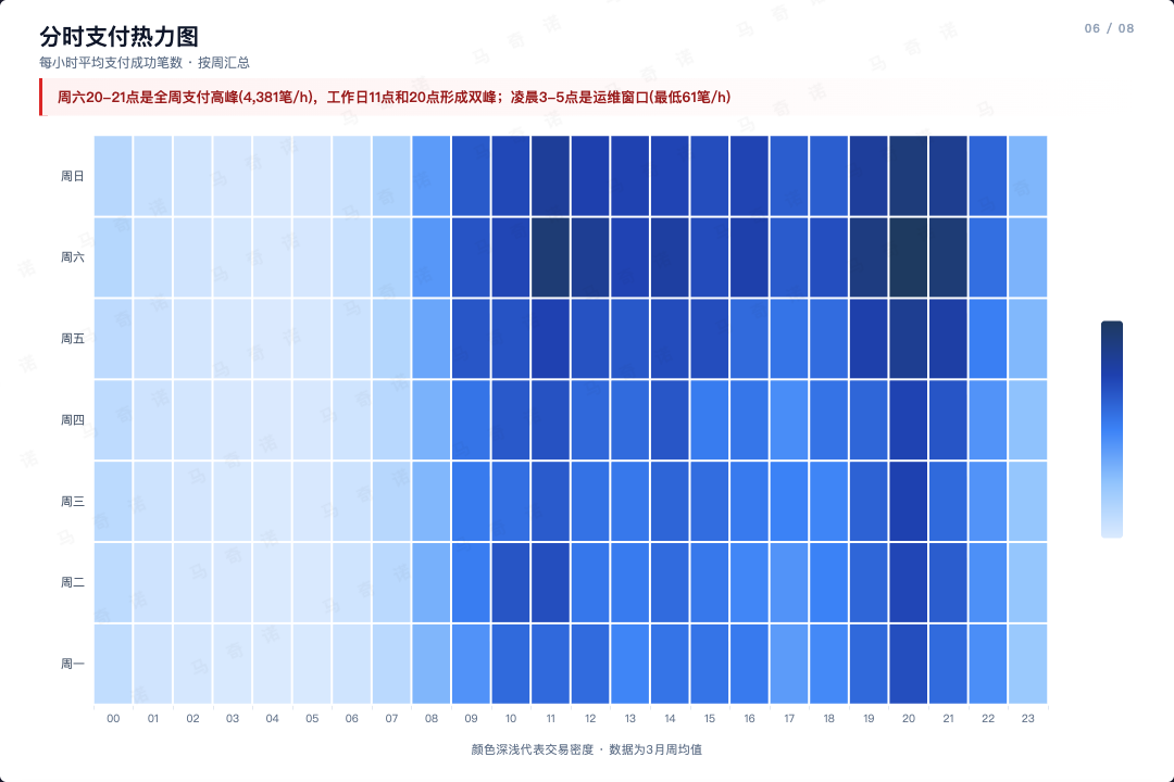
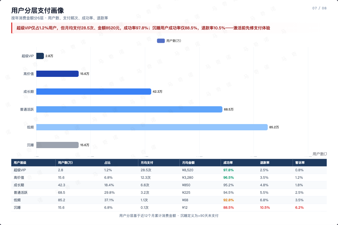
Demo 2: E-commerce Payment Monthly Report (8 slides)
Full payment operations report from Excel — daily trends, payment methods, category analysis, failure diagnostics, heatmap, user tiers, incident timeline.
Source data: demo/ecommerce-payment/ecommerce_payment_demo.xlsx (8 sheets, 31 days)
 |
 |
 |
 |
 |
 |
 |
 |
Interactive HTML:
demo/ecommerce-payment/ecommerce_payment_slides.html
Design System
5-layer slide structure: header → takeaway → body → footer (fixed 720px height)
Color palette: blue (#1e40af) · red (#dc2626) · green (#059669) · amber (#d97706) · gray (#9ca3af)
Components: hero cards, stat boxes, insight callouts, layer bars, mini tables, finding cards, progress bars
Charts: scatter/bubble, grouped bar, stacked bar, proportion bar (ECharts, animation disabled for screenshot)
Typography: PingFang SC / system font stack, hero numbers 32-40px, body 11-13px
How It Works
Your data --> Slide outline (user approves) --> HTML generation --> Playwright screenshot
- Understand: Read data, identify metrics/comparisons/trends
- Outline: Propose slide count and content per slide
- Generate: Single HTML with ECharts + CSS cards
- Review: Open in browser, iterate on spacing/data/readability
- Screenshot: Playwright captures each slide at 1080x720
Update
cd ~/.claude/skills/makino-data-slides && git pull
The skill checks for updates automatically on each run.
FAQ
Q: What data formats are supported?
JSON, CSV, markdown tables, or just describe your data in natural language. The skill extracts structure and proposes a slide outline.
Q: Can I customize colors?
The default palette is investor-report style (blue/red/green/amber). You can override per-slide, but the palette is designed to work as a system.
Q: How is this different from a chart tool?
A chart tool draws one chart. /makino-data-slides generates complete slide cards with multiple visual elements, typography, and narrative structure — designed as article illustrations.
Q: How is this different from /content-to-html?/content-to-html turns a finished article into a presentation or page. /makino-data-slides creates static data cards from raw data — for embedding in articles, not replacing them.
Q: Can I use this for non-Chinese content?
Yes. The typography and layout work with English and Chinese. Just provide your data in any language.
Q: The charts look blank in the screenshot.
ECharts needs a moment to render. The Playwright screenshot script waits 500ms per slide. If charts are complex, increase the wait.
License
Apache 2.0 — see LICENSE and NOTICE
Community & Contact
Bugs, questions and ideas: open an issue. 也可以在公众号「马奇诺」后台留言。

Author
Yorumlar (0)
Yorum birakmak icin giris yap.
Yorum birakSonuc bulunamadi