charted
Health Warn
- License — License: MIT
- Description — Repository has a description
- Active repo — Last push 0 days ago
- Low visibility — Only 7 GitHub stars
Code Pass
- Code scan — Scanned 12 files during light audit, no dangerous patterns found
Permissions Pass
- Permissions — No dangerous permissions requested
No AI report is available for this listing yet.
Charted is a zero dependency SVG chart generator that aims to provide a simple interface for generating beautiful and customisable graphs. This project is inspired by chart libraries like mermaid.js.

Zero-dependency charts for Python and AI agents. SVG and PNG, 15 chart types, a one-line MCP server, and a Claude skill.


Quickstart
uv add charted
Or with pip:
pip install charted
from charted import BarChart

chart = BarChart(
    title="Sales by Quarter",
    data=[120, 180, 210, 150],
    labels=["Q1", "Q2", "Q3", "Q4"],
)
chart.save("chart.svg")
chart.save("chart.png")  # PNG export (requires cairosvg)
That is the whole loop: pass a list of numbers, get back an image. No numpy, no
pandas, no config files.
Core principle: charted itself has zero runtime dependencies. PNG export
and MCP server support are opt-in extras that pull in their own dependencies,
and the base library stays pure Python.
Gallery
Every chart type, rendered. Each image below was generated by charted itself
from the example script; the Quick Tour
shows the code behind each one.
Bar 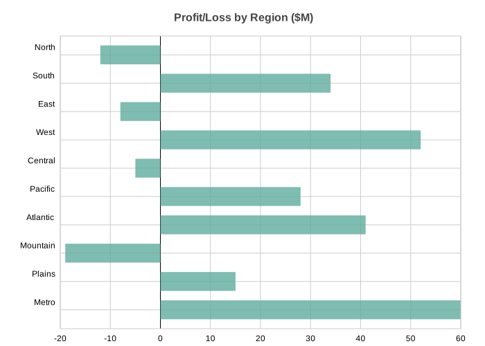 |
Column 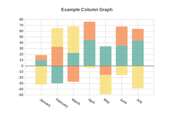 |
Line 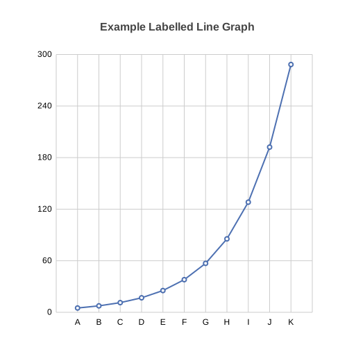 |
Scatter 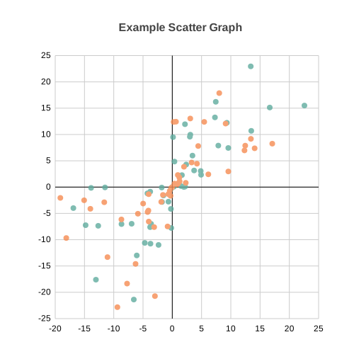 |
Pie 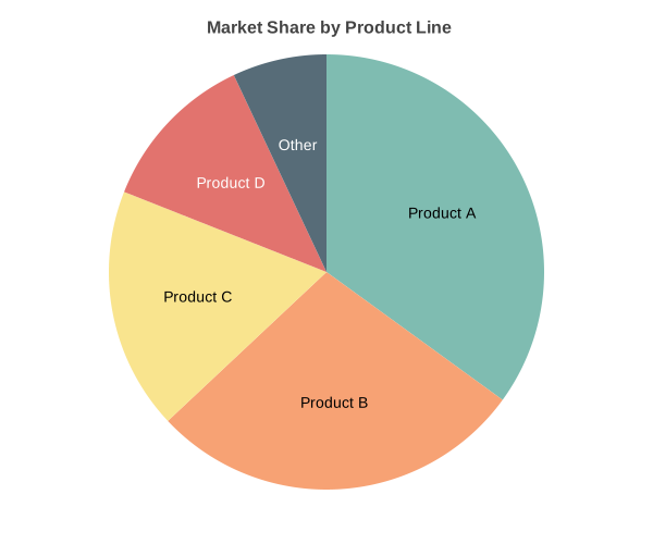 |
Area 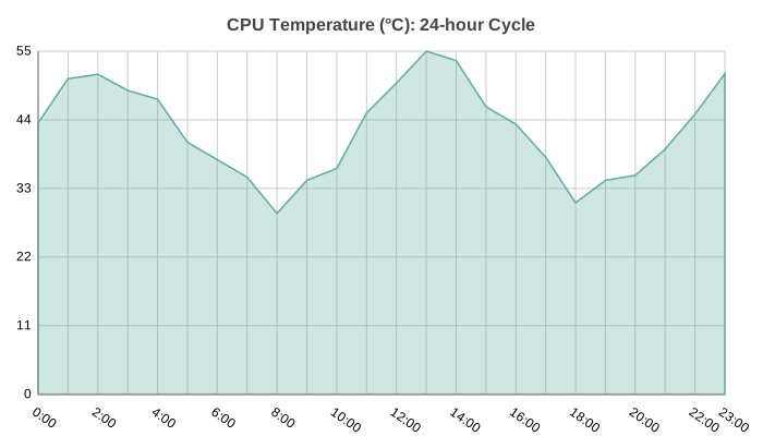 |
Radar 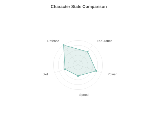 |
Box Plot 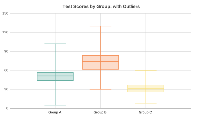 |
Histogram 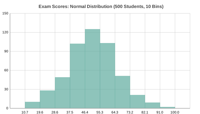 |
Heatmap 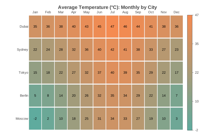 |
Gantt 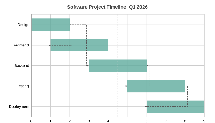 |
Bubble 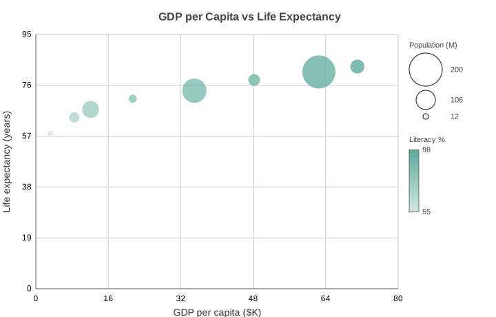 |
Combo 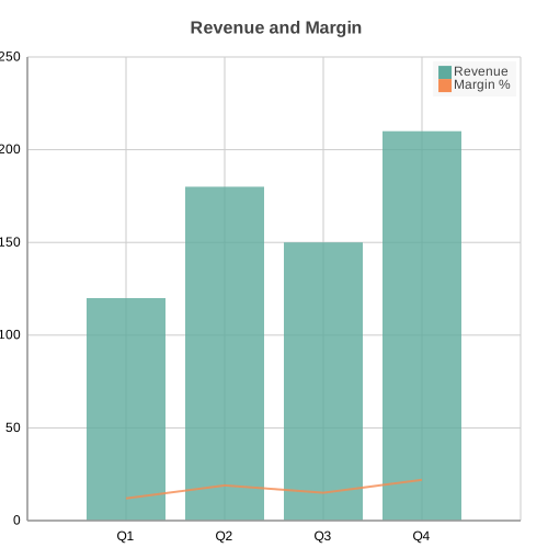 |
Polar Area 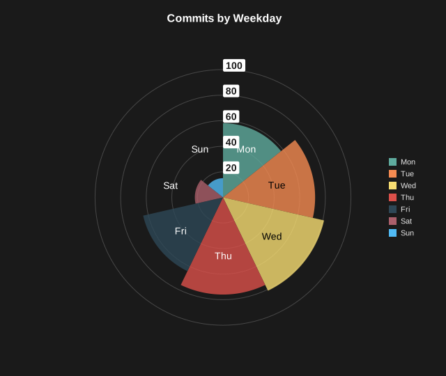 |
Sankey diagrams are also supported; see the Quick Tour for the
flow and funnel examples.
Integration
Run the MCP server with no install using uvx:
uvx --from charted[mcp] charted-mcp
This fetches charted with the MCP extra into a throwaway environment and starts
the server over stdio, so an agent can generate charts without you adding charted
to a project or virtualenv.
Client config
| Client | Setup |
|---|---|
| Claude Code | claude mcp add charted -- uvx --from charted[mcp] charted-mcp |
| Cursor, Cline, other clients | Add the JSON below to the client's MCP server config |
{
  "mcpServers": {
    "charted": {
      "command": "uvx",
      "args": ["--from", "charted[mcp]", "charted-mcp"]
    }
  }
}
The server exposes create_chart, list_chart_types, list_themes, andchart_from_csv. See the MCP Server section
below for tool details and the pip install path.
Claude Skill
Install the chart Skill in one line:
claude skill install charted
Chart gallery
The Quick Tour renders every chart type with the code that
produced it. The same examples live in docs/examples/.
Why Charted?
- Zero runtime dependencies: pure Python, no numpy/pandas required
- 15 chart types: Bar, Column, Line, Scatter, Pie, Area, Radar, Box Plot, Histogram, Heatmap, Gantt, Bubble, Combo, Polar Area, Sankey
- Multi-series support: stacked, side-by-side, grouped layouts
- Negative values handled: proper zero baseline calculations
- SVG and PNG output: SVG natively, PNG via optional
cairosvg(pip install charted[png]) - Theme system: 3 built-in presets + custom theme composition
- Per-series styling: granular control with SeriesStyle builders
- Data loading: CSV/JSON parsers built-in
- Markdown export: generate embed-ready markdown snippets
- CLI included: create charts without writing Python code
- Jupyter ready: charts render inline automatically
- Base Chart class: unified API for dynamic chart type selection
Quick Tour
Every chart type shares the same simple interface: pass data, labels, dimensions, and a title:
from charted.charts import BarChart, LineChart, PieChart

# Bar: single series with negatives
BarChart(
    title="Profit/Loss by Region ($M)",
    data=[-12, 34, -8, 52, -5, 28, 41, -19, 15, 60],
    labels=["North", "South", "East", "West", "Central", "Pacific", "Atlantic", "Mountain", "Plains", "Metro"],
    width=700, height=500,
).save("bar.svg")
# Bar: multi-series side-by-side
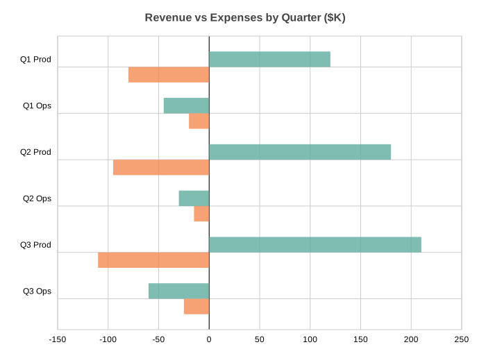
BarChart(
    title="Revenue vs Expenses by Quarter ($K)",
    data=[[120, -45, 180, -30, 210, -60], [-80, -20, -95, -15, -110, -25]],
    labels=["Q1 Prod", "Q1 Ops", "Q2 Prod", "Q2 Ops", "Q3 Prod", "Q3 Ops"],
    width=700, height=500,
).save("bar_multi.svg")
# Bar: stacked
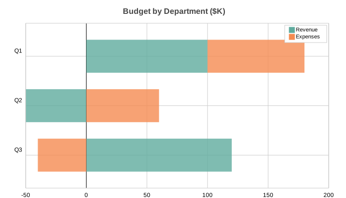
BarChart(
    title="Budget by Department ($K)",
    data=[[100, -50, 120], [80, 60, -40]],
    labels=["Q1", "Q2", "Q3"],
    series_names=["Revenue", "Expenses"],
    x_stacked=True, width=700, height=400,
).save("bar_stacked.svg")
# Bar: side-by-side with negatives
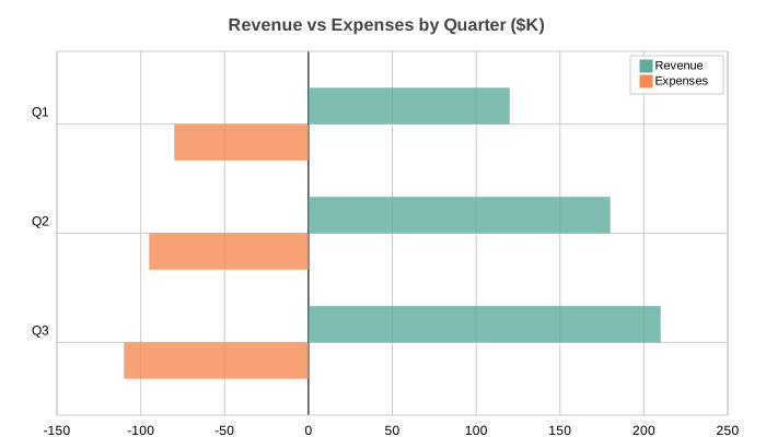
BarChart(
    title="Revenue vs Expenses by Quarter ($K)",
    data=[[120, 180, 210], [-80, -95, -110]],
    labels=["Q1", "Q2", "Q3"],
    series_names=["Revenue", "Expenses"],
    width=700, height=400,
).save("bar_sidebyside.svg")
# Column: multi-series with negatives
from charted.charts import ColumnChart

ColumnChart(
    title="Year-over-Year Growth Rate (%) by Segment",
    data=[[12, -8, 22, 18, -5, 30], [-3, -15, 5, -2, -20, 8], [9, -23, 17, 16, -25, 38]],
    labels=["Q1", "Q2", "Q3", "Q4", "Q5", "Q6"],
    width=700, height=500,
    theme={"v_padding": 0.12, "h_padding": 0.10},
).save("column.svg")
# Column: stacked (default for multi-series)
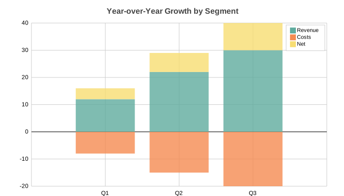
ColumnChart(
    title="Year-over-Year Growth by Segment",
    data=[[12, 22, 30], [-8, -15, -20], [4, 7, 10]],
    labels=["Q1", "Q2", "Q3"],
    series_names=["Revenue", "Costs", "Net"],
    width=700, height=400,
).save("column_stacked.svg")
# Column: side-by-side
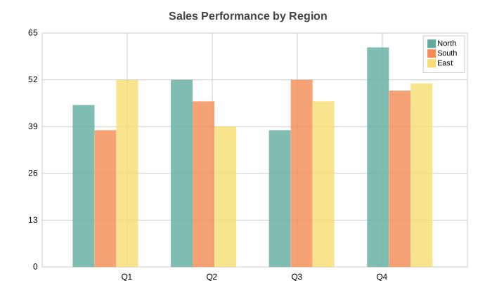
ColumnChart(
    title="Sales Performance by Region",
    data=[[45, 52, 38, 61], [38, 46, 52, 49], [52, 39, 46, 51]],
    labels=["Q1", "Q2", "Q3", "Q4"],
    series_names=["North", "South", "East"],
    width=700, height=400, y_stacked=False,
).save("column_sidebyside.svg")
# Line: multi-series signal data
import math
from charted.charts import LineChart

n = 20
LineChart(
    title="Signal Analysis: Raw vs Filtered vs Baseline",
    data=[
        [math.sin(i * 0.5) * 30 + (i % 7 - 3) * 5 for i in range(n)],
        [math.sin(i * 0.5) * 25 for i in range(n)],
        [math.sin(i * 0.5) * 10 - 5 for i in range(n)],
    ],
    labels=[str(i) for i in range(n)],
    width=700, height=400,
).save("line.svg")
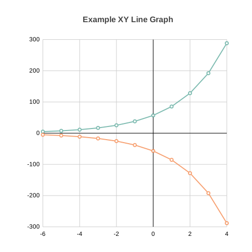
# Line: XY mode with temperature anomaly data
years = list(range(1990, 2010))
anomalies = [-15, -5, 10, 20, 5, 25, 15, 30, 10, 20, 40, 25, 45, 30, 50, 35, 60, 55, 45, 70]
baseline = [round(5 + 2 * math.sin(i * 0.4) + i * 0.5, 1) for i in range(len(years))]

LineChart(
    title="Temperature Anomaly vs 5-Year Rolling Baseline (1990-2009)",
    data=[anomalies, baseline],
    x_data=years,
    labels=[str(y) for y in years],
    width=700, height=400,
).save("xy_line.svg")
# Line: single series
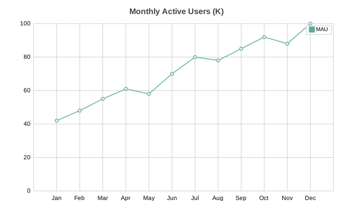
LineChart(
    title="Monthly Active Users (K)",
    data=[[42, 48, 55, 61, 58, 70, 80, 78, 85, 92, 88, 100]],
    labels=["Jan", "Feb", "Mar", "Apr", "May", "Jun", "Jul", "Aug", "Sep", "Oct", "Nov", "Dec"],
    series_names=["MAU"], width=700, height=400,
).save("line_single.svg")
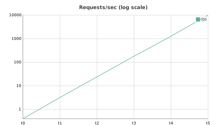
# Line: log scale (opt-in) for data spanning orders of magnitude.
# Pass y_scale="log" (or x_scale="log"); a LogScale instance also works.
LineChart(
    title="Requests/sec (log scale)",
    data=[[1, 8, 60, 450, 3200, 25000]],
    labels=["t0", "t1", "t2", "t3", "t4", "t5"],
    series_names=["rps"],
    y_scale="log",
    width=700, height=400,
).save("line_log.svg")
# Scatter: multi-series cluster analysis
import random
from charted.charts import ScatterChart

random.seed(42)
ca_x = [30 + random.gauss(0, 8) for _ in range(20)]
ca_y = [40 + random.gauss(0, 8) for _ in range(20)]
cb_x = [70 + random.gauss(0, 10) for _ in range(20)]
cb_y = [20 + random.gauss(0, 10) for _ in range(20)]

ScatterChart(
    title="Cluster Analysis: Two Distinct Populations",
    x_data=[ca_x, cb_x], y_data=[ca_y, cb_y],
    series_names=["Cluster A", "Cluster B"],
    width=700, height=400,
).save("scatter.svg")
# Scatter: single series with quadratic curve
random.seed(1)
x_vals = [i for i in range(5, 95, 5)]
y_vals = [round(10 + (v - 50) ** 2 / 50 + random.gauss(0, 4), 1) for v in x_vals]

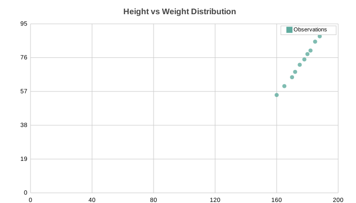
ScatterChart(
    title="U-Shaped Response Curve: Signal vs Input",
    x_data=x_vals, y_data=y_vals,
    series_names=["Observations"],
    width=700, height=400,
).save("scatter_single.svg")
# Pie: basic
from charted.charts import PieChart

PieChart(
    title="Market Share by Product Line",
    data=[35, 28, 18, 12, 7],
    labels=["Product A", "Product B", "Product C", "Product D", "Other"],
    width=600, height=500,
).save("pie.svg")
# Pie: doughnut mode
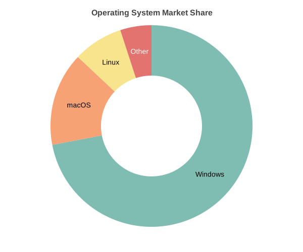
PieChart(
    title="Operating System Market Share",
    data=[72, 15, 8, 5],
    labels=["Windows", "macOS", "Linux", "Other"],
    inner_radius=0.5, width=600, height=500,
).save("pie_doughnut.svg")
# Radar: multi-series
from charted.charts import RadarChart

RadarChart(
    title="Player Skill Comparison",
    data=[[85, 90, 75, 88, 92], [70, 85, 90, 75, 80]],
    labels=["Speed", "Strength", "Defense", "Technique", "Stamina"],
    width=600, height=500,
).save("radar.svg")
# Radar: single series
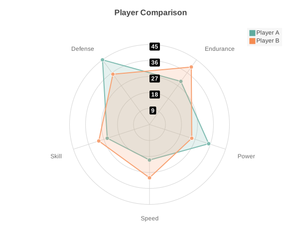
RadarChart(
    title="Character Stats",
    data=[20, 35, 30, 45, 25],
    labels=["Speed", "Power", "Endurance", "Defense", "Skill"],
    width=600, height=500,
).save("radar_multi.svg")
# Area: CPU temperature over 24 hours
from charted.charts import AreaChart

temps = [42 + 10 * math.sin(i * 0.6) + (hash(str(i)) % 5 - 2) * 1.5 for i in range(24)]

AreaChart(
    title="CPU Temperature (°C): 24-hour Cycle",
    data=[round(t, 1) for t in temps],
    labels=[f"{h}:00" for h in range(24)],
    width=700, height=400,
).save("area.svg")
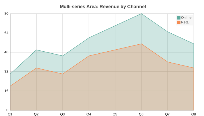
# Area: multi-series revenue by channel
AreaChart(
    title="Multi-series Area: Revenue by Channel",
    data=[[30, 50, 45, 60, 70, 80, 65, 55], [20, 35, 30, 45, 50, 55, 40, 35]],
    labels=["Q1", "Q2", "Q3", "Q4", "Q5", "Q6", "Q7", "Q8"],
    series_names=["Online", "Retail"],
    width=700, height=400,
).save("area_multi.svg")
# Box Plot: distribution quartiles with outliers
import random
from charted.charts import BoxPlot

random.seed(42)
box_a = [round(random.gauss(50, 10), 1) for _ in range(50)] + [95, 5, 102]
box_b = [round(random.gauss(70, 15), 1) for _ in range(50)] + [120, 30, 130]
box_c = [round(random.gauss(30, 8), 1) for _ in range(50)] + [55, 8, 60]

BoxPlot(
    title="Test Scores by Group: with Outliers",
    data=[box_a, box_b, box_c],
    labels=["Group A", "Group B", "Group C"],
    width=700, height=400,
).save("boxplot.svg")
# Histogram: normal distribution (bell curve)
import random
from charted.charts import Histogram

random.seed(42)
scores = [random.gauss(50, 15) for _ in range(500)]

Histogram(
    title="Exam Scores: Normal Distribution (500 Students, 10 Bins)",
    data=scores,
    bins=10, width=700, height=400,
).save("histogram.svg")
# Heatmap: monthly temperature matrix
from charted.charts import HeatmapChart

HeatmapChart(
    title="Average Temperature (°C): Monthly by City",
    data=[
        [35, 36, 38, 40, 43, 45, 47, 46, 44, 41, 38, 36],
        [22, 24, 28, 32, 36, 40, 42, 41, 38, 33, 27, 23],
        [15, 18, 22, 27, 32, 37, 40, 39, 35, 29, 22, 17],
        [5, 8, 14, 20, 26, 32, 35, 34, 29, 22, 14, 7],
        [-2, 2, 10, 18, 25, 31, 34, 33, 27, 19, 10, 3],
    ],
    x_labels=["Jan", "Feb", "Mar", "Apr", "May", "Jun", "Jul", "Aug", "Sep", "Oct", "Nov", "Dec"],
    y_labels=["Dubai", "Sydney", "Tokyo", "Berlin", "Moscow"],
    width=700, height=450,
    low_color="#21639e", high_color="#f97316",
    show_values=True, value_format=".0f",
).save("heatmap.svg")
# Gantt: software project timeline
from charted.charts import GanttChart

GanttChart(
    title="Software Project Timeline: Q1 2026",
    data=[(0, 2), (1, 4), (3, 6), (5, 8), (6, 9)],
    labels=["Design", "Frontend", "Backend", "Testing", "Deployment"],
    width=700, height=400,
    dependencies=[(0, 1), (0, 2), (2, 3), (3, 4)],
    show_today_line=True,
    x_position=4.5,
).save("gantt.svg")
# Sankey: flow diagram (d3-sankey layout)
from charted.charts import SankeyChart

SankeyChart(
    title="Electricity generation to consumption",
    nodes=["Coal", "Gas", "Solar", "Grid", "Homes", "Industry", "Export"],
    links=[
        ("Coal", "Grid", 45), ("Gas", "Grid", 30), ("Solar", "Grid", 15),
        ("Grid", "Homes", 40), ("Grid", "Industry", 35), ("Grid", "Export", 15),
    ],
    width=800, height=500,
).save("sankey.svg")
Nodes are placed in columns by alignment, then relaxed over several iterations so
connected nodes line up and ribbons cross as little as possible. Link thickness is
proportional to flow value; the widths stacked at each node sum to the node's height.
Pass links as (source, target, value) tuples or {"source", "target", "value"}
dicts; endpoints may be node names or indices. Node labels in a dense column are
nudged apart vertically so they stay readable instead of overlapping.
The alignment option controls how nodes are assigned to columns: justify
(default, like d3-sankey) pushes every sink to the final column; left keeps each
node at its own depth; right aligns by distance from the sink; center is left
with sources pinned to the first column.
For funnel / drop-off data, use alignment="left". Funnels have dropout sinks
at many different depths (failed-filter, didn't-respond, cancelled, and so on). Under
the default justify those are all yanked into one tall final column, which crushes
the funnel shape. left lets each dropout terminate at its natural stage, so the
chart reads as a true funnel staircase:
# Funnel: recruitment drop-off, left-aligned so dropouts sit at their depth
SankeyChart(
    title="Recruitment funnel",
    nodes=[
        "Applied", "Passed screen", "Failed screen",
        "Interviewed", "Rejected", "Offered", "Declined", "Hired",
    ],
    links=[
        ("Applied", "Passed screen", 320), ("Applied", "Failed screen", 680),
        ("Passed screen", "Interviewed", 140), ("Passed screen", "Rejected", 180),
        ("Interviewed", "Offered", 60), ("Interviewed", "Rejected", 80),
        ("Offered", "Hired", 45), ("Offered", "Declined", 15),
    ],
    alignment="left",
    width=900, height=400,
).save("funnel.svg")
Theming
Three built-in presets (light, dark, high-contrast) plus custom theme composition:
from charted import BarChart

# Built-in themes
chart = BarChart(data=[120, 180, 210], labels=["Q1", "Q2", "Q3"], theme="light")
chart = BarChart(data=[120, 180, 210], labels=["Q1", "Q2", "Q3"], theme="dark")
chart = BarChart(data=[120, 180, 210], labels=["Q1", "Q2", "Q3"], theme="high-contrast")
| Theme | Preview |
|---|---|
| Light | 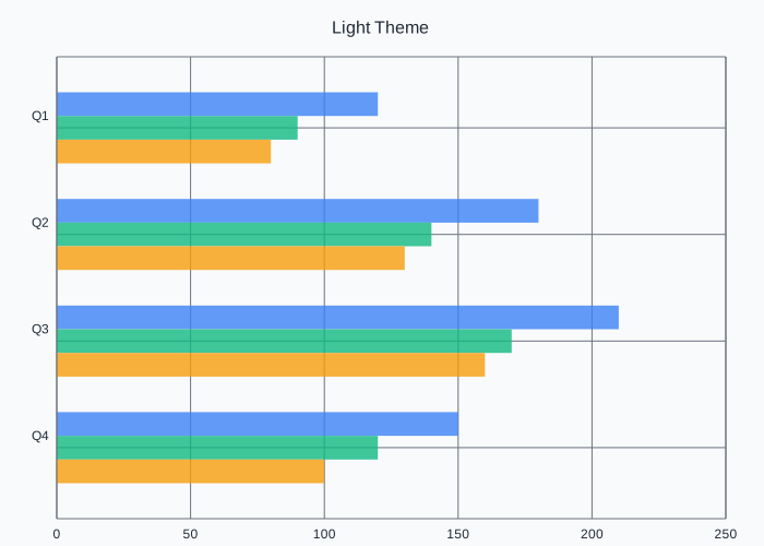 |
| Dark | 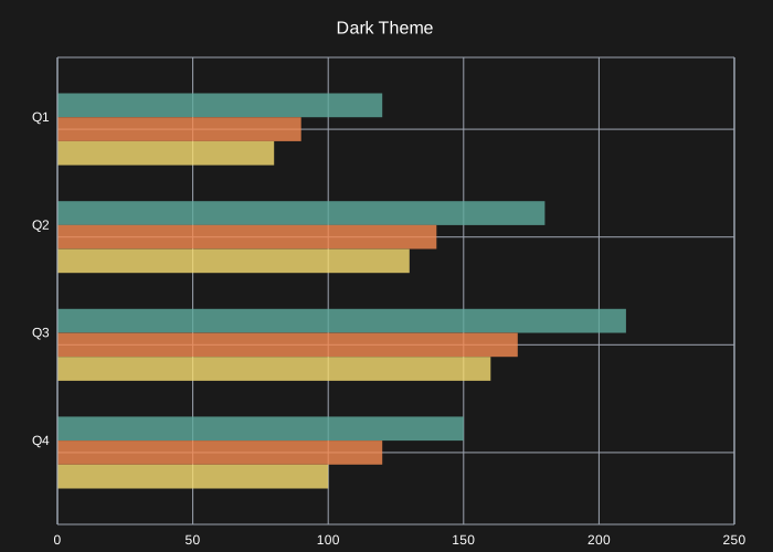 |
| High Contrast | 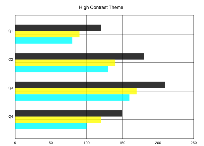 |
See the Theming docs for custom palettes, font overrides, and per-series styling.
CLI Usage
Generate charts without writing Python:
# From CSV
python -m charted create bar output.svg --data sales.csv

# From JSON
python -m charted create column chart.svg -d data.json

# Set the title and dimensions
python -m charted create bar output.svg --data sales.csv \
    --title "Q3 Sales" --width 900 --height 400

# Batch from directory
python -m charted batch input_data/ output_svg/
--title, --width, and --height override the same values in a --config
file when you pass both.
CSV format (default):
The first column is the x-axis labels. Every other column is a data series.
Quarter,Revenue,Expenses
Q1,120,80
Q2,180,95
Q3,210,110
Wide CSV (--transpose):
If your CSV is laid out sideways, with one series per row and the x values
across the header, pass --transpose. The corner cell is ignored, the rest of
the header row becomes the x-axis labels, and each following row is a series
named by its first cell. Without --transpose this layout would plot with the
axes swapped, so the flag is explicit rather than guessed.
Series,Q1,Q2,Q3
Revenue,120,180,210
Expenses,80,95,110
python -m charted create column out.svg --data wide.csv --transpose
JSON format:
{
  "labels": ["Q1", "Q2", "Q3"],
  "data": [[120, 180, 210], [80, 95, 110]],
  "series_names": ["Revenue", "Expenses"]
}
Full CLI docs: python -m charted --help
Data Loading
Load CSV/JSON without pandas:
from charted import load_csv, load_json, BarChart

# From CSV
x, y, labels = load_csv("sales.csv", x_col="Quarter", y_col="Revenue")
chart = BarChart(data=y, labels=x, title=labels[0])
chart.save("sales.svg")

# From JSON
x, y, labels = load_json("data.json")
chart = ColumnChart(data=y, labels=x)
Jupyter Notebook
Charts render inline automatically, no extra setup needed:
from charted.charts import BarChart

chart = BarChart(
    title="Sales by Quarter",
    data=[120, 180, 210, 150],
    labels=["Q1", "Q2", "Q3", "Q4"],
)
# Renders inline in the notebook cell
Markdown Export
from charted import BarChart
chart = BarChart(data=[120, 180, 210], labels=["Q1", "Q2", "Q3"], title="Sales")
# With file path
chart.save("docs/sales.svg")
md = chart.to_markdown(path="docs/sales.svg") # 
# As inline data URL
md = chart.to_markdown() # Data URL embedded in markdown
Base Chart Class
Dynamically select chart type at runtime:
from charted import Chart

chart = Chart(
    data=[120, 180, 210],
    labels=["Q1", "Q2", "Q3"],
    title="Sales",
    chart_type="bar",  # or column, line, scatter, pie, area, boxplot, histogram, heatmap, gantt
)
chart.save("chart.svg")

# Access all chart methods
svg = chart.to_svg()
md = chart.to_markdown()
Installation
Library (use in your code):
uv add charted
Or with pip:
pip install charted
CLI or MCP server (standalone tool, no project install needed):
uvx charted ...
# or
pipx install charted
Note: a
uvx/pipx-installed package runs in its own isolated environment and cannot be imported into your project code. Useuv addorpip installwhen you want toimport chartedin your scripts.
Optional extras (these add dependencies, the core library stays zero-dep):
uv add "charted[png]"     # PNG export via cairosvg
uv add "charted[mcp]"     # MCP server for AI agent integration
uv add "charted[duckdb]"  # generate charts from SQL queries
uv add "charted[dev]"     # dev tools including PNG visual testing

# pip equivalents
pip install 'charted[png]'
pip install 'charted[mcp]'
pip install 'charted[duckdb]'
pip install 'charted[dev]'
PNG Export
Save charts directly as PNG by using the .png extension:
chart = BarChart(data=[10, 20, 30], labels=["A", "B", "C"])
chart.save("chart.svg")          # SVG (no extra dependencies)
chart.save("chart.png")          # PNG (requires cairosvg)
chart.save("chart.png", scale=3) # PNG at 3x resolution
PNG export requires cairosvg. If it's not installed, save() raises a helpful ImportError with install instructions.
MCP Server (AI Agent Integration)
Charted includes an MCP server so AI agents (Claude Code, Cursor, etc.) can generate charts without writing Python:
# Run standalone (no install step, recommended)
uvx --from 'charted[mcp]' charted-mcp

# Or install the extra and run directly
pip install 'charted[mcp]'
charted-mcp

# Register with Claude Code
claude mcp add charted -- uvx --from 'charted[mcp]' charted-mcp
Exposes tools: create_chart, list_chart_types, list_themes, chart_from_csv. The charted[mcp] extra is required.
create_chart and chart_from_csv take an output_format of svg, html, data_url, or png. With output_format="png" the tool returns a rasterized PNG image, so an agent can show the chart inline in a chat UI instead of relaying raw SVG markup. The mcp extra includes cairosvg, so PNG output works out of the box with the uvx command above. PNG rasterization needs cairo's system libraries; on Debian/Ubuntu install them with apt install libcairo2.
More features
A few extra parts of the public API that the examples above don't cover.
Auto chart selection. auto(data, **kwargs) picks a chart type from the shape of the data (1D becomes a bar or pie, a matrix becomes a heatmap, and so on) and returns a chart instance. auto_size(data, width, height) returns the (width, height) it would scale a dataset up to when you don't pass explicit dimensions.
from charted import auto

chart = auto([10, 20, 30], title="Sales")
Build from a dict or DataFrame. from_dict({"data": ..., "chart_type": ...}) builds a chart from a config dict. from_dataframe(df) takes a pandas DataFrame (or a plain dict of column to list if pandas isn't installed) and uses the first numeric column as the data and the index or first string column as the labels.
from charted import from_dict, from_dataframe

chart = from_dict({"chart_type": "line", "data": [1, 2, 3]})
chart = from_dataframe(df)  # falls back to a dict if pandas is missing
Inline and data-URL embedding. inline_svg(path) reads an SVG file back as a string for embedding in HTML or notebooks. chart_to_data_url(path) returns the same SVG URL-encoded as a data:image/svg+xml,... URI you can drop straight into an <img> tag or markdown image.
Save and restore a chart's config. chart.to_config() serializes a chart to a JSON-friendly dict (dimensions, data, labels, scales, reference lines, annotations, and so on). Chart.from_config(config, **overrides) rebuilds the chart from that dict, with keyword overrides merged on top so you can tweak one value without rebuilding the whole config.
config = chart.to_config()
chart2 = Chart.from_config(config, title="Updated title")
Fluent styling. chart.style(**kwargs) applies theme overrides and returns the chart for chaining, so you can set things like background_color or legend_font_size after construction.
chart = BarChart(data=[1, 2, 3]).style(background_color="#fff", legend_font_size=12)
Hover tooltips in HTML. chart.to_html(tooltips=True) attaches a native SVG <title> to each data mark so browsers show a built-in hover tooltip with no JavaScript. This only affects the HTML output; to_svg() and save() are unchanged.
Named palettes. resolve_palette(name) turns one of the built-in palette names into a list of hex colors you can pass as colors=. The names live in NAMED_PALETTES: default, viridis, ocean, categorical, rainbow, monochrome, pastel, sunset, forest, inferno, and the colourblind-safe okabe-ito.
from charted import resolve_palette

chart = BarChart(data=[1, 2, 3], colors=resolve_palette("viridis"))
Reference lines. Pass reference_lines=[{"value": 50, "axis": "y", "label": "Target"}] to draw a horizontal or vertical line at a value with an optional label. axis is "y" for a horizontal line (the default) or "x" for a vertical one.
Annotations. Pass annotations=[...] using LineAnnotation, BoxAnnotation, or LabelAnnotation to mark up the plot with lines, shaded regions, or text.
from charted import BarChart, LineAnnotation, BoxAnnotation, LabelAnnotation
Log and time scales. Pass x_scale= or y_scale= as "log" for a logarithmic axis or "time" for a time axis (which accepts dates, datetimes, or ISO date strings as x values). The default is "linear". Log and time scales are rejected on the value axis of a bar or column chart, since those fill from a zero baseline.
LineChart(data=[1, 10, 100, 1000], labels=["a", "b", "c", "d"], y_scale="log")
Links
Font System
Charted avoids tkinter by using pre-defined font metrics in fonts/definitions/. Generate new font definitions:
uv run python charted/commands/create_font_definition.py Helvetica
Reviews (0)
Sign in to leave a review.
Leave a reviewNo results found