dashline
Health Uyari
- License — License: MIT
- Description — Repository has a description
- Active repo — Last push 0 days ago
- Low visibility — Only 5 GitHub stars
Code Uyari
- process.env — Environment variable access in dist/dashline.js
Permissions Gecti
- Permissions — No dangerous permissions requested
Bu listing icin henuz AI raporu yok.
A Claude Code opinionated statusline configurable from settings.json
dashline
A Claude Code status line configured in settings.json. The default shows the context
window on the left and plan usage on the right. Change it by editing a list of fields.
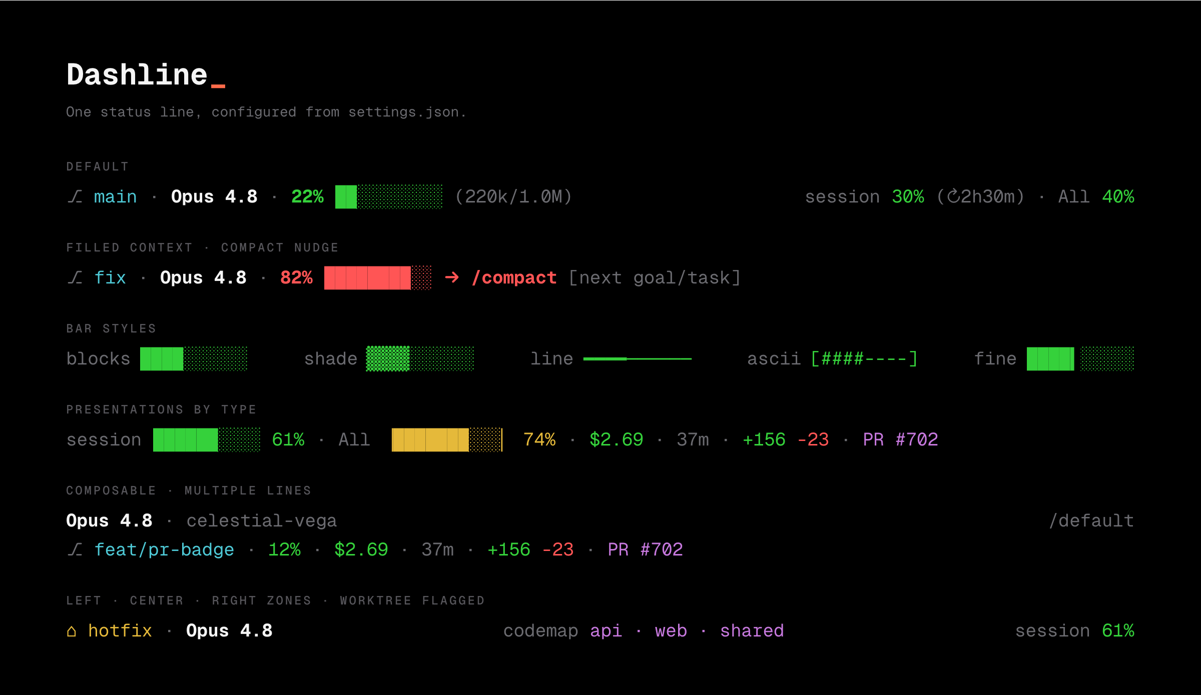

Why
dashline keeps two numbers on screen: how full the context window is, and how much of the
session and weekly rate limit is used. Both otherwise live behind the /usage command.
Any other field in the payload can be added by name.
Install
A Claude Code plugin cannot set the main status line on its own. Both routes below end
with settings.json pointing at dashline; the plugin route does it for you.
As a plugin (recommended)
/plugin marketplace add ordinarynerds/dashline
/plugin install dashline@ordinarynerds
/dashline:install
Manual
git clone https://github.com/ordinarynerds/dashline.git ~/.claude/dashline
cd ~/.claude/dashline && npm install && npm run build
./scripts/install.sh
The installer backs up settings.json, points statusLine at node dist/dashline.js,
and leaves a settings.json.bak-dashline-* file. Undo with ./scripts/install.sh --uninstall. Start a new session or run /statusline to see it. Requires Node 18+.
Updating
Plugin: enable auto-update in /plugin (Marketplaces tab), or pull on demand:
/plugin marketplace update
/reload-plugins
Manual:
cd ~/.claude/dashline && ./scripts/install.sh --update
Quick start
The config is a dashline key in ~/.claude/settings.json. Each entry in lines is one
row. This is the default:
{
  "dashline": {
    "lines": [
      { "left": ["branch", "model", "context"], "right": ["session", "weekly"] }
    ]
  }
}
An item is one of six shapes:
"branch"                                       // widget
["model", "cyan"]                              // widget + color
["cwd", "basename"]                            // widget + variant
["session", { "bar": "fine", "label": "5h" }]  // widget + options
{ "text": "api", "color": "dim" }              // literal text
"kache stat"                                   // any unrecognized string runs as a shell command
A row is either a bare array like ["branch", "model"] (left-aligned), or a{ "left": [...], "center": [...], "right": [...] } object spread across the width.
The reference lists every widget and option.
Recipes
Each block is a value for dashline.lines and the status line it renders. Paste one into
your settings.
Cost and PR on the right

{ "left": ["branch", "model", "context"], "right": ["cost", "pr", "session"] }
Usage as bars

{
  "left": ["branch", "context"],
  "right": [
    ["session", "bar"],
    ["weekly", "bar"]
  ]
}

Reference
Widgets
Each widget reads one field of the payload; the right column is its type. A widget with no
data hides itself, and an empty row is skipped. An unrecognized bare string runs as a shell
command, and a { "text": ... } item is printed literally.
| Widget | Example | Displays | Type |
|---|---|---|---|
branch |
⎇ main |
git branch | label |
model |
Opus 4.8 |
model name | label |
context |
44% ████░░░░░░ (440k/1.0M) · high |
model context | percent |
session |
session 61% (↻2h11m) |
session usage and reset | percent |
weekly |
All 74% |
weekly usage | percent |
cost |
$2.69 |
session cost | money |
duration |
37m |
wall-clock this session | duration |
lines |
+156 -23 |
lines added and removed | delta |
pr |
PR #702 |
open PR number | label |
review |
pending |
PR review state | label |
worktree |
⌂ hotfix |
linked worktree | label |
cwd |
~/Development/dashline |
working directory | label |
repo |
dashline |
repository name | label |
effort |
high |
reasoning effort | label |
name |
celestial-vega |
session name | label |
output |
/default |
output style | label |
version |
v2.1.90 |
Claude Code version | label |
burn |
→ /compact ~18m |
projected time to critical context | label |
fast |
fast |
fast mode | flag |
thinking |
thinking |
extended thinking | flag |
vim |
NORMAL |
vim mode | label |
agent |
security-reviewer |
active subagent | label |
context, session, and weekly color themselves by fill (green to red). The usage
pair appears on Pro and Max once the payload carries rate limits. The burn widget, thehistory variant, and the trend option read a short history of the session, so they
appear after a few refreshes.
Presentations, by type
A presentation works by type, not by widget: any percent widget takes any percent
presentation. Pass it as the item's variant. The first in each row is the default.
| Type | Presentations |
|---|---|
percent |
pct (44%), bar (████░░░░░░), gauge (▕████░░▏), ratio, tokens ((440k/1.0M)), history (▁▂▃▅▆█, context only), plus bar styles |
duration |
short (37m), long (0h37m), clock (0:37:00) |
money |
usd ($2.69), cents (269c), round ($3) |
delta |
pair (+156 -23), sum (+133), added (+156) |
label |
text, basename, upper, lower, truncate:N |
flag |
on (hidden when off), onoff (fast:off) |
The percent default draws the number, bar, tokens, and countdown when each is present.
The reductive presentations (bar, pct, tokens) draw only that part.
Data options
Object-form keys that change what a widget shows rather than how. Combine them withvariant, bar, and color.
| Option | Types | Effect |
|---|---|---|
label |
percent | rename the prefix, such as session to 5h |
countdown |
percent | set false to drop the reset countdown |
warningAt, criticalAt |
percent | color thresholds for this item, overriding the global ones |
trend |
percent | append a ↑/↓/→ arrow for context, read from session history |
width |
percent | bar width in columns |
bar |
percent | bar glyph style (see bar styles) |
truncate |
label | shorten the text to N characters with an ellipsis |
icon |
label | a glyph placed before the text |
color |
any | a fixed color (see below) |
bg |
text, label | a background color, for badges |
bold, italic, underline |
any | set true to add that text attribute, alongside any color |
variant |
any | which presentation to draw |
Colors
A color term is one or more of these words, so "bold red" is valid:
red · green · yellow · blue · magenta · cyan · gray · black · white · dim · bold · italic · underline
A term can also be a hex value for 24-bit color: "#4EC9D6", or "#fff" in shorthand.
Mix it with attributes, so "bold #4EC9D6" works.
The bg option fills the background of a text or label item, which makes a badge:{ "text": " PR ", "color": "black", "bg": "#C678DD" }.
A color on an item overrides its default styling. context, session, and weekly
normally color themselves by fill; a fixed color removes that signal.
Bar styles
Any percent bar takes a bar glyph style. Every style is single-cell, so the bar
stays the same width whichever you pick.
bar |
44% of 10 | |
|---|---|---|
blocks (default) |
████░░░░░░ |
sharp |
shade |
▓▓▓▓░░░░░░ |
softer fill |
line |
━━━━────── |
thin |
ascii |
[###-----] |
brackets counted inside the width |
fine |
████▍░░░░░ |
smooth, 8 sub-cell steps per column |
gradient |
██████░░░░ |
filled cells ramp green to red by position (truecolor) |
The gradient style colors each filled cell along a green-to-red ramp by its position, so
a fuller bar reads hotter. It uses truecolor, unlike the single-color styles above.
Themes
theme remaps the named colors to a palette in one move, so every widget that uses a named
color, and the fill colors on context, session, and weekly, follow the scheme.
Available: nord, dracula, gruvbox, catppuccin.
{ "dashline": { "theme": "catppuccin", "lines": [["branch", "model", "context"]] } }
Powerline
powerline: true draws each zone as connected segments joined by arrow glyphs, with each
segment's background fading into the next. A segment takes an item's bg, or an alternating
neutral tone when it has none, so it composes with badges. The right zone runs the arrows in
reverse so the ribbon points back toward the content. Needs a Nerd Font.
Icons
icons: true prefixes label widgets (branch, model, cwd, pr, and so on) with a Nerd
Font glyph. An explicit icon on an item wins over the default. Needs a Nerd Font.
Config keys
Alongside lines, the dashline object takes:
| Key | Default | Effect |
|---|---|---|
separator |
· |
drawn dim between items in a zone |
margin |
5 |
columns kept free at the right edge |
powerline |
false |
draw each zone as arrow-joined segments (needs a Nerd Font) |
theme |
"" |
recolor named colors from a palette: nord, dracula, gruvbox, catppuccin |
icons |
false |
prefix label widgets with a Nerd Font glyph |
contextWarningAt |
40 |
context turns yellow ("high") at/above this % |
contextCriticalAt |
50 |
context turns red with the → /compact nudge at/above this % |
usageWarningAt |
70 |
usage widgets turn yellow at/above this % |
usageCriticalAt |
90 |
usage widgets turn red at/above this % |
Editor autocomplete
The config has a schema at dashline.schema.json. It constrains
only the dashline key and leaves the rest of settings.json alone. Point your editor at
it for autocomplete and validation. In VS Code, add to your settings:
"json.schemas": [
  {
    "fileMatch": ["**/.claude/settings.json", "**/.claude/settings.local.json"],
    "url": "https://raw.githubusercontent.com/ordinarynerds/dashline/main/dashline.schema.json"
  }
]
How it works
Claude Code passes the status-line command a JSON payload on stdin. dashline reads it,
reads the dashline config from the settings files, and prints one line per entry inlines. It makes no network calls and does not read the transcript.
Each widget is a pure function from the payload to a typed value, which a presenter draws.
The git branch and worktree are not in the payload, so dashline runs git once. Each
command item runs under a 2-second timeout.
The burn widget, the history variant, and the trend option need a history, so when
the config uses one dashline keeps a small dashline-state/ directory next to the settings
with recent context samples per session. Otherwise it holds no state.
Security
dashline can run shell commands. Command sources are restricted:
- Command items run only from your own user settings (
~/.claude/settings.jsonand~/.claude/settings.local.json). Config that arrives through a project, such as a.claude/settings.jsoncommitted to a repository you cloned, may arrange widgets, but
any command in it is dropped. Cloning a repo cannot make dashline run code. - Dynamic values reach your commands through the environment (
$DASHLINE_BRANCH,$DASHLINE_WORKTREE,$DASHLINE_CWD), never spliced into the command text, so a
branch named like a shell expression cannot inject anything. - dashline's own git lookups run without a shell.
- Each command runs under a 2-second timeout.
- A command's output is printed as is, including any terminal escapes it emits. Run only
tools you trust.
Develop
npm install
npm test          # node's test runner over src
npm run build     # bundle src to dist/dashline.js
npm run typecheck
Source is in src/: widgets/ holds one file per field, present/ draws each data
type, render.ts lays out the zones, layout.ts justifies a line, and config.ts reads
and merges settings. Adding a widget is one file plus one line in widgets/registry.ts.
Releases run on release-please: commit
with Conventional Commit messages. Merging its
release PR bumps the version, writes CHANGELOG.md, and tags a release.
License
MIT © Ordinary Nerds. See LICENSE.
Yorumlar (0)
Yorum birakmak icin giris yap.
Yorum birakSonuc bulunamadi