sdk
Health Warn
- License — License: MIT
- Description — Repository has a description
- Active repo — Last push 0 days ago
- Low visibility — Only 6 GitHub stars
Code Pass
- Code scan — Scanned 12 files during light audit, no dangerous patterns found
Permissions Pass
- Permissions — No dangerous permissions requested
No AI report is available for this listing yet.
OTF SDK — @otfdashkit/ui , @otfdashkit/ui-native , @otfdashkit/tokens, @otfdashkit/cli. MIT licensed.
otf-ui
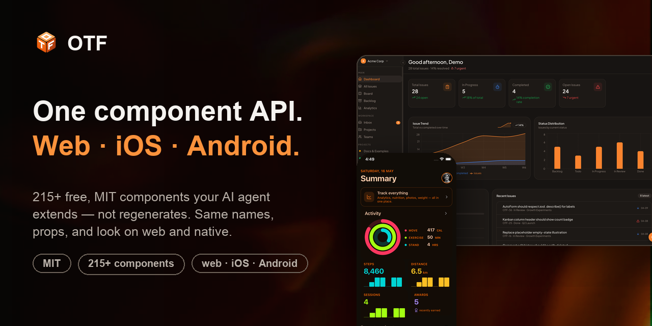
One component API for web, iOS, and Android.
Stop burning AI tokens on broken UI code. Pre-built, accessible, production-tested components your coding agent extends — instead of regenerating the same buttons, forms, and dialogs (half of them broken) on every prompt. <Button> from @otfdashkit/ui (React · Radix · Tailwind v4) and <Button> from @otfdashkit/ui-native (Expo · Tamagui) share the same name, props, and look. Build once, ship to the browser and to the App Store.





The tool that spun up your MVP — Lovable, Bolt, v0, Replit, Rork — keeps regenerating the same components on every prompt, and the bill grows as the project does. otf-ui is the component layer your agent should build on instead: one opinionated, accessible API that renders truly native on every platform — no Platform.select, no second design system, no createTamagui boilerplate. Wrap Radix + Tailwind v4 on the web and Tamagui on native, import the same names everywhere.
Features
- 🧩 One API, three platforms — identical component names and props on web, iOS, and Android. Learn it once.
- 📦 215+ components — 137 web (Button → Dialog → DataTable → charts → a Tiptap editor) + 80 native primitives, all keyboard- and screen-reader-accessible.
- 🎨 17 themes, zero config — flip a single attribute. Shared design tokens are CSS variables on web and native tokens on mobile.
- ⚡ Copy-paste or
npm install—pnpm add @otfdashkit/ui, or copy the source via the CLI registry. Your code either way. - 🪶 Wrap, don't reinvent — opinionated APIs on top of battle-tested primitives, not yet-another-from-scratch widget set.
- 🤖 Built for AI coding agents — structured JSDoc + tested prompts so Claude Code and Cursor scaffold real screens instead of guessing.
- 🆓 MIT — own the source, eject anytime, no lock-in.
See it live
Everything below is open and clickable — no signup, no install required to look around.
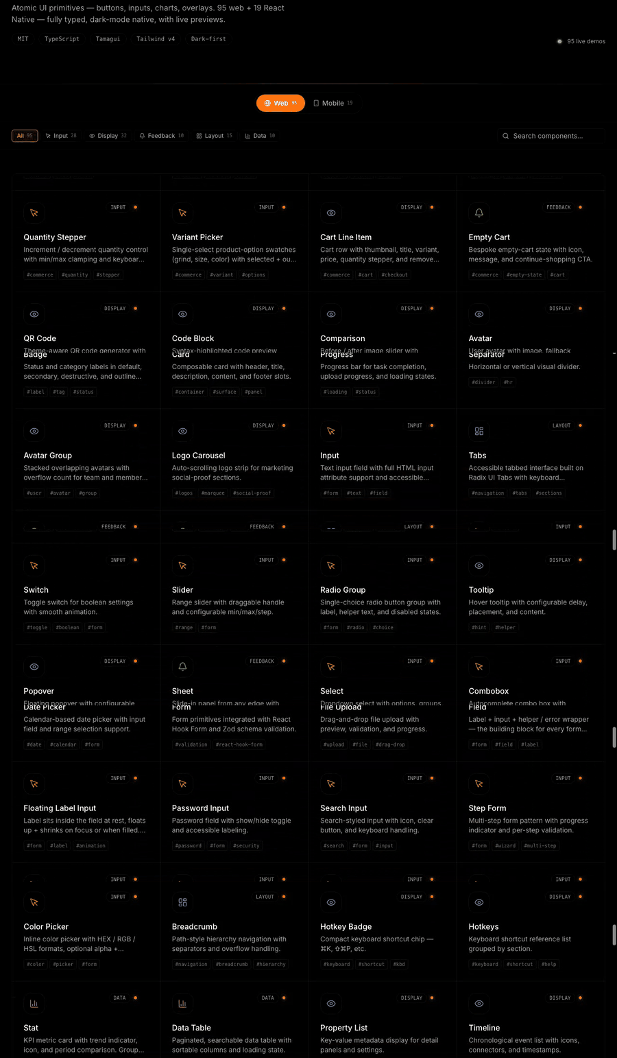
| Storybook — every component, every variant | Native showcase — on a real phone |
|---|---|
|
|
|
|
ui.otf-kit.dev The full web component library — props, variants, and a11y states, live. |
native-preview.otf-kit.dev Phone-framed showcase with a per-screen Expo Go QR — scan and land on the same component on your device. |
Prefer browsing by category? The component gallery has all 215+ with copy-paste install per component.
Quick start
# Web (Next.js / Vite)
pnpm add @otfdashkit/ui @otfdashkit/tokens

# Native (Expo)
pnpm add @otfdashkit/ui-native @otfdashkit/tokens
// Web — app/layout.tsx (Next.js) or src/main.tsx (Vite)
import '@otfdashkit/tokens/web.css'
import '@otfdashkit/ui/styles'
import { Button, Card, Input } from '@otfdashkit/ui'

export function SignInCard() {
  return (
    <Card>
      <Input placeholder="Email" />
      <Button variant="primary" size="lg">Continue</Button>
    </Card>
  )
}
// Native — same names, same props. That's the whole point.
import { Button, Card, Input } from '@otfdashkit/ui-native'
Wrap the app root once (<OTFProvider> on native, the CSS imports on web) and you're done. No createTamagui config, no token wiring.
Theming
17 themes ship in the box — Slate, Warm, Cosmic, Terminal, and 13 more. Switch with one attribute:
<html data-theme="cosmic">                  // web
<OTFProvider defaultTheme="cosmic">         // native
Tokens live in @otfdashkit/tokens and resolve to CSS variables on web and native design tokens on mobile — the same palette, both targets.
Built for AI coding agents
otf-ui is designed to be read by the agents you already code with. Every component ships structured JSDoc and a prompts.md with tested prompts, so Claude Code, Cursor, and friends generate working screens instead of hallucinating props.
"Build a settings page with a profile form, a danger zone, and a theme picker — use @otfdashkit/ui."
…produces real, accessible components with correct props, because the model can read the source and the prompt library.
Agent Skills
Prefer to drive the SDK straight from your coding agent? OTF ships installable
Agent Skills — drop them into Claude Code, Cursor, Codex,
and 70+ skills-compatible agents:
npx skills add otf-kit/skills
- otf-cross-platform-ui — one component API, web + native
- otf-ui — web components (
@otfdashkit/ui) - otf-ui-native — native components (
@otfdashkit/ui-native) - otf-tokens — theming (
@otfdashkit/tokens)
Source: github.com/otf-kit/skills.
What's in the box
| Package | Platform | What |
|---|---|---|
@otfdashkit/ui |
Web | 137 components — Button, Card, Form, Dialog, Sheet, Drawer, Command palette, Toast, Calendar, DataTable, BarChart/AreaChart, Tiptap editor, ImageCrop, and 120+ more. Built on Radix + Tailwind v4. |
@otfdashkit/ui-native |
iOS · Android | 80 primitives — same names and props as web, one <OTFProvider> at the root. |
@otfdashkit/tokens |
Both | 17 themes — CSS vars on web, native tokens on mobile. |
@otfdashkit/cli |
Mobile | Registry installer for heavy-peer components (Skia, Reanimated, MMKV) — copies source, no forced peer deps. |
@otfdashkit/eslint-plugin-otf-design |
Tooling | Catches hex literals and default Tailwind blues/purples/grays at lint time. |
Component categories: Layout · Forms & inputs · Overlays (dialog/sheet/drawer/popover) · Data (tables, trees, charts) · Navigation · Feedback · Media · Editors. Browse them all in Storybook or the gallery.
Documentation
- 📖 Docs — otf-kit.dev/docs
- 🧪 Storybook (web) — ui.otf-kit.dev
- 📱 Native showcase — native-preview.otf-kit.dev
- 🗂 Component gallery — otf-kit.dev/components
Contributing
Issues, ideas, and PRs are welcome. Found a missing variant or an a11y gap? Open an issue or send a PR — see CONTRIBUTING.md. Every component ships the same contract: implementation + Storybook story + a11y test + prompts.md + README + export.
If otf-ui saves you time, a ⭐ helps other builders find it.
Community
Join the Discord for help, feature requests, bug reports, and release announcements.
Status
v0.1.x — alpha. APIs may shift before 1.0; pin exact versions if you ship to production.
Building a whole app?
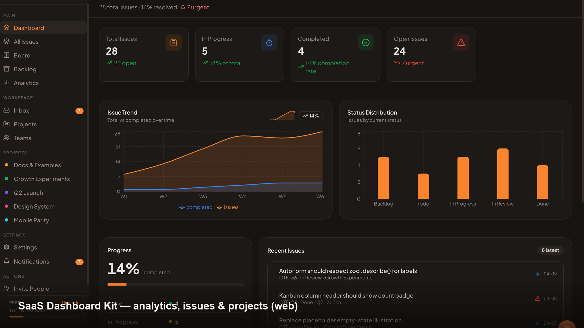
The SDK is free, MIT, and stands entirely on its own — that's the point. If you'd rather not wire the backend from scratch, OTF also offers optional full-stack kits (a SaaS dashboard, a fitness app, a booking app): the same SDK dropped into a complete, owned starting point — auth, database, payments, deploy scripts, and an ai/ config your agent reads to extend it.
 |
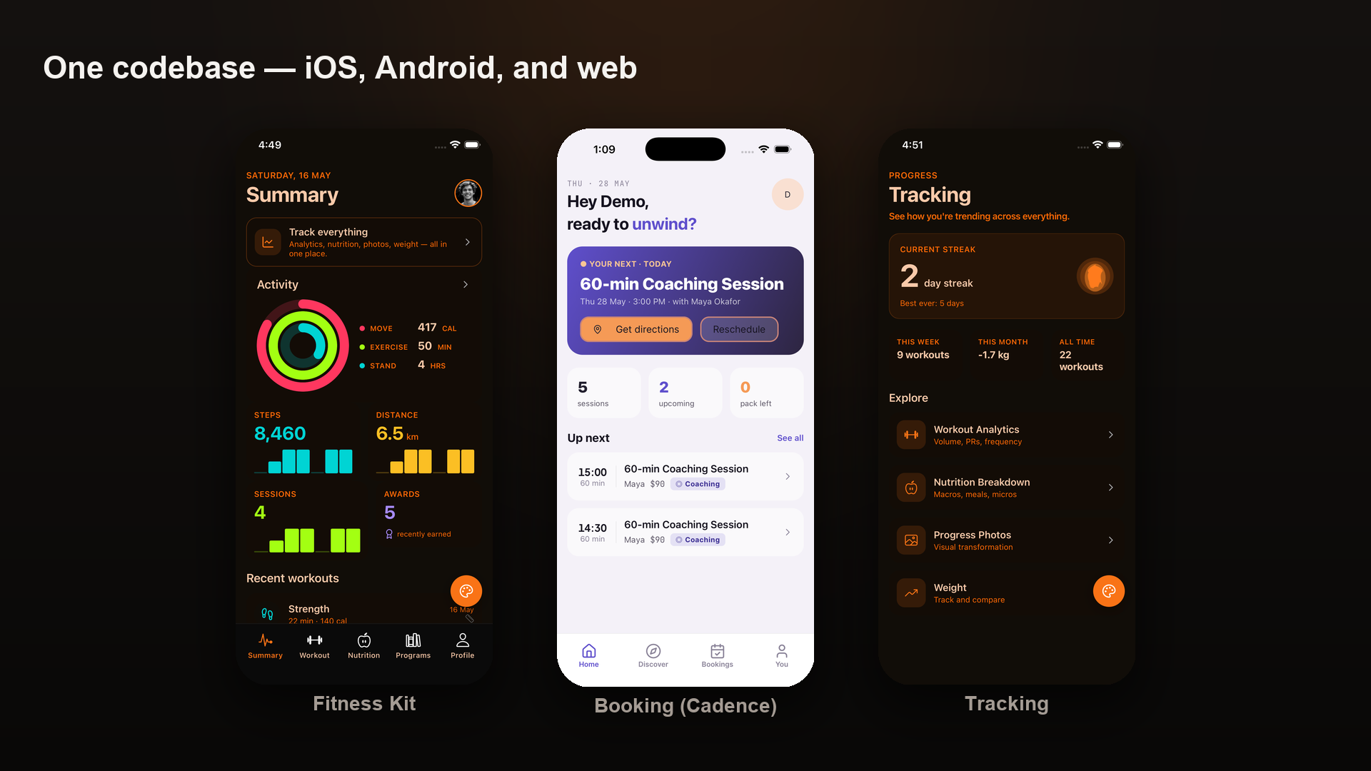 |
| SaaS Dashboard — live at saas.otf-kit.dev | Fitness — iOS · Android · web, one codebase, at fitness-preview.otf-kit.dev |
Live demos and details at otf-kit.dev.
License
MIT — free forever for every SDK package. You own the source; eject anytime.
@otfdashkit/ui·@otfdashkit/ui-native·@otfdashkit/tokens·@otfdashkit/cli·@otfdashkit/eslint-plugin-otf-design
The commercial OTF kits ship under a per-developer license — details at otf-kit.dev.
Reviews (0)
Sign in to leave a review.
Leave a reviewNo results found