ui
Health Pass
- License — License: Apache-2.0
- Description — Repository has a description
- Active repo — Last push 0 days ago
- Community trust — 479 GitHub stars
Code Pass
- Code scan — Scanned 12 files during light audit, no dangerous patterns found
Permissions Pass
- Permissions — No dangerous permissions requested
No AI report is available for this listing yet.
A library of behaviors for agents to build the next generation of user interfaces.
UI SDK
A library of behaviors for agents to build the next generation of user interfaces.
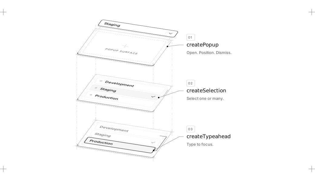
Keyboard navigation, focus, selection, dismissal, popups, drag and drop and the ARIA they need live in @ui-sdk/core, with adapters for React, Vue, Svelte, Solid and Web Components.
Install
UI SDK is in beta. Install core and the adapter for your framework:
npm install @ui-sdk/react @ui-sdk/core
For other frameworks, swap @ui-sdk/react for @ui-sdk/vue, @ui-sdk/svelte, @ui-sdk/solid or @ui-sdk/web.
Then give your agent the UI SDK skill:
npx skills add vercel-labs/ui --skill ui-sdk
Example
Every component in UI SDK is built from behaviors. You start by creating the primitive with behaviors.
Don't worry, you don't need to learn how to write this. Your agents will. And we made them really good at it.
import { createFocusRecovery, definePrimitive } from "@ui-sdk/core"

const searchField = definePrimitive({
  name: "search-field",
  state: () => ({ value: "" }),
  api: (context) => ({
    set: (value: string) => context.store.set({ value }),
    recovery: createFocusRecovery({ fallback: () => context.element("input") }),
  }),
  slots: (slot) => ({
    input: slot({
      attrs: (state) => ({ value: state.value }),
      on: {
        input: (event, { api }) =>
          api.set((event.target as HTMLInputElement).value),
      },
    }),
    clear: slot({
      present: (state) => state.value !== "",
      attrs: () => ({ type: "button" }),
      press: ({ api }) => api.set(""),
      bind: (el, part) => part.api.recovery.bind(el, part),
    }),
  }),
})

export { searchField }
Then render it in your framework with createParts. The parts are the same in all five.
React
import { createParts } from "@ui-sdk/react/primitive"
import { searchField } from "./search-field"

const parts = createParts(searchField, { input: "input", clear: "button" })

const SearchField = parts.Root
const SearchFieldInput = parts.Input
const SearchFieldClear = parts.Clear

function Search() {
  return (
    <SearchField>
      <SearchFieldInput placeholder="Search" />
      <SearchFieldClear>Clear</SearchFieldClear>
    </SearchField>
  )
}

export { Search }
Vue
<script setup lang="ts">
import { createParts } from "@ui-sdk/vue/primitive"
import { searchField } from "./search-field"

const parts = createParts(searchField, { input: "input", clear: "button" })

const SearchField = parts.Root
const SearchFieldInput = parts.Input
const SearchFieldClear = parts.Clear
</script>

<template>
  <SearchField>
    <SearchFieldInput placeholder="Search" />
    <SearchFieldClear>Clear</SearchFieldClear>
  </SearchField>
</template>
Svelte
<script lang="ts">
  import { createParts } from "@ui-sdk/svelte/primitive"
  import { searchField } from "./search-field"

  const parts = createParts(searchField, { input: "input", clear: "button" })

  const SearchField = parts.Root
  const SearchFieldInput = parts.Input
  const SearchFieldClear = parts.Clear
</script>

<SearchField>
  <SearchFieldInput placeholder="Search" />
  <SearchFieldClear>Clear</SearchFieldClear>
</SearchField>
Solid
import { createParts } from "@ui-sdk/solid/primitive"
import { searchField } from "./search-field"

const parts = createParts(searchField, { input: "input", clear: "button" })

const SearchField = parts.Root
const SearchFieldInput = parts.Input
const SearchFieldClear = parts.Clear

function Search() {
  return (
    <SearchField>
      <SearchFieldInput placeholder="Search" />
      <SearchFieldClear>Clear</SearchFieldClear>
    </SearchField>
  )
}

export { Search }
Web Components
Register a custom element for each part:
import { createParts, wrappedButton, wrappedChild } from "@ui-sdk/web"
import { searchField } from "./search-field"

createParts(searchField, {
  root: "search-field",
  input: { tag: "search-field-input", target: wrappedChild("input") },
  clear: { tag: "search-field-clear", target: wrappedButton },
})
Then use them in your HTML:
<search-field>
  <search-field-input><input placeholder="Search" /></search-field-input>
  <search-field-clear><button>Clear</button></search-field-clear>
</search-field>
Contributing
Contributions are welcome. See CONTRIBUTING.md to get the repo
running locally and land a change, and use
issues to report bugs. By
participating, you agree to our Code of Conduct.
Security
Please do not open public issues for security vulnerabilities. Instead, follow
SECURITY.md and report responsibly to
[email protected].
Beta terms
UI SDK is currently in beta and subject to the Vercel beta terms;
the framework, APIs, documentation, and behavior may change before general availability.
Reviews (0)
Sign in to leave a review.
Leave a reviewNo results found