variant-design-skill
Health Pass
- License — License: MIT
- Description — Repository has a description
- Active repo — Last push 0 days ago
- Community trust — 43 GitHub stars
Code Warn
- Code scan incomplete — No supported source files were scanned during light audit
Permissions Pass
- Permissions — No dangerous permissions requested
No AI report is available for this listing yet.
Solve the blank canvas problem. Prompt → 3 distinct designs → vary → export. A Claude Code skill inspired by the Variant design community.
variant-design
English | 中文
Solve the blank canvas problem. Prompt → 3 fully-formed distinct designs → vary → export.
A Claude Code skill inspired by the Variant design community, powered by the Impeccable design system. Give it a prompt, get three divergent design directions — each from a different studio's aesthetic — then iterate with one-word actions.
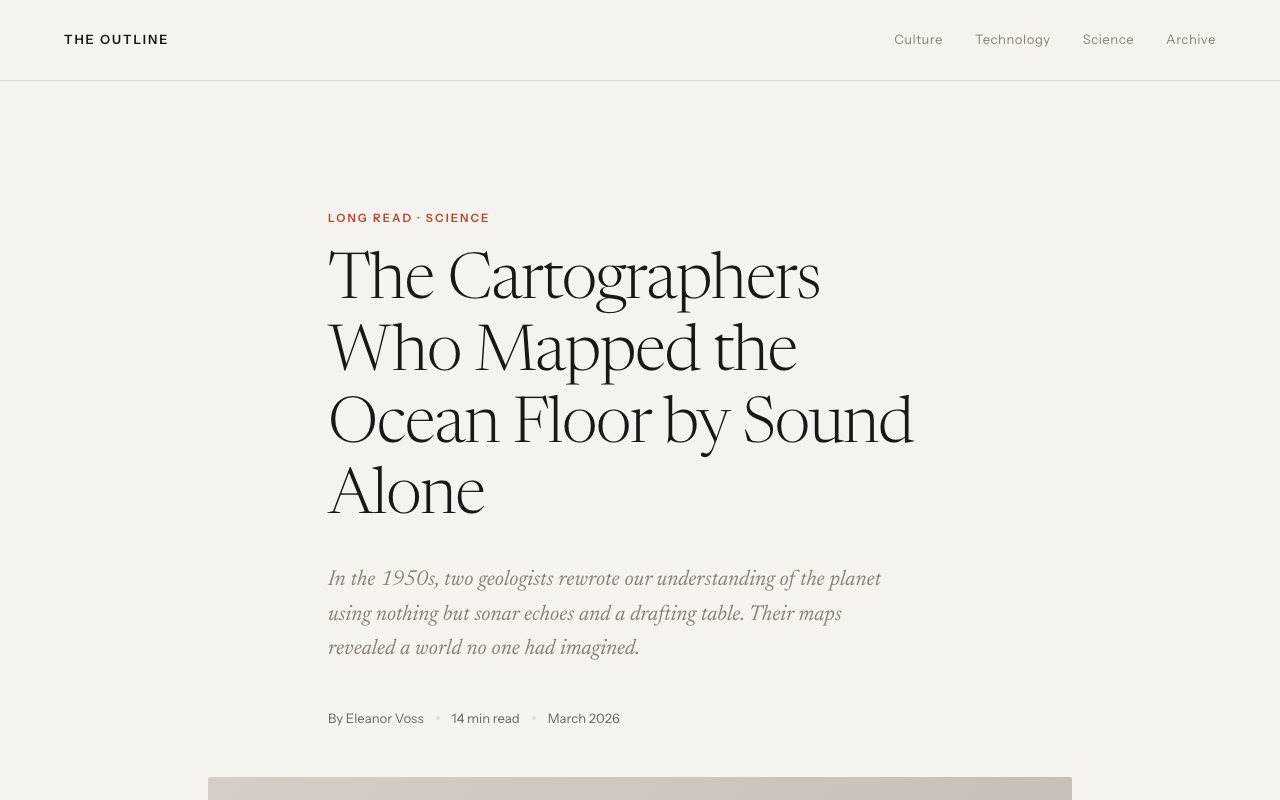
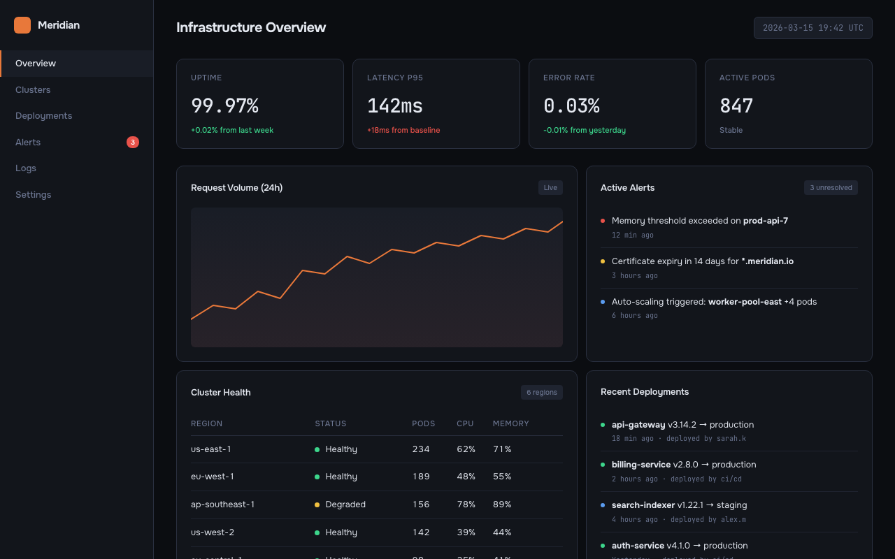
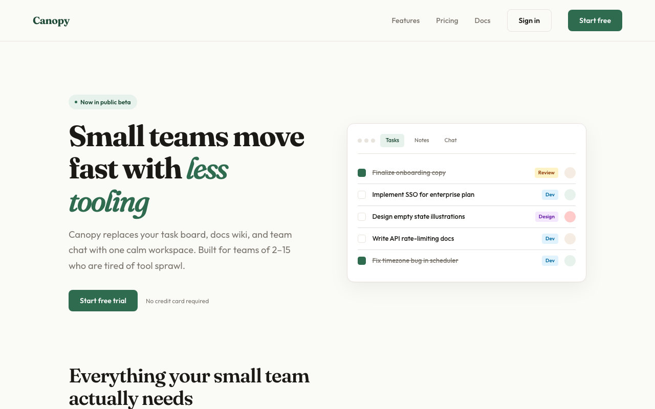
Sample output
Three variations from a single prompt — each feels like a different studio:
| A — Editorial | B — Dark Dashboard | C — SaaS Landing |
|---|---|---|
 |
 |
 |
What it does
Generate Mode (default)
- Detects your scenario — dashboard, SaaS landing page, editorial, e-commerce, mobile app, creative tool, education, portfolio, food & beverage, fashion & lifestyle
- Loads design system references — typography, color theory (OKLCH), spatial design, motion, micro-interactions, interaction, responsive, UX writing
- Generates 3 distinct variations — each pulls from a different aesthetic direction with full interactivity (scroll reveals, animated charts, hover effects, functional JS)
- Runs an AI Slop Test — quality gate that catches generic AI aesthetic fingerprints before presenting
- Ships working code — Context-aware output: auto-detects React projects and generates
.tsxcomponents; generates zero-dependency interactive HTML otherwise. Real content, no lorem ipsum - Offers variation actions — push further, polish, critique, swap styles, remix colors, shuffle layouts, add motion, dramatize, make interactive
Analyze Mode (existing sites)
- Scans your existing code — reads HTML, CSS, JSX, Vue, Svelte files for design tokens
- Extracts design primitives — colors, fonts, spacing, components, transitions, breakpoints
- Detects inconsistencies — near-duplicate colors, off-grid spacing, missing hover states, contrast failures, font scale issues
- Generates a style report — scored audit with severity levels and priority fix list
- Produces tokens — consolidated CSS custom properties file from scattered hardcoded values
- Generates style-matched pages — new pages that follow your existing design system exactly
- Creates migration plans — phased checklist for consolidating an inconsistent codebase
audit                    → Full style consistency report
tokens                   → Extract tokens from existing CSS
match                    → Generate new pages matching your existing style
new page pricing         → Add /pricing page following your current design
migrate                  → Phased plan to consolidate design tokens
compare old new          → Side-by-side existing vs. redesigned
Installation
Claude Code (recommended)
claude skill install https://github.com/YuqingNicole/variant-design-skill
Or add manually to your project's SKILL.md — copy the contents of SKILL.md into your existing skill file.
Other Claude interfaces
Claude.ai (web/desktop): Paste the contents of SKILL.md into a Project's custom instructions, or drop it at the top of a conversation as a system prompt.
API / custom integrations: Include SKILL.md as a system message before your user turn.
Usage
Basic triggers
The simplest way — just describe what you want:
design a dashboard for a crypto trading terminal
show me 3 directions for a SaaS landing page
give me UI options for a wellness app
Directed triggers — lock in a style or reference a site
You can be more specific by naming an aesthetic direction, a palette, or even an existing site you want to match:
developer tools homepage, code-first hero with CLI snippet, dark Data/Technical direction

landing page for an AI agent tool — Dark Indigo palette, Geist font, Code-First layout from saas.md

3 variations for a food delivery app — one Warm/Human, one Bold/Expressive, one Neo-brutalist

reproduce the visual style of [site you described] — dark navy, monospace, swim lane diagrams
Tip: the more constraints you name (direction + palette + layout pattern), the more targeted the output. The more open the prompt, the more divergent the three variations will be.
Anatomy of a directed prompt
[what it is] + [domain] + [aesthetic direction or palette] + [layout hint] + [any signature detail]
Examples:
| Goal | Prompt |
|---|---|
| Match a specific site's vibe | "developer tool landing page — dark Data/Technical, CLI code hero, Dark Indigo palette" |
| Explore freely | "landing page for a mindfulness app" |
| One fixed + two free | "3 directions for a finance dashboard — one must be Amber Finance dark terminal" |
| Multi-screen flow | "3-screen onboarding flow for a meditation app, Wellness Soft palette" |
Variation actions
After seeing the initial 3 variations, iterate with:
| Action | What happens |
|---|---|
| Vary strong | Push current direction to its extreme |
| Vary subtle | Polish and refine, same aesthetic |
| Distill | Strip to essence — remove everything non-essential |
| Change style | Keep layout, swap entire visual language |
| Remix colors | 3 alternative palettes using OKLCH: analogous / complementary / unexpected |
| Shuffle layout | Same content + style, different composition |
| Add motion | Layer micro-interactions and animations onto current design |
| Dramatize | Push interactions to cinematic maximum (parallax, 3D tilt, curtain reveal) |
| Make interactive | Add functional patterns: filtering, charts, drag-and-drop, form validation |
| Polish | Refine against design system: typography, spacing, interactions, motion, copy |
| Critique | Systematic audit against all 8 design system dimensions |
| Extract tokens | Export design tokens as CSS / JSON / Tailwind config |
| See other views | Mobile / dark mode / empty state / onboarding / hover states |
| Mix | Combine two variations: "Mix A + B" or "A's layout + C's colors" |
Quick iteration shorthand
In Claude Code you can use shorthand for fast iteration:
A vary strong          → Push Variation A to maximum
B remix colors         → 3 new palettes for Variation B
C → mobile             → Show C as mobile viewport
pick A                 → Select A as winner
A + B colors           → Mix A layout with B palette
tokens A               → Extract CSS tokens from A
compare                → Side-by-side view of all 3
open B                 → Re-open B in browser
react A                → Export Variation A as React .tsx component
react B                → Export Variation B as React .tsx component
show context           → Print current persisted palette/fonts/direction
reset context          → Clear context, start fresh next session
What you'll see
Files are written to variant-output/ and auto-opened in your browser — you never need to manually find or open files. Each variation comes with a compact Summary Card in the terminal (direction, palette, fonts, interactions). Actions are grouped into Reshape / Tune / Animate / Refine / Export categories.
On iteration, the same file is overwritten and re-opened — your browser tab refreshes automatically. The terminal shows a 2-3 line summary of what changed, not the full code.
Context persists across sessions. When you re-enter a project directory, the skill reads variant-output/.variant-context.json and resumes your last palette, fonts, direction, and iteration count automatically:
✦ Resuming context: Amber Warm · Editorial · Instrument Serif + Instrument Sans · picked B · 4 iterations
  (reset context to start fresh)
No need to re-specify preferences you've already confirmed. Use show context to inspect the current context, or reset context to start fresh.
Output format is context-aware: if your current directory contains a React project (package.json with react dependency), output is .tsx components. Otherwise, zero-dependency HTML is the default. Override with --react or --html. See below for more.
React output (context-aware)
In a React project, the skill automatically switches to .tsx output:
# In a React/Next/Vite project directory:
design a dashboard  →  generates variant-output/VariantA.tsx, VariantB.tsx, VariantC.tsx
                        Detects Next.js → adds "use client" where needed
                        Detects framer-motion → uses it; otherwise CSS animations

# In any other directory:
design a dashboard  →  generates variant-output/variant-dashboard-A.html (unchanged)

# Explicit override anywhere:
design a dashboard --react   →  always .tsx
design a dashboard --html    →  always HTML

# Export a specific variation:
react A              →  export Variation A as .tsx
export to next       →  export winning variation as Next.js App Router component
Generated .tsx files go to variant-output/ — move them to src/components/ to include in your project's build. The preview command is inferred from your package.json scripts (npm run dev, pnpm dev, etc.).
Reference library
Domain references
Scenario-specific materials (starter prompts, palettes, typography, layouts, real community examples):
| File | Domain |
|---|---|
references/dashboard.md |
Data dashboards, analytics, monitoring, trading terminals |
references/editorial.md |
Magazines, journalism, long-form, news |
references/saas.md |
SaaS landing pages, B2B, developer tools |
references/ecommerce.md |
E-commerce, consumer apps, fintech cards |
references/education.md |
Learning apps, quizzes, language tools |
references/creative.md |
Generative art, music tools, creative software |
references/mobile.md |
iOS/Android apps, onboarding, home screens |
references/portfolio.md |
Designer portfolios, developer showcases, freelancer sites |
references/food-beverage.md |
Restaurants, recipes, coffee brands, bakeries, cocktail bars |
references/fashion.md |
Fashion brands, streetwear, beauty, interior design, lifestyle |
references/palettes.md |
Universal palette library — 39 palettes × 7+ aesthetic directions (incl. Pinterest trends) |
references/interactive-patterns.md |
Filtering, drag-and-drop, charts, lightbox, carousels, multi-step forms |
Design system references (Impeccable)
Foundational design principles loaded for every generation:
| File | Covers |
|---|---|
references/design-system/typography.md |
Modular scale, fluid type, font pairing, OpenType features, vertical rhythm |
references/design-system/color-and-contrast.md |
OKLCH color space, tinted neutrals, 60-30-10 rule, dark mode, WCAG contrast |
references/design-system/spatial-design.md |
4pt grid, container queries, squint test, hierarchy through multiple dimensions |
references/design-system/motion-design.md |
100/300/500 rule, ease-out-expo, stagger, reduced motion, perceived performance |
references/design-system/interaction-design.md |
8 interactive states, focus-visible, forms, modals, keyboard navigation |
references/design-system/responsive-design.md |
Mobile-first, content-driven breakpoints, input detection, safe areas |
references/design-system/ux-writing.md |
Button labels, error formulas, empty states, voice vs tone, accessibility |
references/design-system/micro-interactions.md |
Scroll reveals, hover effects, counters, parallax, page transitions, toasts |
references/design-system/style-audit.md |
Token extraction, consistency detection, audit reports, migration plans |
Design principles
- Real content wins. Plausible headlines, real data, actual copy. Makes designs feel alive.
- Commit fully. Half-executed aesthetics look worse than simple ones.
- Never converge. If A is dark, B cannot also be dark. Each must feel like a different studio.
- Typography first. Distinctive display font + reliable body. Never Inter, Roboto, Arial, system-ui.
- Color = one bold OKLCH choice. One dominant color used with conviction beats five timid colors. Always tint neutrals.
- No AI slop. No purple gradients, no glassmorphism, no bounce easing, no centered-everything layouts.
Contributing
PRs welcome. Each domain reference file follows a consistent 6-section schema:
- Starter Prompts (domain-grouped)
- Color Palettes (CSS custom properties)
- Typography Pairings
- Layout Patterns
- Signature Details
- Real Community Examples
Design system references follow the Impeccable style structure with principles, code examples, and anti-patterns.
Examples
The examples/ directory contains runnable demos:
| File | What it demonstrates |
|---|---|
examples/coffee-brand-interactive.html |
Full interactive landing page: curtain reveal, staggered entrance, scroll reveals, animated counters, product filter, card hover lift, image zoom, SVG donut chart, flavor bar animation, toast notifications, mobile hamburger menu, back-to-top, reduced motion fallbacks |
Open any example directly in your browser to see the interactions in action.
Built with Claude Code Skills. Design system powered by Impeccable.
Reviews (0)
Sign in to leave a review.
Leave a reviewNo results found