variant-design-skill
Health Gecti
- License — License: MIT
- Description — Repository has a description
- Active repo — Last push 0 days ago
- Community trust — 43 GitHub stars
Code Uyari
- Code scan incomplete — No supported source files were scanned during light audit
Permissions Gecti
- Permissions — No dangerous permissions requested
Bu listing icin henuz AI raporu yok.
Solve the blank canvas problem. Prompt → 3 distinct designs → vary → export. A Claude Code skill inspired by the Variant design community.
variant-design
English | 中文
Solve the blank canvas problem. Prompt → 3 fully-formed distinct designs → vary → export.
A Claude Code skill inspired by the Variant design community, powered by the Impeccable design system. Give it a prompt, get three divergent design directions — each from a different studio's aesthetic — then iterate with one-word actions.
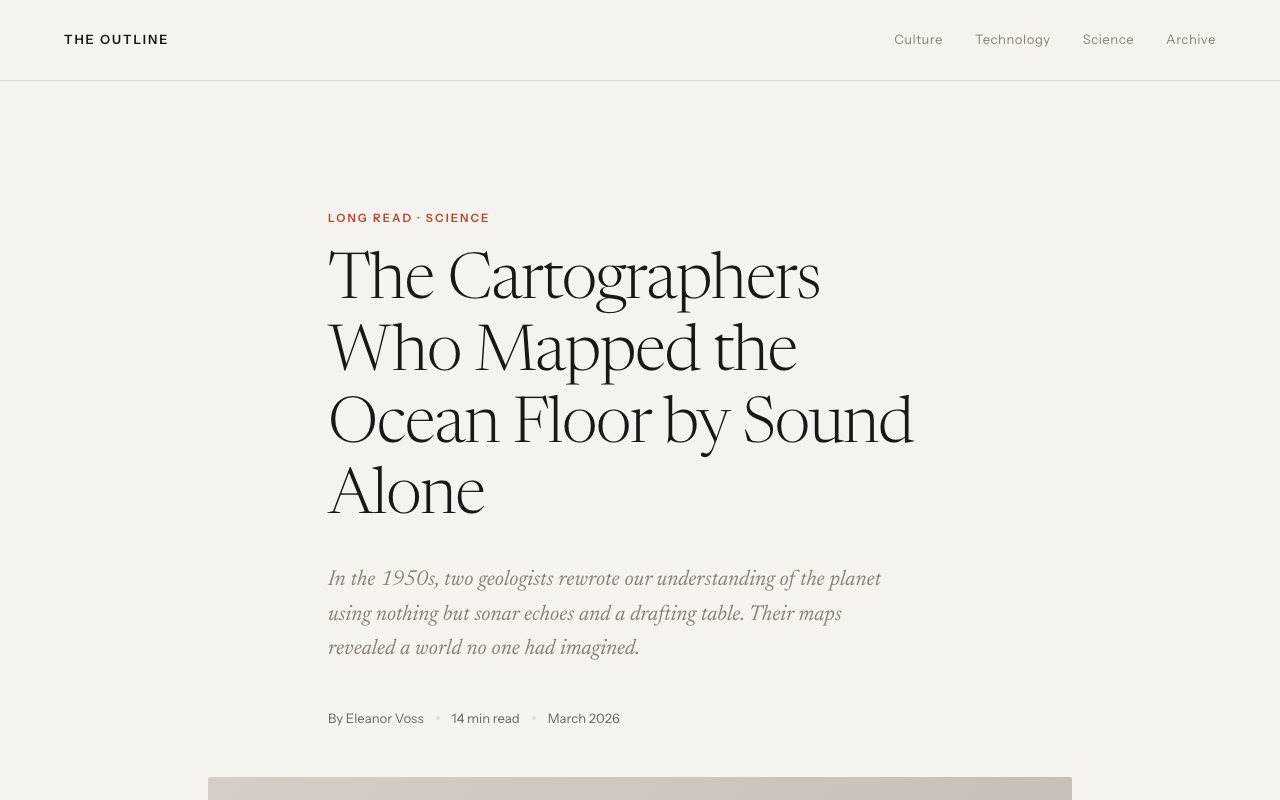
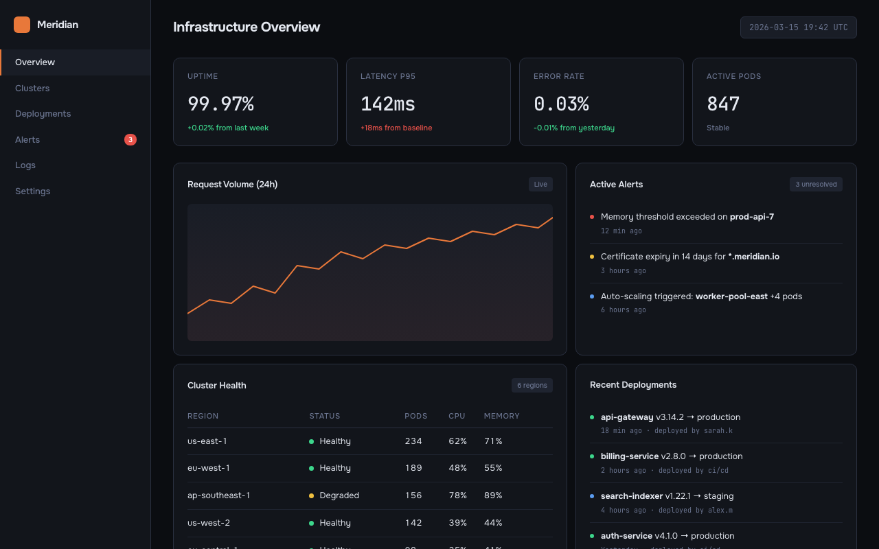
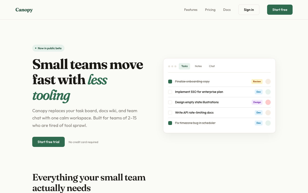
Sample output
Three variations from a single prompt — each feels like a different studio:
| A — Editorial | B — Dark Dashboard | C — SaaS Landing |
|---|---|---|
 |
 |
 |
What it does
Generate Mode (default)
- Detects your scenario — dashboard, SaaS landing page, editorial, e-commerce, mobile app, creative tool, education, portfolio, food & beverage, fashion & lifestyle
- Loads design system references — typography, color theory (OKLCH), spatial design, motion, micro-interactions, interaction, responsive, UX writing
- Generates 3 distinct variations — each pulls from a different aesthetic direction with full interactivity (scroll reveals, animated charts, hover effects, functional JS)
- Runs an AI Slop Test — quality gate that catches generic AI aesthetic fingerprints before presenting
- Ships working code — Context-aware output: auto-detects React projects and generates
.tsxcomponents; generates zero-dependency interactive HTML otherwise. Real content, no lorem ipsum - Offers variation actions — push further, polish, critique, swap styles, remix colors, shuffle layouts, add motion, dramatize, make interactive
Analyze Mode (existing sites)
- Scans your existing code — reads HTML, CSS, JSX, Vue, Svelte files for design tokens
- Extracts design primitives — colors, fonts, spacing, components, transitions, breakpoints
- Detects inconsistencies — near-duplicate colors, off-grid spacing, missing hover states, contrast failures, font scale issues
- Generates a style report — scored audit with severity levels and priority fix list
- Produces tokens — consolidated CSS custom properties file from scattered hardcoded values
- Generates style-matched pages — new pages that follow your existing design system exactly
- Creates migration plans — phased checklist for consolidating an inconsistent codebase
audit                    → Full style consistency report
tokens                   → Extract tokens from existing CSS
match                    → Generate new pages matching your existing style
new page pricing         → Add /pricing page following your current design
migrate                  → Phased plan to consolidate design tokens
compare old new          → Side-by-side existing vs. redesigned
Installation
Claude Code (recommended)
claude skill install https://github.com/YuqingNicole/variant-design-skill
Or add manually to your project's SKILL.md — copy the contents of SKILL.md into your existing skill file.
Other Claude interfaces
Claude.ai (web/desktop): Paste the contents of SKILL.md into a Project's custom instructions, or drop it at the top of a conversation as a system prompt.
API / custom integrations: Include SKILL.md as a system message before your user turn.
Usage
Basic triggers
The simplest way — just describe what you want:
design a dashboard for a crypto trading terminal
show me 3 directions for a SaaS landing page
give me UI options for a wellness app
Directed triggers — lock in a style or reference a site
You can be more specific by naming an aesthetic direction, a palette, or even an existing site you want to match:
developer tools homepage, code-first hero with CLI snippet, dark Data/Technical direction

landing page for an AI agent tool — Dark Indigo palette, Geist font, Code-First layout from saas.md

3 variations for a food delivery app — one Warm/Human, one Bold/Expressive, one Neo-brutalist

reproduce the visual style of [site you described] — dark navy, monospace, swim lane diagrams
Tip: the more constraints you name (direction + palette + layout pattern), the more targeted the output. The more open the prompt, the more divergent the three variations will be.
Anatomy of a directed prompt
[what it is] + [domain] + [aesthetic direction or palette] + [layout hint] + [any signature detail]
Examples:
| Goal | Prompt |
|---|---|
| Match a specific site's vibe | "developer tool landing page — dark Data/Technical, CLI code hero, Dark Indigo palette" |
| Explore freely | "landing page for a mindfulness app" |
| One fixed + two free | "3 directions for a finance dashboard — one must be Amber Finance dark terminal" |
| Multi-screen flow | "3-screen onboarding flow for a meditation app, Wellness Soft palette" |
Variation actions
After seeing the initial 3 variations, iterate with:
| Action | What happens |
|---|---|
| Vary strong | Push current direction to its extreme |
| Vary subtle | Polish and refine, same aesthetic |
| Distill | Strip to essence — remove everything non-essential |
| Change style | Keep layout, swap entire visual language |
| Remix colors | 3 alternative palettes using OKLCH: analogous / complementary / unexpected |
| Shuffle layout | Same content + style, different composition |
| Add motion | Layer micro-interactions and animations onto current design |
| Dramatize | Push interactions to cinematic maximum (parallax, 3D tilt, curtain reveal) |
| Make interactive | Add functional patterns: filtering, charts, drag-and-drop, form validation |
| Polish | Refine against design system: typography, spacing, interactions, motion, copy |
| Critique | Systematic audit against all 8 design system dimensions |
| Extract tokens | Export design tokens as CSS / JSON / Tailwind config |
| See other views | Mobile / dark mode / empty state / onboarding / hover states |
| Mix | Combine two variations: "Mix A + B" or "A's layout + C's colors" |
Quick iteration shorthand
In Claude Code you can use shorthand for fast iteration:
A vary strong          → Push Variation A to maximum
B remix colors         → 3 new palettes for Variation B
C → mobile             → Show C as mobile viewport
pick A                 → Select A as winner
A + B colors           → Mix A layout with B palette
tokens A               → Extract CSS tokens from A
compare                → Side-by-side view of all 3
open B                 → Re-open B in browser
react A                → Export Variation A as React .tsx component
react B                → Export Variation B as React .tsx component
show context           → Print current persisted palette/fonts/direction
reset context          → Clear context, start fresh next session
What you'll see
Files are written to variant-output/ and auto-opened in your browser — you never need to manually find or open files. Each variation comes with a compact Summary Card in the terminal (direction, palette, fonts, interactions). Actions are grouped into Reshape / Tune / Animate / Refine / Export categories.
On iteration, the same file is overwritten and re-opened — your browser tab refreshes automatically. The terminal shows a 2-3 line summary of what changed, not the full code.
Context persists across sessions. When you re-enter a project directory, the skill reads variant-output/.variant-context.json and resumes your last palette, fonts, direction, and iteration count automatically:
✦ Resuming context: Amber Warm · Editorial · Instrument Serif + Instrument Sans · picked B · 4 iterations
  (reset context to start fresh)
No need to re-specify preferences you've already confirmed. Use show context to inspect the current context, or reset context to start fresh.
Output format is context-aware: if your current directory contains a React project (package.json with react dependency), output is .tsx components. Otherwise, zero-dependency HTML is the default. Override with --react or --html. See below for more.
React output (context-aware)
In a React project, the skill automatically switches to .tsx output:
# In a React/Next/Vite project directory:
design a dashboard  →  generates variant-output/VariantA.tsx, VariantB.tsx, VariantC.tsx
                        Detects Next.js → adds "use client" where needed
                        Detects framer-motion → uses it; otherwise CSS animations

# In any other directory:
design a dashboard  →  generates variant-output/variant-dashboard-A.html (unchanged)

# Explicit override anywhere:
design a dashboard --react   →  always .tsx
design a dashboard --html    →  always HTML

# Export a specific variation:
react A              →  export Variation A as .tsx
export to next       →  export winning variation as Next.js App Router component
Generated .tsx files go to variant-output/ — move them to src/components/ to include in your project's build. The preview command is inferred from your package.json scripts (npm run dev, pnpm dev, etc.).
Reference library
Domain references
Scenario-specific materials (starter prompts, palettes, typography, layouts, real community examples):
| File | Domain |
|---|---|
references/dashboard.md |
Data dashboards, analytics, monitoring, trading terminals |
references/editorial.md |
Magazines, journalism, long-form, news |
references/saas.md |
SaaS landing pages, B2B, developer tools |
references/ecommerce.md |
E-commerce, consumer apps, fintech cards |
references/education.md |
Learning apps, quizzes, language tools |
references/creative.md |
Generative art, music tools, creative software |
references/mobile.md |
iOS/Android apps, onboarding, home screens |
references/portfolio.md |
Designer portfolios, developer showcases, freelancer sites |
references/food-beverage.md |
Restaurants, recipes, coffee brands, bakeries, cocktail bars |
references/fashion.md |
Fashion brands, streetwear, beauty, interior design, lifestyle |
references/palettes.md |
Universal palette library — 39 palettes × 7+ aesthetic directions (incl. Pinterest trends) |
references/interactive-patterns.md |
Filtering, drag-and-drop, charts, lightbox, carousels, multi-step forms |
Design system references (Impeccable)
Foundational design principles loaded for every generation:
| File | Covers |
|---|---|
references/design-system/typography.md |
Modular scale, fluid type, font pairing, OpenType features, vertical rhythm |
references/design-system/color-and-contrast.md |
OKLCH color space, tinted neutrals, 60-30-10 rule, dark mode, WCAG contrast |
references/design-system/spatial-design.md |
4pt grid, container queries, squint test, hierarchy through multiple dimensions |
references/design-system/motion-design.md |
100/300/500 rule, ease-out-expo, stagger, reduced motion, perceived performance |
references/design-system/interaction-design.md |
8 interactive states, focus-visible, forms, modals, keyboard navigation |
references/design-system/responsive-design.md |
Mobile-first, content-driven breakpoints, input detection, safe areas |
references/design-system/ux-writing.md |
Button labels, error formulas, empty states, voice vs tone, accessibility |
references/design-system/micro-interactions.md |
Scroll reveals, hover effects, counters, parallax, page transitions, toasts |
references/design-system/style-audit.md |
Token extraction, consistency detection, audit reports, migration plans |
Design principles
- Real content wins. Plausible headlines, real data, actual copy. Makes designs feel alive.
- Commit fully. Half-executed aesthetics look worse than simple ones.
- Never converge. If A is dark, B cannot also be dark. Each must feel like a different studio.
- Typography first. Distinctive display font + reliable body. Never Inter, Roboto, Arial, system-ui.
- Color = one bold OKLCH choice. One dominant color used with conviction beats five timid colors. Always tint neutrals.
- No AI slop. No purple gradients, no glassmorphism, no bounce easing, no centered-everything layouts.
Contributing
PRs welcome. Each domain reference file follows a consistent 6-section schema:
- Starter Prompts (domain-grouped)
- Color Palettes (CSS custom properties)
- Typography Pairings
- Layout Patterns
- Signature Details
- Real Community Examples
Design system references follow the Impeccable style structure with principles, code examples, and anti-patterns.
Examples
The examples/ directory contains runnable demos:
| File | What it demonstrates |
|---|---|
examples/coffee-brand-interactive.html |
Full interactive landing page: curtain reveal, staggered entrance, scroll reveals, animated counters, product filter, card hover lift, image zoom, SVG donut chart, flavor bar animation, toast notifications, mobile hamburger menu, back-to-top, reduced motion fallbacks |
Open any example directly in your browser to see the interactions in action.
Built with Claude Code Skills. Design system powered by Impeccable.
Yorumlar (0)
Yorum birakmak icin giris yap.
Yorum birakSonuc bulunamadi